
Our websites are growing inexorably. Over the last decade, the median weight of a web page has more than doubled on desktop and more than tripled on mobile. Animations, videos, tracking tools… With each feature added in the name of comfort or user experience, the feature creep that characterizes the modern web becomes further entrenched as a norm. A phenomenon that contradicts current ecological concerns, increasing the energy demands of data centers and accelerating the planned obsolescence of our devices.
Swimming against this tide, some websites are choosing radical simplicity. "Brutalist," "Low-tech," "Frugal"… these web design approaches advocate a return to essentials and rehabilitate the principle of less is more. An aesthetic that's trendy, far from unique to the web, making its way into a pop culture where brutalism is experiencing a certain revival, as illustrated for example by Charli XCX's recent "brat" album cover, whose modest, raw and striking design turned it into a major cultural phenomenon. But beyond the visual, these minimalist approaches invite us to rethink our relationship with information, particularly on the Internet, and the attachment we've developed to more or less useful embellishments that sometimes end up burying, or even eroding, the web's raw material: text.
What is a « frugal » website?
This is a website that adopts a minimalist design and intentionally forgoes anything that unnecessarily clutters the page or distracts from its purpose. Frugal design is not synonymous with ugly, boring, or ineffective, nor does it reject design altogether—quite the opposite. It represents a return to design's primary mission: creating accessible media to communicate a message effectively.
Generally, a site that has adopted these principles displays a few notable characteristics:
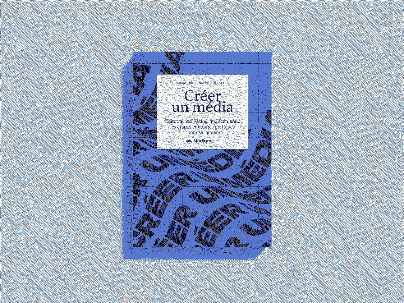
- No heavy audiovisual elements, such as images or (worse) videos, that are downloaded when a new user visits a page. Some sites will favor the use of optimized images through techniques like dithering and trading resolution or color depth for a much lighter image.
In the example below, the original image (above) is 2052.52 KB, compared to 269.96 KB for the optimized version (below) thanks to a slight reduction in the number of colors and resolution achieved with the Ditherit tool.

- Use of system fonts. These are fonts like Arial, Georgia, or Times New Roman that are already installed on virtually all devices and have been considered web standards for years. These
- Eliminating third-party tools and services, such as Google Analytics or Google AdSense, which consume substantial energy by multiplying data transmissions between multiple servers, often for limited useful information. They also go against the principles of a sustainable web that is more ethical and respectful of privacy. The Low-tech magazine, for example, chose to use alternative methods on its site, for two reasons: « The first is energy consumption: advertising services increase data traffic and therefore energy consumption. Secondly, Google collects information about blog visitors, which requires us to write very detailed privacy statements and cookie notices, which also consume data and frustrate visitors ».
- Limited functionality. No games, no user accounts, and no personalized news feed powered by algorithms. The reason: interactive features that consume a lot of energy, as well as the need to continuously store and transmit data. This is why most websites adopting a minimalist design prefer to use a static site—that is, a site with a single appearance that doesn't need to query a database to personalize the user experience, unlike a dynamic site. In short, everyone is (literally) on the same page. You can find more information about creating a static site at the end of this article.
- Direct access to the text that minimizes the barrier between the reader and the content. In his guide on brutalist web design, David Copeland reminds us that a web page is above all a "hypertext" document in which interactive elements are limited to "hyperlinks" and buttons: "Although JavaScript (a programming language primarily intended to add interactive features to a website, editor's note) allows any element to respond to a click, websites are not applications, and the vast majority of them should not need to resort to such measures to allow visitors to navigate or submit data ". He also recommends taking advantage of the major advantage of a web page over a physical magazine: the ability to scroll through content endlessly, allowing for smooth, uninterrupted reading at the pace chosen by the reader.

As an example, WHOISBN? (an application that provides information about a book's publisher based on its ISBN code) notes in its footer that its site design was inspired by recommendations from the guide « A Frugal Website » by designer Sarah Garcin. Result: a site presented on a single page where all information is gathered and which features, on the left, buttons allowing navigation between different sections without having to reload the page.
But what for?
Low-tech websites significantly reduce resource requirements, limiting their environmental impact. Being less resource-intensive, they also allow older or less powerful devices to access content effortlessly, without forcing users to regularly replace expensive hardware that is polluting to manufacture. Additionally, by adopting a streamlined design, page downloads are faster, which remains, even in 2025, a critical issue for regions without fast, stable, or secure connections.
Using "low-tech" methods ensures greater compatibility, relying on web standards that have existed for decades rather than features that come and go with trends. A simplicity that strengthens a site's accessibility, for example making content easier to access for people with visual impairments for whom screen readers become complex on pages saturated with interactive elements. Technical simplicity, which reduces the use of features, supplementary services or databases, also limiting risks related to hacking.
Finally, the constraint of frugality can be a creative lever rather than a limitation, offering new technical and editorial possibilities. Designing a frugal website thus becomes an act of creative resistance that challenges the assumptions imposed by major tech companies. Low-tech Magazine, for example, has developed a site so undemanding that it can be hosted locally… and powered by solar energy. By rejecting Google's advertising services, the magazine also had to rethink its business model, notably through selling articles as books, further strengthening its independence. Low-tech practices don't consist of removing features, but of creating new ones. For example, rather than forcing visitors to log back in each time they visit, why not make access easier offline by optimizing its printing on paper? You can find some advice on this in the frugal web guide mentioned earlier.
How do I do this?
A few tools and guides to help you get started.
- Optimize images. Use tools like Squoosh or ImageMagick to reduce their file size. Also test dithering with Ditherit.
- Use a static site generator. Hugo, Jekyll, Pelican (used by Low-tech Magazine) or Eleventy make it possible to create fast and lightweight sites. These tools do require certain technical skills and can prove more complex for sites or blogs publishing new content regularly, since they are not CMS (Content Management System) platforms like WordPress or Ghost that are specifically designed to manage article publishing.
- Clean up your code with tools like PurgeCSS that will help you identify unused lines of code to optimize your site.
- ★ "Decorating your text" ★ If you want to "enhance" your text while avoiding adding images, prefer using widely available Unicode symbols (like ★♦ •) that visitors won't have to download. Some sites list symbols you can simply copy and paste, like this one: https://glyphy.io/cool-symbols
- Learn more. Low-tech Magazine has published its own guide covering the behind-the-scenes of its own "low-tech" website. Also discover the manifesto for sustainable web or the Brutalist Web Design guide on the role of restraint in internet design. You can also find practical advice in the Low-tech Lab guide, Making a Low-tech Site?. For recommendations on programming and building a clear, legible HTML/CSS page, you can read this guide. Also read this article on the link between digital sobriety and accessibility. Track the state of the web on Httparchive to observe how website sizes are evolving.
Go further
- What are the specific features of graphic design for independent media? What vision do we defend? Here is our manifesto, written by our art director, Christelle Perrin.
- How to create accessible newsletters?
- Tech and design challenges: 5 things to know for designing your newsletter.