Name: Sabir
Nationality: Belgian
Year of creation: 2019
Founders: Maud Marique, Pauline Allié, Eva Anna Maréchal, Lucie Guien
Business model: Not specified
Medium: Print
Media type: Contemporary literature review
Publication language(s): French
With Sabir, the first time our paths crossed was on May 19th, at the Palais de Tokyo. The art center was hosting the Paris Ass Book Fair, a fair dedicated to independent publications of all kinds that give pride of place to queer and feminist perspectives.
The Sabir team had a colorful booth there displaying their first six volumes. I flipped through the blue issue, which focuses on accents. Inside, about twenty authors talk about their own accent, wonder if you can hear other people's accents just by reading them, discuss Internet accent, how accent is represented in design… After that I'm not really sure, as I was saying, at that point I just flipped through it, that's all.
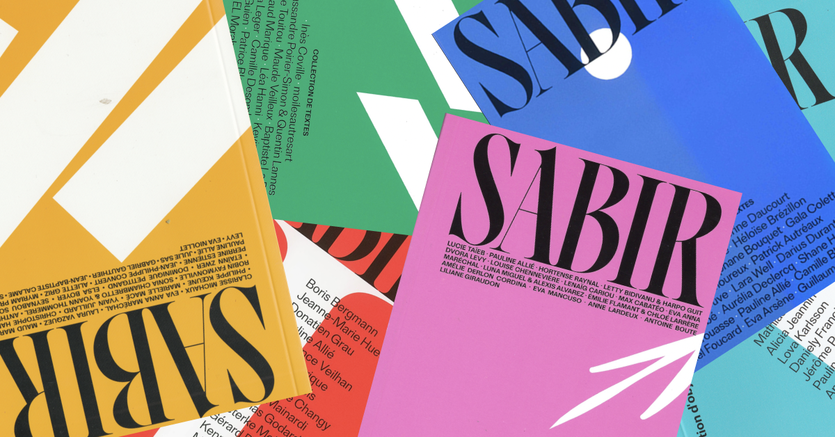
The following Monday I returned to the office, and on the shelves of the library we shared, a pink cover seemed familiar to me. It was Sabir again.

In the evening, I waited for everyone to leave before slipping away with the object.
Fusion of cultural horizons
Before opening it this time, I did some research. On its website, Sabir describes itself as a "collection of texts". Each edition invites authors to submit texts in whatever form they choose—poetry, theater, short stories, essays, experimental forms—based on a given theme: accent, but also love, self-censorship, the future… Sabir is "a territory radically devoted to the text where the only images are expressed in words", the editorial committee claims. The committee is made up of Maud Marque, artist and poet, Pauline Allié, author and screenwriter, Eva Anna Maréchal, author and editor, and Lucie Guien, actress.
So many cultural horizons that explain the diversity of formats offered in Sabir. The magazine also organizes
I'll learn about the team in this podcast from the Wallonia-Brussels Centre | Paris, they met in Brussels during a literary creation workshop at La Cambre National School of Visual Arts (ENSAV). "Following this year of exchanges where we had learned to discuss each other's texts, we wanted to continue the experience and looked for the best way to do it," they explain.
Well, that said, I still don't have information on the origin of the name Sabir. I continue my exploration and land on the collective's Instagram page. I go all the way back, the first post is from November 12, 2018. It's a definition.
1. A language formed of disparate elements, difficult to understand. Syn. informal gibberish.
— Trésor de la langue française
2. A vehicular language born from contact between speakers of different native languages who needed to communicate.
— Wikipédia
For a journal, and especially for this one, Sabir is truly a lovely name.
That literally means everything and nothing.
The name itself embodies the journal's reason for being: it is an invitation to experiment, to play with the boundaries of language, to explore disorienting forms while always remaining intelligible. The idea of necessary communication between people and varied cultural worlds resonates with particular force, and one imagines the journal as a truly diverse and inclusive meeting space.
Mousetrap
Come on, shall we open it?
The pink issue is about love, and it's with its opening pages that I fell in love. The editorial shows us something that usually remains private: a selection of messages exchanged in the cofounders' group chat.
They wonder: isn't love too obvious a subject? And besides, for now, they only have women writers. And not much that's critical.

All the while giving a glimpse into the intimacy of their private conversations.
The game
Well, I can sense that I'm going to have trouble commenting on the next pages of this issue. These are author texts, we're not going to dissect them; you either like them or you don't. So that you can still get a sense of what you might find there, I'm proposing a game to you.
Since there are as many ways to read a magazine as there are people on Earth, we're going to randomly select three issues and see what their corresponding pages look like.
The site https://www.tirage-au-sort.net/nombre-aleatoire is inviting me to visit the pages…
172

We've arrived at the final text in the journal. I won't reveal to you who wrote it or for whom—let's keep a little mystery. This page can nonetheless give you a sense of the very stripped-down, conversational editorial style found throughout Sabir. One text takes the form of an epistolary exchange, another reads like a table of contents. There are also short stories, with punctuation in all the right places, perfectly proper. I mention this because there are so many journals that love the sound of their own voice or chalk everything up to artistic performance, leaving readers to search for meaning even when there isn't any. Here, you sense that each text has been carefully selected, you understand why it appears here rather than there. The forms echo one another, as do the styles—it's coherent. The reason is that contemporary writing is the co-founders' specialty, and you feel it as you read through the journal.
85

We've talked about the texts, now it's time to pay attention to those who write them. Page 85 is a bio, that of Max Cabatéo. I'm delighted to come across him because he's from Metz like me and because I have a passion for Sunday. There we go. So before each text, Sabir introduces its authors — in their own image. Some come from poetry, others from journalism, film, theatre, publishing, teaching… The literary journal En attendant Nadeau will tell you better than I can: " These micro-biographies are fascinating. They deal with devices, collectives, informal groups, master's programs, performed graphic design, processes, digital media, video capsules… Techno-procrastino-insurrectional writing. Does printing on paper do justice to these ambitions? That's not certain. The sonic and visual dimension is missing, the space, the colours, the timbre of voices, the volume, the bodies. " On this last point, I actually think that paper leaves room for imagination, and it's great to see sometimes strange and unusual texts printed in black and white in a small book; to imagine the voices of their authors, to create the show in your head. The bios give an idea of each person's world, allow you to imagine a new universe as you go through the texts. This also echoes the cofounders' desire not to include photos in the pages of their journal.
109

If that's not proof that I'm not cheating… These pages aren't numbered, but since they're located between pages 107 and 110, I deduce that 109 is on the right. Since we're presumably going to talk about design, I went to ask Christelle Perrin, the art director at Médianes, to gather her impressions. For this page, she and I agree, it's a white line on a pink page. We find this spread after each text throughout the magazine, with the difference being that the line isn't quite at the same level: it descends a little more each time. On the cover of this Sabir about love, there's an arrow cut in two. I imagine the line we find throughout the pages forms the body of the arrow. In short, it's the love put into the texts that allows the arrow to move. Christelle picks up Sabir and notes that the offset of the line as you go through the pages gives the impression that the arrow moves when you flip through the magazine. She also notes that this insertion of pink between the texts on the white pages creates a rhythmic two-tone edge, and it's true that it's lovely.
In Sabir, there are only two inks: pink and black. The texts are printed black on white, but here and there, pink makes its appearance; on punctuation marks or to indicate character names before their lines in theatrical texts. It's simple and it allows readers to easily identify the different elements.
From constantly flipping through Sabir, I'm beginning to wear down the coated paper (that's what we call paper covered with a thin layer of plastic) on its cover. It doesn't sadden me. I love that a book lives and bears the marks of time.
Mystery
With all that, I realize I haven't even told you about the price. A Sabir costs fifteen euros. You can find them in a handful of bookstores in Paris — I found one at the Wallonie-Bruxelles bookstore — but also in Rennes, Marseille, Brussels, and Liège. You can also order them online, on their website.
I note that their first issue was able to be launched in 2019 thanks to a crowdfunding campaign. The team needed 2,800 euros to cover the printing costs of the first issue of Sabir, acquire a typeface suitable for reading on paper, and anticipate some of the printing costs of the second issue. Ultimately, the co-founders raised over 5,000 euros, allowing them to cover all the printing costs of the second issue.
Since then, Sabir no longer runs crowdfunding campaigns.
There's one thing that bothers me, and that's the mystery built around this magazine. There's no detailed presentation page on their site, no manifesto, no editorial charter, no recap of their history, no details about their events, "Sabir La Nuit", or their other potential activities. Do they work full-time on Sabir? Is the magazine breaking even? Where do their financial resources come from? Can we support them in ways other than buying an issue? How do they organize themselves concretely? These details that aren't details—you have to search them out yourself by reading articles written by others, and even then, the information is fragmentary.
Moreover, if the journal is in fact engaged — you can feel it in the themes it addresses, in its selection of texts, in the prominent platform given to queer and feminist voices — this engagement is not explicitly stated or claimed outright.
Some will say this mystery suits Sabir just fine, that you understand where the magazine is heading by reading its texts. Me, I think it's better when micro-publishing loudly proclaims its values and makes efforts toward transparency.
To go further
- The media that intrigued Maëlle, Marine and Pauline in recent months: It's Freezing in LA!, Les Autres Possibles and Surf Session.
- Love at first sight, breakups and compromises. Natalie Thiriez tells us the story of a symbiotic yet tumultuous relationship between Le 1 and its article.
- Weight, texture, ink, grain: a series of insights from experience to help you choose your paper.
- Printing means paper media. Which elements change from one paper type to another? What are the consequences? We present you with practical examples.