


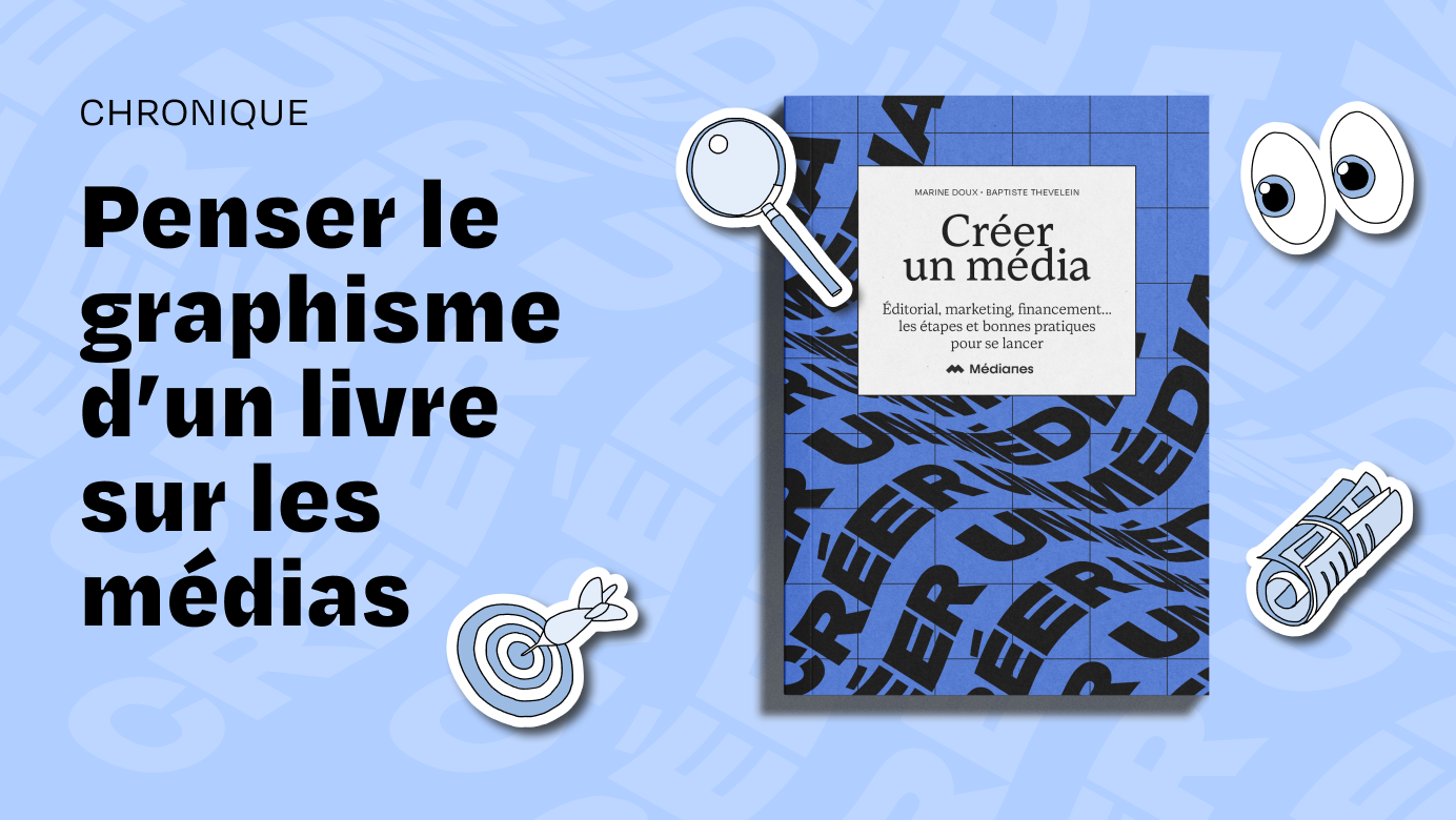
On April 2, Médianes released its first book, Creating a Media: a practical guide supplemented with interviews, designed to provide a wealth of information and experience from people who wish to create a media outlet in turn, so they don't have to start from scratch.
Colors, shapes, paper choice… I explain the origins of the visual identity and layout of the book Créer un média, and how they were designed.

How did we design the book's visual identity?
Once the idea of a book about media creation was launched within the team, we quickly had to think about its design. My goal was to make it a serious yet approachable work that could both provide answers and spark new thinking.
For consistency, I returned to Médianes' visual identity, with its blue palette and its usual typefaces. I then looked for what could be implemented so that, within this framework, the book would have its own identity. I was careful to ensure that the titles were sufficiently distinct from one another, and that the text was set in a typeface configured to be comfortably readable, even over long reading sessions.
To ensure that the overall look of the book, rendered entirely in blues and blacks, would not appear too cold, I chose a warm, ivory-colored paper with a soft, inviting touch whose texture is visible. The cover is made from the same paper, but thicker, which allows for a supple overall feel that pages through pleasantly.
Clear structure and visual landmarks
We had in mind that this book would be, precisely, more browsed through than read in a linear fashion. I then designed opening templates across full pages with colored backgrounds, so that they could be spotted quickly, and one could stop at the segments that interested them.

Because its aim is to be a practical guide rather than a theoretical work, I based the book's structure—sometimes materializing it—on a 5×5 mm grid, reminiscent of small-squared notebooks.
Special sections — such as the toolbox, glossary, and interviews — use different layouts to visually separate appendices from the main text and quoted speech from our own commentary. To complement this, I created a system of blocks and highlighting to identify annotations, examples, key takeaways, and cross-references to other sections.
Build a lightweight and playful set
To energize and identify the content of each section, Maëlle Ledu prepared an illustration for each theme covered: targets, revenue streams, value proposition, communication… These drawings, also available as a sticker sheet at the beginning of the book, help give the whole work a more playful and practical feel.

The pitfall to avoid? Making the result too cluttered, with a variety of styles that could undermine the original need for clarity. We made several adjustments as we wrote to ensure the book's consistency and harmony.
A cover that catches the eye
As for the cover… Well, our goal has always been, since Médianes' inception, to bring new voices to light, sustainably. I thus took up the characteristic grid of Médianes' visual identity, onto which the book title catches, unfurling like a banner. It can evoke the words that are heard, wafting and travelling. I ultimately selected an intense Pantone shade capable of catching the eye.
Adapt the visual identity for the online book
Finally, with Maëlle, we created numerous visuals to promote the book's publication on social media.


