When launching a project, creating a visual identity is a priority that usually includes finding typefaces. There's no one-size-fits-all recipe for choosing them, as each project has its own requirements, and it's very helpful to have support from a graphic designer. That said, here are a few concepts to help you get started. By the way, what is typography?
1. Adapt the typeface to the spirit of the project
Typefaces are designed by individuals in a long and meticulous process with clear objectives: to create a universal or conversely unusual typeface, one that is comforting or unsettling, friendly or aggressive, dynamic or calm… these impulses infuse the drawn characters, which together form a spirit, an atmosphere.
So it's important to understand your project's values and what context you want to place it in, to best adapt the font.
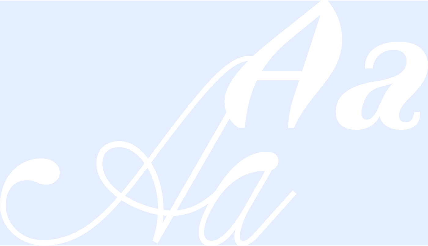
Broadly speaking, we can accept that serif typefaces would lean toward literature, tradition, quality, even luxury. Sans-serif typefaces would be more modern, more dynamic, more familiar and welcoming. Monospace typefaces would evoke typewriters. When rendered in bright colors (color also plays a role, we can return to that), these latter ones would suggest a high-performing digital environment, even a mysterious one. As for cursive and especially script typefaces, they would convey the authenticity of handwriting, a sense of proximity. All of this in the conditional mood, because you and I could find countless counter-examples — I'm serving you broad generalizations here. To go further, I've prepared an illustrated glossary of these technical terms.
Typography alone can hardly express everything, but its consistency with the project is an excellent starting point. You can also create balance by choosing a second typeface — two are often used, sometimes even three, for different purposes (headings, body text, supplementary content). Let's also keep in mind that text doesn't exist in isolation: art direction encompasses colors, shapes, photographs, illustrations, and layout that will frame them, and which together will form the project's visual identity.
Examples
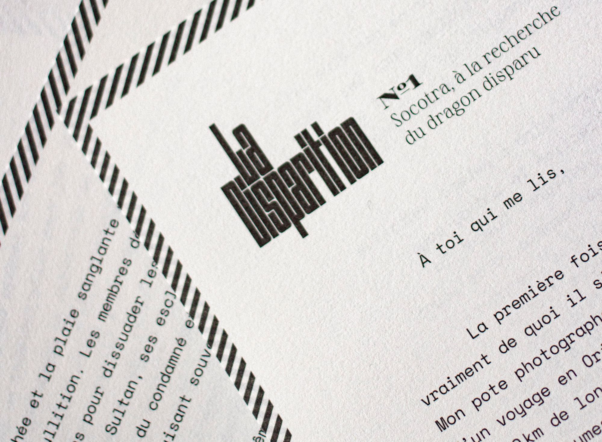
For La Disparition, a news publication using letters to chronicle with a committed perspective the disappearances occurring worldwide, we were looking for typefaces that echoed the spirit of typewriter fonts while being more contemporary and more assertive. I chose three typefaces: Space Mono, a monospace font for body text, Sprat for headlines—an angular serif with an aggressive, sharp-edged character. The logo itself is built with Outward, a highly architectural typeface that can form a solid block and create a stamp-like effect.
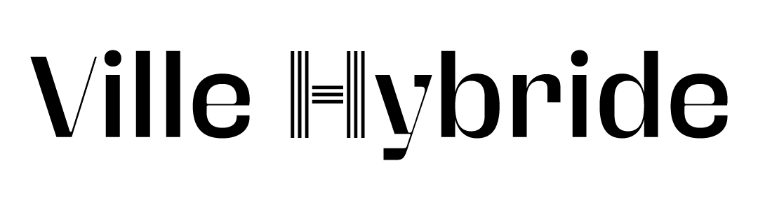
With Ville Hybride, a media outlet showcasing cities reinventing themselves, I chose a pair of sans serif typefaces. The primary one is somewhat industrial and vulnerable due to the fineness of certain strokes. It's complemented by an architectural H that evokes the blend of influences.
Break free and create new codes
It's possible to go against the grain by choosing a typeface that defies the codes and conventions of your field to stand out. For example, while monospace fonts (inherited from the typewriter) are generally associated with tech and programming, we've recently seen tech professionals use typefaces historically rooted in the literary domain.
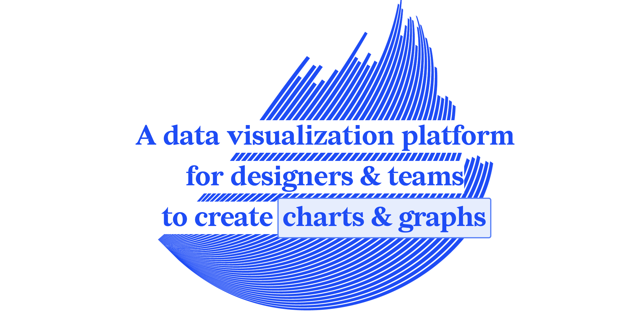
It's in this spirit that I advocated for using a serif typeface, Redaction, for the new visual direction of Datylon, a chart creation tool.
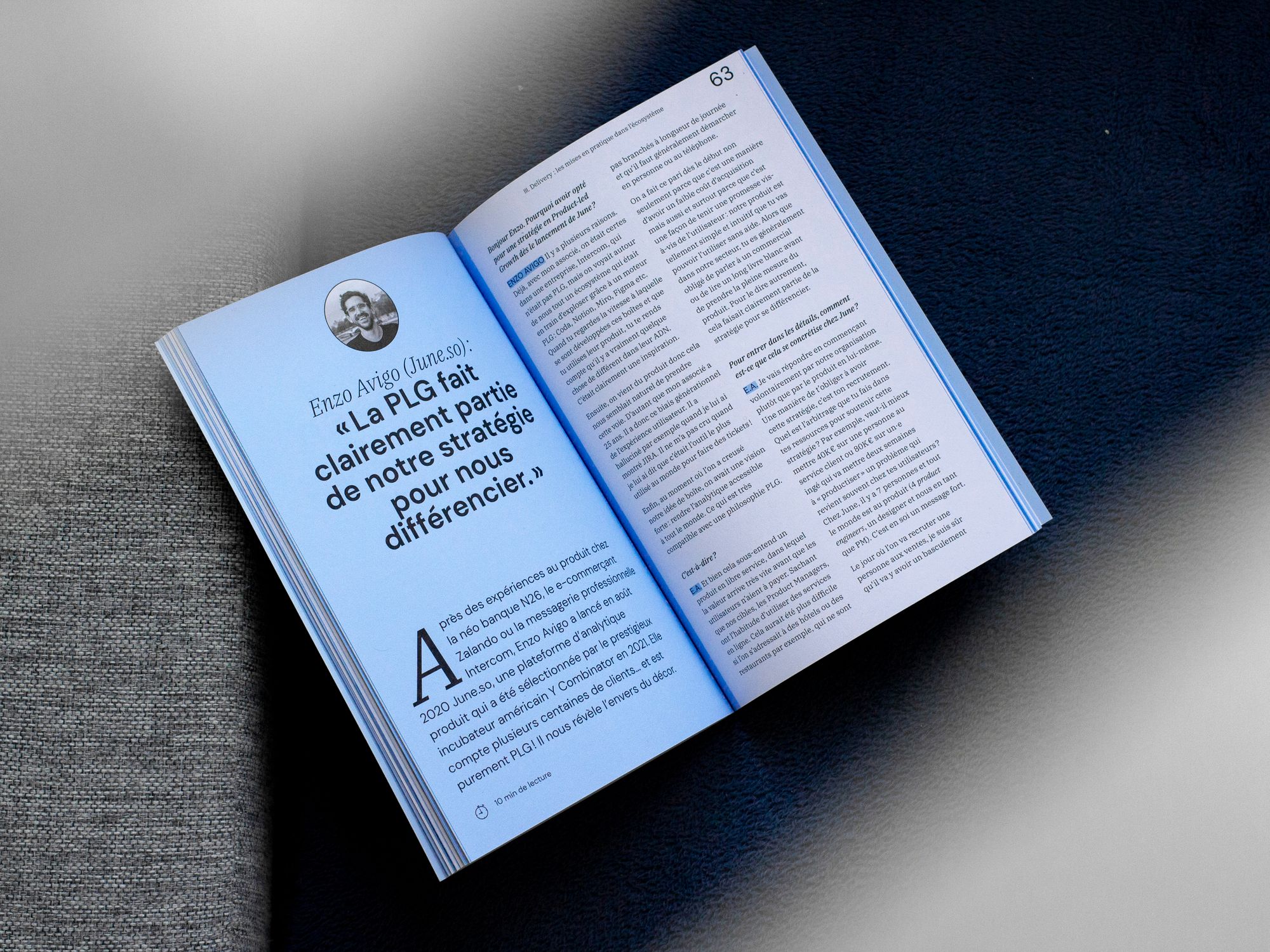
The challenge of the Ticket book, devoted to a specialized marketing field, was to create a welcoming identity that invites reading, with a seriousness suggesting deep and well-argued content. I proposed a blend of a geometric sans-serif with DM Sans, and a structured serif typeface with IBM Plex Serif. We wanted to move away from the highly tech-focused imagery typically associated with this type of publication.
2. Adapt the font to the usage
Readability
Readability will certainly depend on the choice of font, but also on other elements — line spacing, alignment, contrast, etc.
With the evolution of screen definitions, it's no longer as true that serif fonts are less readable on screen. You can run print tests for texts intended to be read on paper, and run tests on different types of screens (size and resolution) for content meant to be read on screen: the same typeface won't render in exactly the same way on screen and on paper.
Title font, paragraph font
Some fonts are wonderful at large sizes for short text (those famous Display fonts you sometimes encounter), but far less effective for long paragraphs at small sizes — conversely, fonts that are pleasant and readable for text paragraphs can turn out to be dull at best when used large on headings (you sometimes see variants labelled Text for that purpose). Generally speaking, fonts for long text at small sizes are less contrasted and less distinctive than their headline cousins, which can afford to be more flamboyant.
3. Adapt the font to material needs
License, cost, completeness
Before committing to one or more typefaces, it is essential to ensure they will meet your needs in the long term, whether paid or free. In particular: does it have all the necessary font weights? Does it include italic characters? Does it have certain special characters or useful alphabets? Is it compatible with the tool you're working with?
If the font is paid: what is its cost? The license is usually paid only once, and will depend on the number of computers on which it needs to be installed, the page views on a website, etc. It's best to carefully read the details indicated on the foundries' websites — which moreover often express their prices excluding tax — to avoid any surprises.
Newsletter features
Email is an old tool that has barely evolved technically since its launch, and each email client (Gmail, Spark, Yahoo, Apple Mail, Outlook…) has its own rules when it comes to loading special fonts. A special font may display for one person but not another. So, generally speaking, to ensure nothing shifts across all email services, whether on MacOS, Linux, or Windows, on mobile or desktop, it's best to stick with system fonts, which are broadly the following: Arial, Times New Roman, Georgia, Courier New, Verdana, Tahoma, Trebuchet MS, Impact.
4. Where to find fonts?
Let's skip generic sites like DaFont that, while they have a few good references, mostly offer incomplete and poorly-crafted fonts. The most well-known and convenient aggregators are:
- Google Fonts: free and open source. Fonts that are often very common and not particularly distinctive.
- Adobe fonts: included in paid Adobe subscriptions. Rarer typefaces, some gems, and plenty of rather chaotic selections.
There are independent foundries and aggregators of free or open-source fonts. Some fonts can be found in different collections. Free and open-source fonts are generally offered by typographers or foundries, or commissioned and made free by cultural organizations. Be aware that weight and italic options are often limited.
- Collletttivo: free fonts.
- Design-research.be/by-womxn/: a collection of typefaces designed exclusively by women.
- Use and modify: fonts that can all be freely modified.
- Velvetyne: a French type foundry that offers fonts with a distinct character.
- Genderfluid Type Library: A collection of inclusive typefaces (= featuring ligatures—merged characters—that allow masculine and feminine forms to be combined without using a mid-dot).
- Noir Blanc Rouge: This type foundry offers a selection of fonts available for free.
- Hanken: Here, too, some of the work is free.
- French Typography: Individual fonts and a directory of the French typographic scene. See especially “Open Access Resources,” which lists many open-access fonts at the bottom of the page. (Note: Sometimes the hyperlinks don’t work, but the resources are always accessible via a small search engine.)
- Future fonts: fonts currently in development or recently completed, usually at a low or no cost.
- Take Lucas Descroix or Florian Karsten, for example: you can look up the work of a specific typographer.
- It might also be worth checking out typography schools, such as Écal in Switzerland or the National Typographic Research Center in Nancy, France.
Here are a few of my favorite paid type foundries: ohnotype | vj-type | blazetype | goodtypefoundry | thedesignersfoundry | tightype | colophon-foundry | sharptype | 205.tf | intervaltype | black-foundry
Note: Trial versions of paid fonts are often available to ensure that the font works well in your project. However, these are limited versions that generally do not include accents or special characters. The use of trial fonts is limited strictly to testing purposes, and any visuals created with them must not be published without purchasing the license.
Note: Some of these typefaces can be found on Google Fonts or Adobe Fonts.
It is also possible to commission custom lettering or typography work from typographers. I encourage you to reach out to them to learn more.
Learn More
Help! I don’t understand the technical terms of typography
. Examples related to readability, accessibility, hierarchy, and
structure. Médianes Practical Guide: “Defining Your Value Proposition.” More case studies in
my portfolio. Médianes Column
: Why So Much Bold?Médianes
Column: Paying Attention to Illustrations That Accompany Your Images