When we created Médianes exactly five years ago, we didn't yet have a website, readers, clients, or an office. But we already had a clear idea of what we wanted to defend and help strengthen: media, journalistic independence, and above all, a more just, inclusive and sustainable society.
We wanted to support those shaping today's and tomorrow's media. To be able to speak to all professions: journalists, designers, developers, marketing managers, executives. To create a space where exchanges would be demanding but kind, without unnecessary jargon. We wanted to be easily approachable. All of this through a media outlet, a studio and a network, to help bring new voices to the fore, sustainably.
Five years later, the team has grown considerably—we've supported over 150 newsrooms, published in numerous media outlets, and expanded our network across Europe—you'll find more information on our about page—but there's one question we've never answered, and perhaps no one has ever asked us: where does the Médianes logo come from?
I found a few words I had noted in my notebook: serious and accessible, open, encounter, support, collective, gentle. It was from these concepts that I began to think about the logo.


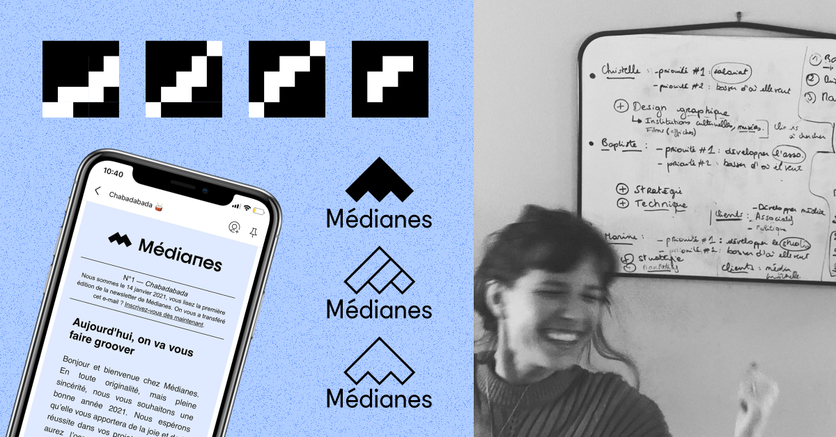
We explored many directions, looking into movement, flight, the agora, the gaze, connection, balance. Clearly, we needed something very legible, with a fairly simple and well-constructed symbol. Something that evokes movement, progression. At first, I drew three bars of increasing size, like a histogram. A very basic shape that already said: it's going up.
Then those bars became a staircase. There was something very concrete in that idea: you don't skip steps, you move one step at a time. There was something of Tetris in it — those simple shapes that fit together, that find their place with each other.

By rotating this shape 90 degrees, the staircase became a roof, a shelter, almost a house, and then it also evoked an arrow pointing upward. There was also, in what became a stylized M, a notion of a mountain we would be able to climb together — to traverse the highs and lows together, and that, clearly, we have done.
For the Médianes wordmark, we chose a geometric, almost architectural typeface, with this very squared-off
Very quickly, light blue established itself as the primary color: calm, reflective, understated, it was compatible with our desire to be a vehicle for showcasing other ideas, initiatives, and media.
Five years later, that logo is still here. I've sometimes felt like evolving it, but I'm glad it's there to remind us that we are too.
To go further
- Want to read behind the scenes of other graphic productions? Discover the design genesis of the book Créer un média
- You can also read our mini-manifesto for media-responsive design
- Media, studio, network: wondering what we actually do? Check out our About page!
- Need support with your artistic direction? Discover our expertise in this area