Whether you're occasionally printing posters or cards to support events, or your media revolves around a paper format (magazine, newsletter, book…), you're always eventually faced with the thorny question of paper. Thick or thin? Textured or smooth? Bright white or warm ivory? We help you make sense of it all.
Paper Variables
Paper is the only tangible element that will truly be in contact with your readers: it's not something to overlook.
As always, we'll start by considering the target audiences for this printed material and what feeling you want to convey to them. What do you want to communicate?
Weight and thickness
A light, flexible paper with low weight. Generally more transparent, these papers have something inherently fragile about them. They are very airy. Depending on quality, the result can be precious or brutally cheap, poorly made paper. Common office printer paper, at 80g/m², belongs to this family.
Heavy, rigid paper with a high weight, suitable for covers, envelopes, posters — anything that needs a bit more structure.
In between, there are more commonly used papers in publishing, papers around 100, 110, or 120 g/m² that have good body while remaining flexible enough for pages to turn smoothly.
Another parameter, related to basis weight, comes into play: the thickness of the sheet. At equal basis weight (= weight), papers can be more or less thick in printing; this is referred to as "bulk". By choosing a paper that is more or less thick (or "bulky"), you can adjust the thickness of the finished book.
The texture
A grainy, textured paper might evoke drawing paper, or possess a rougher, less refined quality, suitable for certain projects.
Other papers (wove, laid, etc.) have patterns and visible lines that come from the papermaking process.
On the other end of the spectrum, very soft papers exist that feel as caressing as silk voile. They are more comforting and user-friendly.
The shade
Not all papers have the same shade (or the same brightness, if we're being completely honest), ranging from pure white to ivories or even cream. While pure white can have a reassuring, factual, dare I say surgical appearance, beige papers seem warmer, even aged.
Opacity
Papers, particularly thinner ones, can be more or less opaque. Transparency can be useful for indicating what comes next (is it text or an image?) and greater opacity allows you to focus, conversely, on the content alone of the open page.
The sunsets
Papers can be coated — in other words, covered with a very thin plastic layer — which makes them either glossy or matte, almost truly smooth, and which prevents inks from soaking into the paper: they dry on the surface. As a result, colors are more intense than on uncoated papers (also called offset paper), which absorb more ink. In my opinion, coated papers produce a less natural result.
Use cases
La Disparition
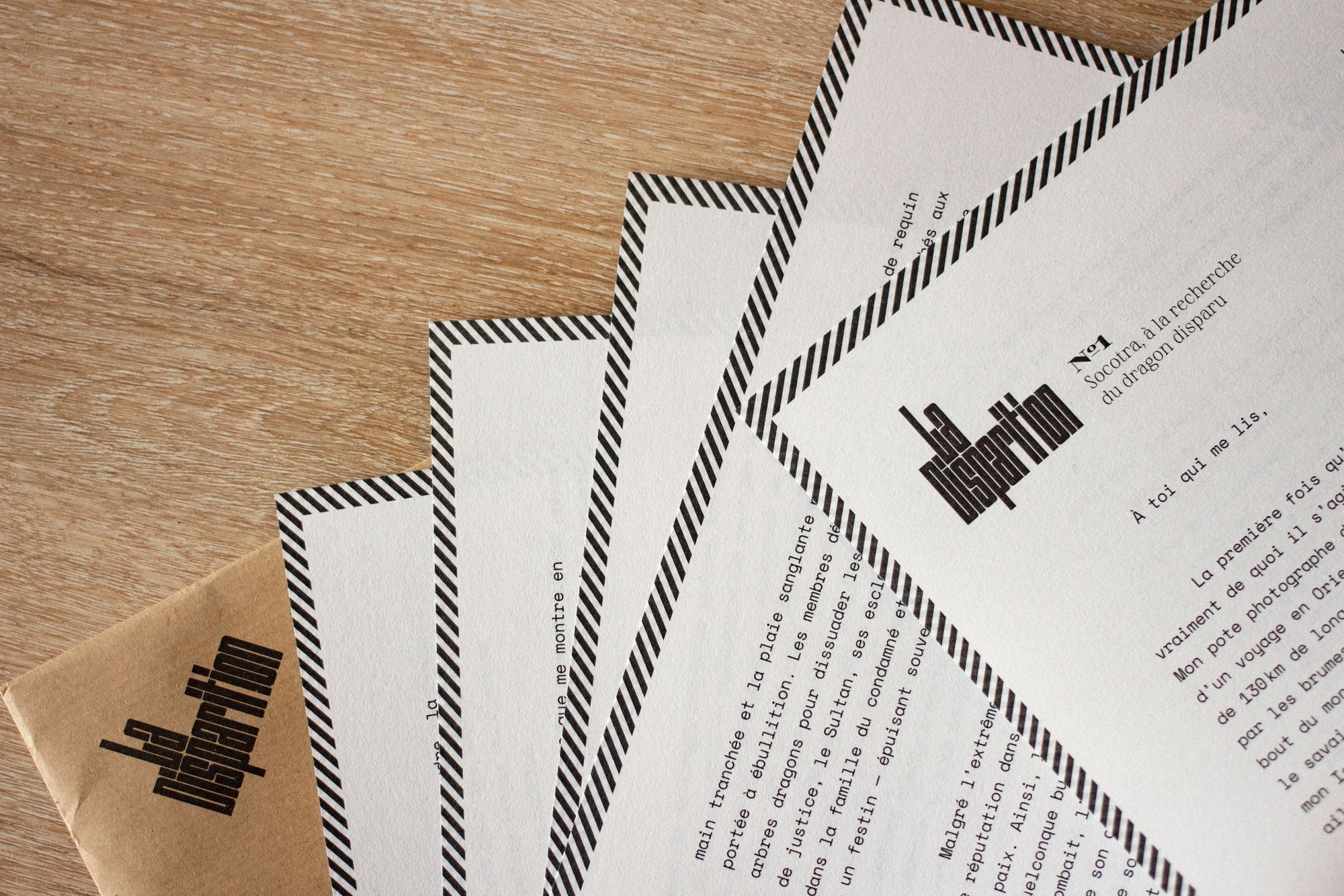
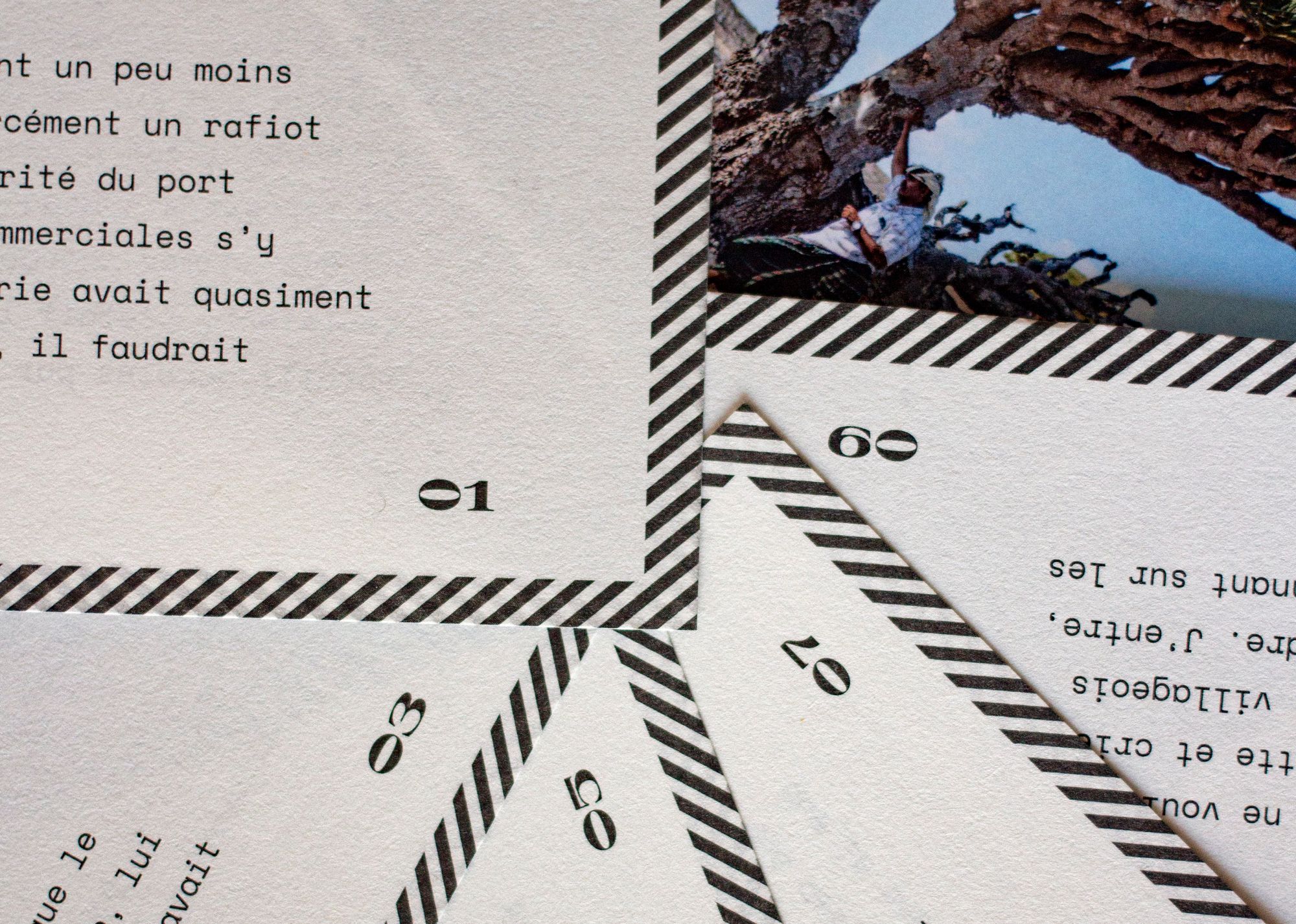
The postal letters from La Disparition report on the latest news from the disappearance front. I wanted to convey this martial tone through uncoated, textured paper—evoking the feel of sandpaper, a paper that grips, that resists—in a slightly ivory shade as if it had already traveled far and wide, complemented by diagonal hatching reminiscent of airmail envelopes.
Pays
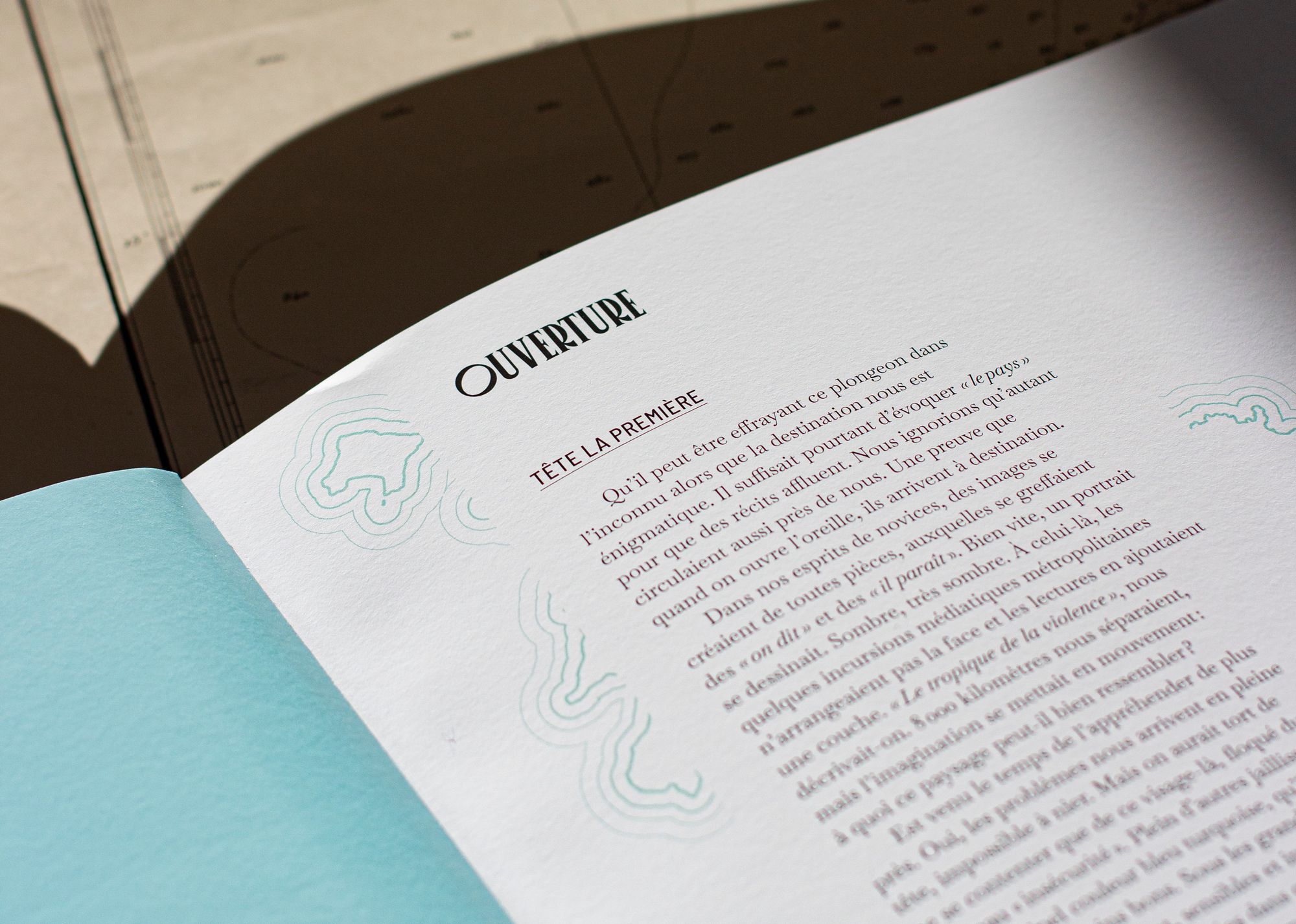
To maintain natural photographic rendering, in the Pays publication containing almost as many photos as text, we chose an uncoated paper, smooth yet thick (120g/m²), of high quality, from Arctic Paper. To avoid altering the colors of the photos too much, we selected a very white paper.
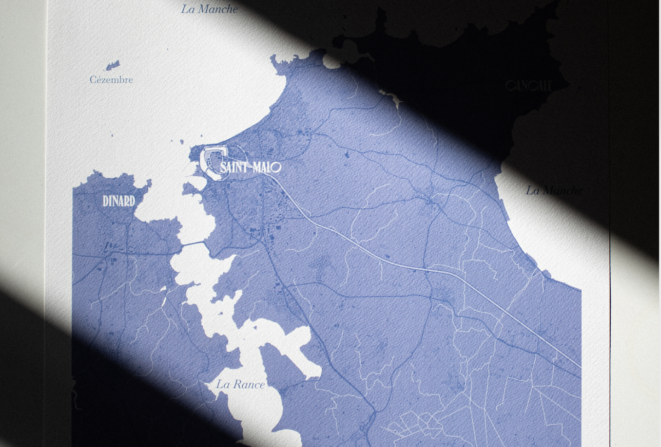
For posters, we use Italian paper from Fedrigoni: it's thick, white, with a pronounced texture reminiscent of watercolor paper. We wanted art paper to emphasize the artistic dimension of the cartographies and move away from their informational aspect.
Roadbook
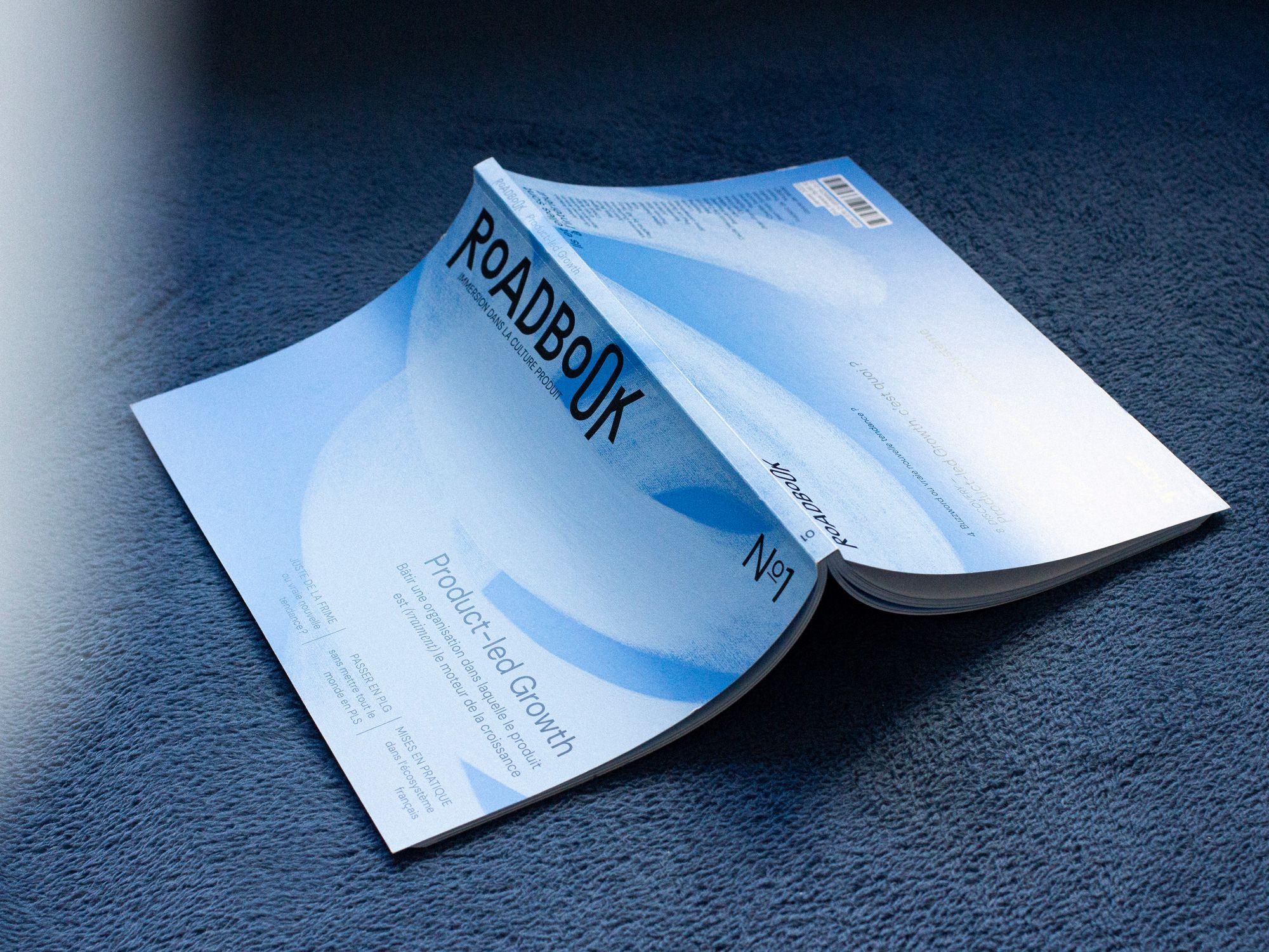
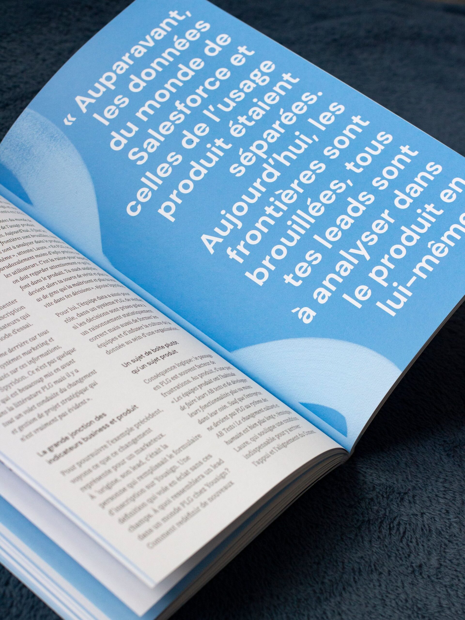
For the first issue of Ticket, we chose a coated paper cover, the coating gives it a truly finished, professional appearance that catches the light in a particular way. The interior pages, by contrast, are in uncoated bulky paper to add more volume — uncoated because it absorbs inks heavily on flat areas.
What next?
Of course, the best papers come at a price that reflects their quality, and this will be a factor to consider. Contact your printer early enough to discuss all of this with them, to see what they can offer you, at what price, and with what timeframe. I cannot encourage you strongly enough to get quotes from several printers: depending on the relationships they maintain with their suppliers, their organization, rates can vary greatly — including on the raw material that is paper.
Next, other factors may come into play, consistent with your project; take a look at recycled papers, unbleached, papers made in France or from wood sourced from the European Union…
Finally, you can contact paper manufacturers and resellers (Arctic Paper, Antalis, for example) and request samples from them. Then, as a second step, you can request a blank dummy, which reproduces the correct number of pages with the right papers, in the right format, to allow you to see perfectly what the finished object would look like — though with completely blank pages.