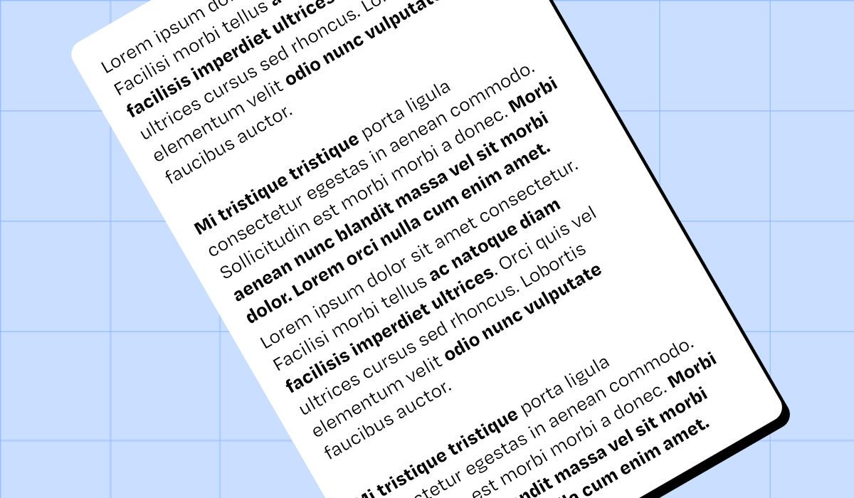
When writing a long piece of text, it can be tempting to bold certain words to make them stand out. You might be inclined to do the work for readers, anticipating their attention will be brief. However, introducing bold text into a paragraph raises several concerns.
Issues with bold text
- Bold is often used as a crutch to fix text that's too long or unclear. It's better to simplify the syntax to reduce the need for this two-tier treatment.
- By highlighting certain parts of the text, we mechanically dim the other passages, which then seem superfluous. Yet what matters to the person writing the text is not necessarily what will matter to the person reading it.
- The sequence of bold and non-bold words can create a rhythmic break that hinders fluidity (and comfort) when reading attentively. The eyes are encouraged to jump from one bold passage to another, rather than reading complete sentences.
- The tags, used in HTML to create bold text, guide search engines in determining the essential content of the page — which doesn't necessarily correspond to the bolded passages.
- Bold (or underlined) text usually indicates clickable or interactive content on the web. This creates a risk of frustration.
So, when should you use bold text?
In fact, it's rarely necessary to use bold the way you would highlight study cards. And content length doesn't matter; besides, there's no bold in books or newspaper columns.
On the other hand, the need to guide readers and hold their attention is real. That's the role of subheadings, which appear at the start of each paragraph to introduce its essence. These subheadings serve as anchors for navigating the text. They are what we emphasize by using bold or larger type—giving them a distinct status from the rest of the text.
Bold can also be used to mark a different text style: an introductory summary or a pullquote, for example.
In short
When using bold text heavily, it's best to keep your writing concise and well-structured: one main idea per paragraph with a subheading to introduce it. Bold should be reserved for highlighting this structure: the introductory summary, headings, subheadings, and any pull quotes. This way, at Médianes, we ensure we clarify information hierarchy and put graphic design at the service of our users.
Resource for further information
Lexicon of Typographic Rules, published by Actes Sud, €17.