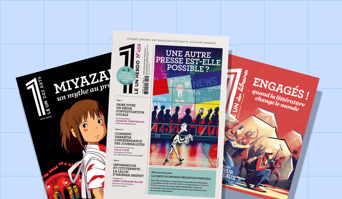
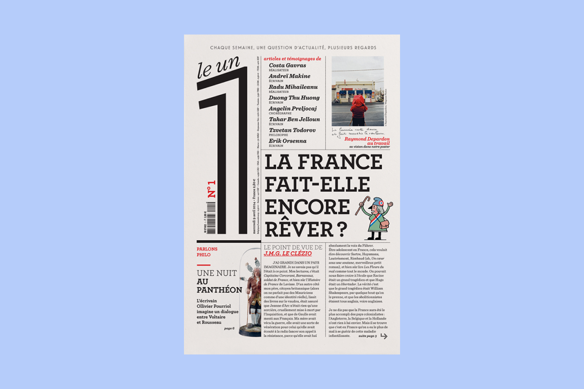
Natalie Thiriez is Art Director for the weekly Le 1, which she co-founded in 2014 with Éric Fottorino, Henry Hermand and Laurent Greilsamer. Aiming to offer a genuine "press object", Le 1 takes the form of a large sheet of paper folded in four on which writers, artists, researchers and journalists break down one major topic each week. An original format that calls for covering and consuming current events differently.
Hello Le 1! Show your papers.
To find our format, we worked with a studio called Be-pôles at the time, which is now called Saint-Lazare. Antoine Ricardou, one of its directors, wanted to make us
Éric [Fottorino] then suggested adding an extra fold so that the first unfolding would be something more intimate. Once we'd found our format, we needed to find paper that would feel good in hand. We wanted a weight that would hold everything together but wouldn't be too heavy. It had to fold properly without the crease looking too ugly.
The texture and color of the paper were also important. We looked for several papers. Cyclus was the first one we used. We liked everything about it. Plus, it was made from recycled paper and the prices were right.
Have you been using the same paper since then?
We had to change it, even multiple times. At one point, there was a major paper crisis in a context where it was already difficult to get any. Prices had already skyrocketed. And then at some point, this paper we loved so much simply disappeared because the company that made it [Arjowiggins, editor's note] ceased operations. Curiously, many recyclable papers disappeared during this crisis. So we lost our beautiful paper that people often asked us the name of. Besides, it was a paper that aged rather well. When you look at the first copies of the 1, they don't deteriorate and the paper doesn't yellow.
Was this durability one of your criteria?
For us, it was very important. Unless exposed to direct sunlight without protection, this paper doesn't fade. In the office, we keep the first issues of the 1 in cardboard boxes. When we take them out, we can see they have retained their original colors.
We really want a quality product. You also have to look at how images and photos will be reproduced. We process our images and colors based on the characteristics of our papers. For example, we once had a paper that was quite nice, but it was a bit whiter, even a little too white for my taste (laughs), and we had to adjust it. It was actually quite difficult when our beautiful paper was discontinued.
Besides durability, were you looking for any other essential features?
For me, the paper experience must be quite sensual. Paper should have texture. I don't like smooth papers. Besides, for our other titles [Légende and Zadig, Editor's note], our papers aren't smooth. They have a bit of texture. We test a whole range of criteria with Anne-Sophie Legrand, who handles production for us. She goes to the papermakers to bring back several proposals for us. In a way, it's a bit like wine tasting. It can be quite subjective in the end, but for me, paper shouldn't be soft. It must have a little energetic quality. It may seem strange to put it that way, but that's what I feel when I choose a paper. Obviously, it depends on what we want to produce. Sometimes there are fine papers that work very well for certain types of media.
Did you easily find a printer who could meet your expectations and deliver the result you were looking for?
Admittedly, this format did limit our choices somewhat. But in the end, we found what we needed fairly quickly at Jean-Paul Maury (Maury Imprimeur). When Le 1 is printed, it comes out of the machine already folded. Even if we produce a
In addition to the 1 « classic », we also produce Le 1 XL and other limited editions. For those, we don't use the paper we currently use, Lettura, simply because it doesn't exist in that format. For the XL versions, we use Amber Graphic instead, which is the same paper we use for Légende and Zadig. We also use this paper for the XS versions, particularly Le 1 for booksellers, which is smaller. With these formats, we have to fold one more time, which forces us to go from 90 grams to 80 grams.
For the XL format, like with the Miyazaki issue, we offer a large poster at the end. We print these large formats using offset [a printing process similar to lithography, editor's note], not on web presses, like The 1. So we need papers that are available for both rotary and offset printing as well as in the different sizes we need.
So illustration was an essential subject in the design of the 1 ?
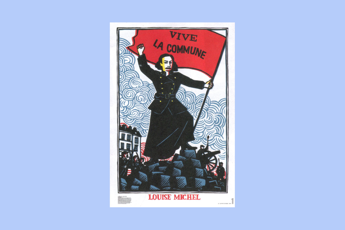
We've put a lot of work into this. That is to say, what we work on, for example, with photogravure specialists, which is actually quite uncommon in the press because it comes with a cost. Each time, we try to optimize the rendering in print. It's fine, detailed work that requires experience. For "offset" paper, for example, it's a paper that "absorbs". We boost the colors to recover the original ones.
In 2014, the issue was sold for €2.80. Prices gradually reached €3.50. What caused this increase?
There's the paper, the rising cost of living as well, and more broadly, the increase in expenses. Because of this spike in paper prices, the state was supposed to help the press. But we had to get ahead of it because the money still hasn't been paid. The only solution we had was to raise our prices. If we hadn't done it, we would have gone under. It's completely absurd.
[By email, Nathalie Thiriez clarified to us that at the start of the newspaper, a ton of paper cost them 600 euros, versus 1,300 euros today, Editor's note].
Does the format of the 1 influence how you handle your subjects?
We use three formats with Le 1. A first format in A4, rather intimate. You find writer's text, poetry, and the editorial there. You open the newspaper and then find the second format, rather "news"-oriented. There's the major interview, reference points, and generally another piece like a "Zoom", a "Let's Talk Philosophy" or something else. You unfold it again and you have the third format, the poster one, which becomes the "surprise". It can be several articles or large infographics. This format gives us plenty of possibilities. It's also a space of freedom for us who make it, knowing that the rest is still fairly regular. The public needs relatively fixed reference points in a newspaper, but they also like being surprised. We think it's important to keep surprising them.
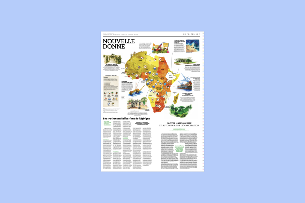
When you're on your phone or computer, you get alerts coming from all directions. When you're reading a magazine, any magazine, you're less distracted by what's happening around you. With paper reading, we retain information better than with digital reading. In fact, we sometimes do this experiment: we lay out a large sheet of paper and place a phone on top of it. Right away, at a glance, you see the space of freedom you can't have on a phone. Even though there are other kinds of freedoms you can have with digital media, we like the idea of "opening up" ideas. With this unfolding, you get back that sense of openness.
Aren't you losing that concept of
Digital subscriptions remain marginal for us [Subscriptions to 1's all-digital offering represent less than 10% of their subscribers, editor's note]. People are really attached to the paper experience of 1. In some cases, for people living abroad for example, it can indeed be easier to use the app. When the events in Israel happened, it fell on a Saturday and we had finished our issue on Friday. We ended up with a story about Disney that wasn't our best seller at the newsstand because it was out of sync with current events. But thanks to digital, we were able to ask Sylvain Cypel [journalist, regular contributor to Le 1], who knows Israel extremely well, to write us a daily letter. Digital gives us flexibility.
Originally, when we built our application, we wanted to update it daily. As it turned out, that's not what readers expect. The 1 is a sheet, a topic, an hour of reading.
To go further
- To discover the latest issue of 1, « Work: what for? » click here.
- Apolline Labrosse reveals all the secrets behind the original covers of the feminist magazine Censored.
- When it comes to printing, paper is essential. What elements change from one paper type to another? What are the implications? We present practical examples.