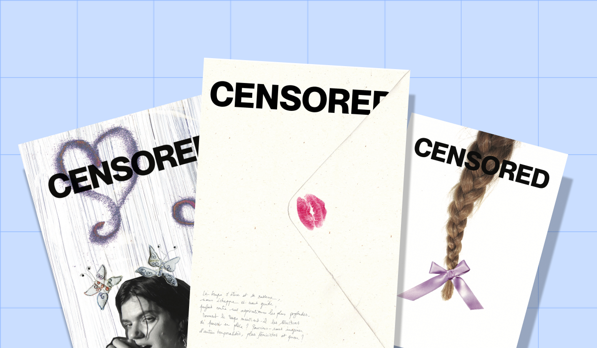
Apolline Labrosse is Art Director of the feminist magazine Censored, co-founded in 2018 with her sister Clémentine Labrosse. The magazine documents art, culture and contemporary struggles through a feminist and queer lens. It stands out for its original and sensory covers, which always serve the themes explored within each issue.
Hello Censored! Present your documents.
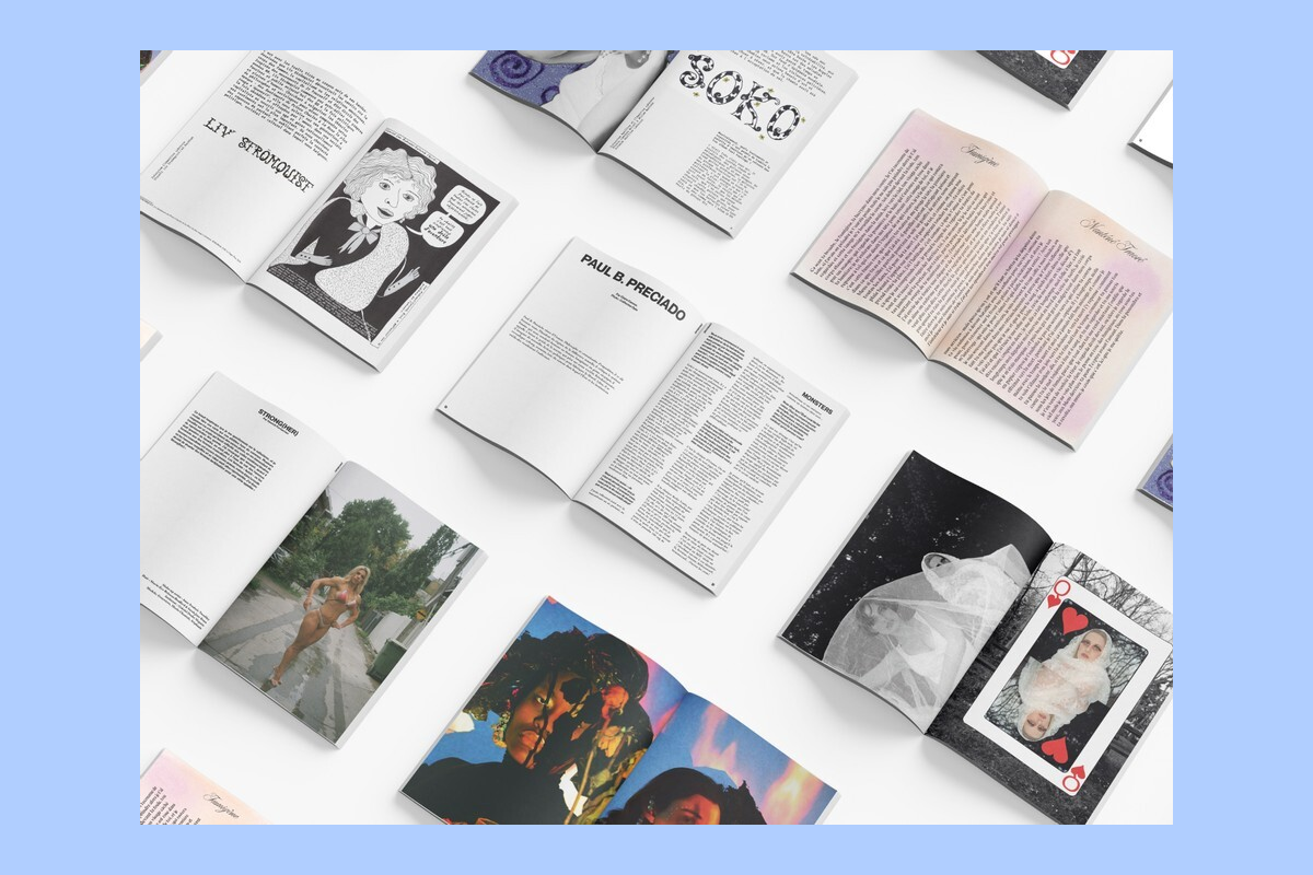
We've had two different papers from the start. We alternate between a textured paper and a glossy paper. These are sixteen-page booklets, which allows us to switch back and forth. The glossy paper enhances the colors in fashion photography while the matte paper brings out the landscape photos.
What references do you use?
We source mainly from Fedrigoni, an Italian paper company. Recently, one of their sales reps gave me a ton of samples and I went crazy—everything was too beautiful. For the magazine's interior, we watch the budget and lean toward economy. We alternate between Munken paper and Arena. The latter comes in several finishes: "rough," which is a textured paper, and "bulk," which is more voluminous. It's really a matter of calculations: depending on our mailing requirements, certain papers work better because they're lighter in weight.
What should the sensory experience be?
Softness. When it comes to touch, it's really quite basic paper or else paper with texture, but it will feel like the experience of a book. And it still has some body to it. Our papers are thick enough so that there's no show-through from one page to the next.
The latest issue of Censored focuses on time. What were your thoughts in choosing the right paper?
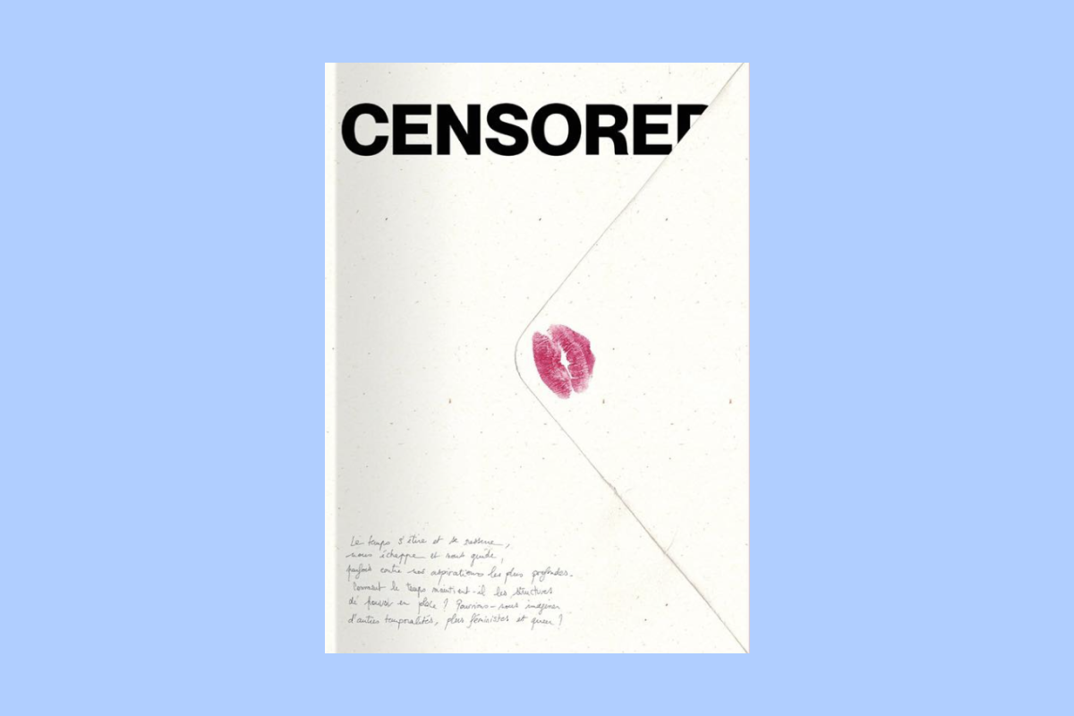
The cover is a back cover flap that folds over the front. Initially, we wanted to make it entirely epistolary and turn it into an exquisite corpse, but that would have required planning a year in advance. In the end, we have around a dozen letters in total. I presented them as such: on the left page, I scanned lots of envelopes I found and reworked them. And on the right page, colored paper. We used slightly more matte paper than usual inside because we wanted it to look like letter paper. We hesitated a lot between many different papers. At first, I wanted something colorful, like blotting paper. But that was super expensive. Plus, I wanted to make it look like we'd glued fake stamps on the back of the magazine. If I printed on directly colored paper, my stamps would have shown up pink. So at the last minute, we switched to Woodstock paper, which is part of Fedrigoni's range. It's quite expensive paper but very beautiful, made from recycled paper with a hemp base. You can really see the residue. Then, since we wanted to keep the idea of aged, slightly yellowed paper, we still tinted the inside with this blotting pink.
One of the previous issues of Censored titled "Responses to Violence" takes the form of an administrative report. How did you go about it?
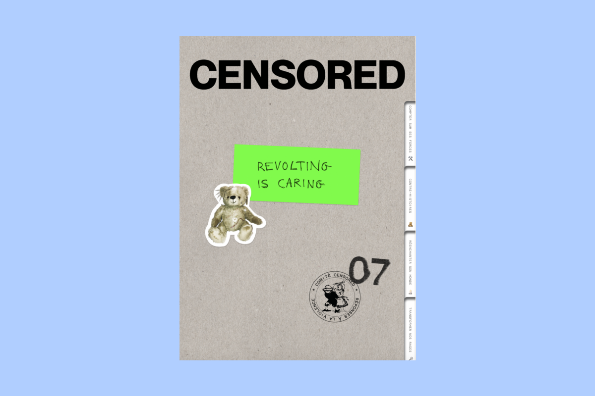
For "Responses to Violence," I initially wanted Bristol board, but again it was too expensive. So we went with basic gray cardboard. This paper is very economical—recycled paper fibers glued together. It costs practically nothing to produce. The result has a bit of a 1970s folder feel to it. It was the sales rep at our printing company who told us, "You know we have a notching machine? It's equipment that lets you assemble administrative folders." We decided to use it, and it cost us around 400 euros. Maximum impact for much less money than we'd expected. What's great is that our printer has gotten used to our concepts. Now she helps us and works through ideas with us.
Why create such complicated covers?
Our special issues are indulgences we grant ourselves each time. But since we started, we can't really do without them anymore. Our papers serve the concepts we develop in each issue. We want the idea developed inside to be felt right from the cover. Since issue 5, "Transmission", we've been reflecting on archives. That's when we rethought the project more seriously. We think a lot about the moment when people will be drawn to the magazine in a bookstore. I'm interested in a book or magazine because the cover attracts me. If I see an iridescent paper, I'll go straight to touch it.
Your artistic direction seems increasingly minimal. Is that part of your thinking?
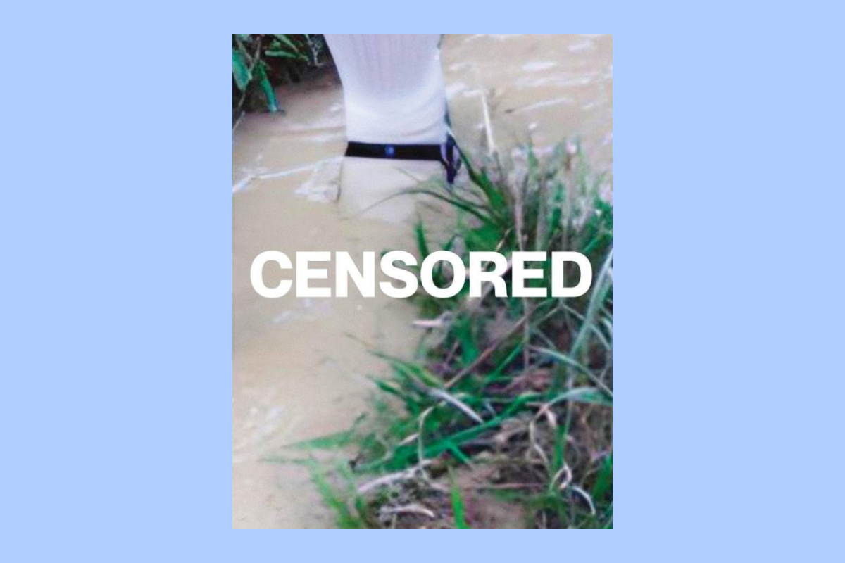
I find that bookshop shelves always feel a bit crowded. At first, we used large full-page photos or neon colors. Now, we're not always minimalist, but we try to offer something cleaner. We don't always stick to it though. The issue 8 on ecology has a big photo. With our visuals, we try not to be too shocking either, contrary to what the name Censored might suggest. Some people sometimes expect really edgy stuff, but actually we don't go there.
Do these special numbers work as well for preorders?
It's especially in bookstores. During pre-orders, people don't necessarily notice the papers we've used, the cutting, whether it's real or just an effect. In a bookstore, it makes an impression on people. And above all, they take care of it. They tend to display it a bit in their homes. I have the feeling it lasts longer. Now, we make sure that having something that twists on the cover each time is part of our identity.
Have you ever had last-minute surprises?
Exactly, with issue 8! We had to change the cover thirty minutes before sending it to print. That big photo wasn't planned at all. I was working with an illustrator and I had planned black glitter paper. At the last moment, I received the quote for that paper and was asked to front 10,000 euros for it. Of course, I don't have 10,000 euros in cash flow! So I said no, I'm changing the paper. What do you have in stock? My printer offered me a Munken, something really basic. Because the price of paper had skyrocketed, that's all I could afford. Later, when I explained these changes to the illustrator, she no longer wanted to use her illustration. It's not a big deal, but we had to adapt. Budget constraints are constantly present.
To go further
- To get the latest issue of Censored, « IT'S ABOUT TIME! », click here.
- Love at first sight, breakups and compromises. Natalie Thiriez tells us the story of a close but tumultuous relationship between the weekly Le 1 and its featured article.
- When it comes to printing, paper is essential. What elements change from one paper type to another? What are the implications? We present practical examples.