

The context
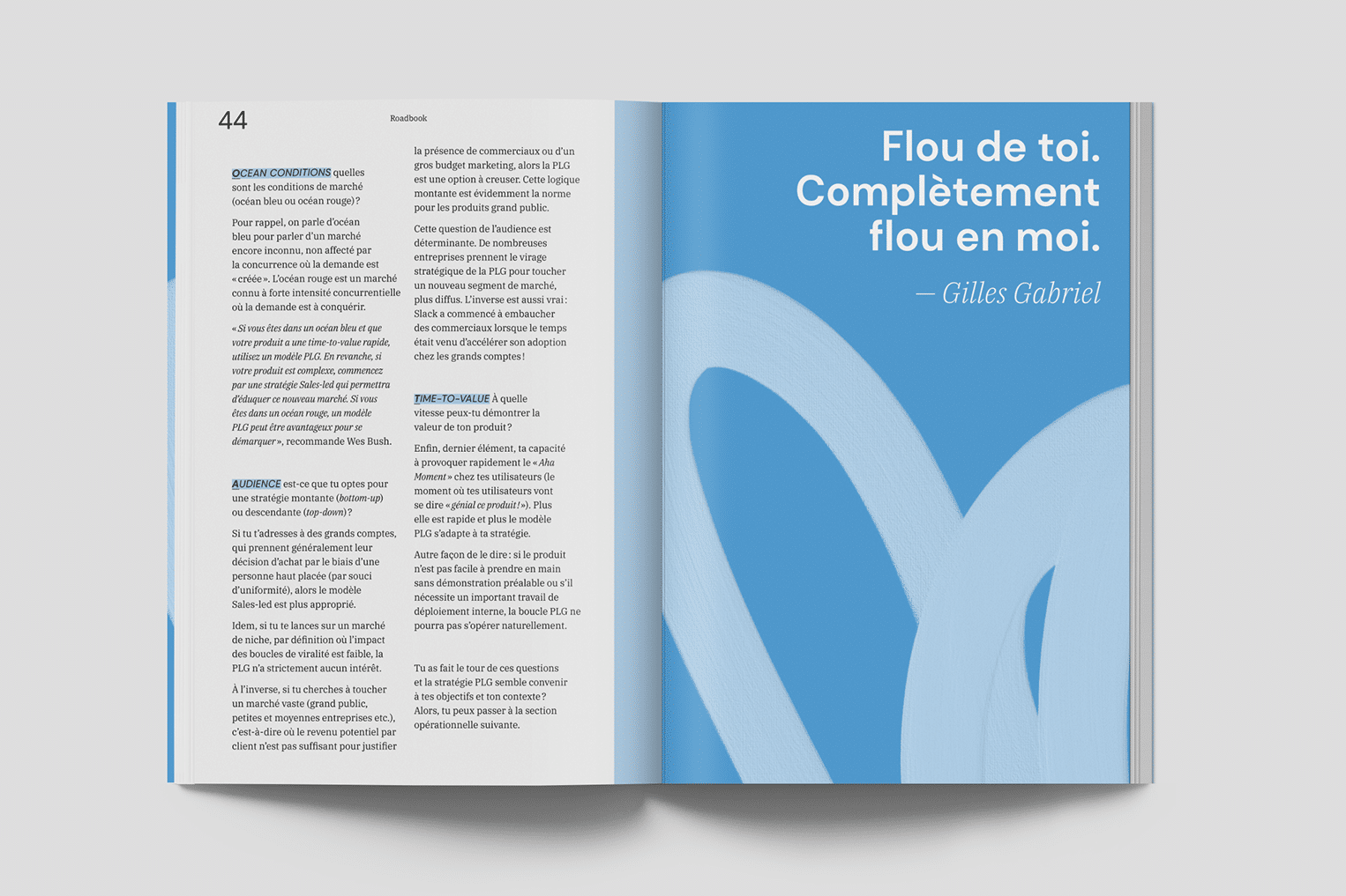
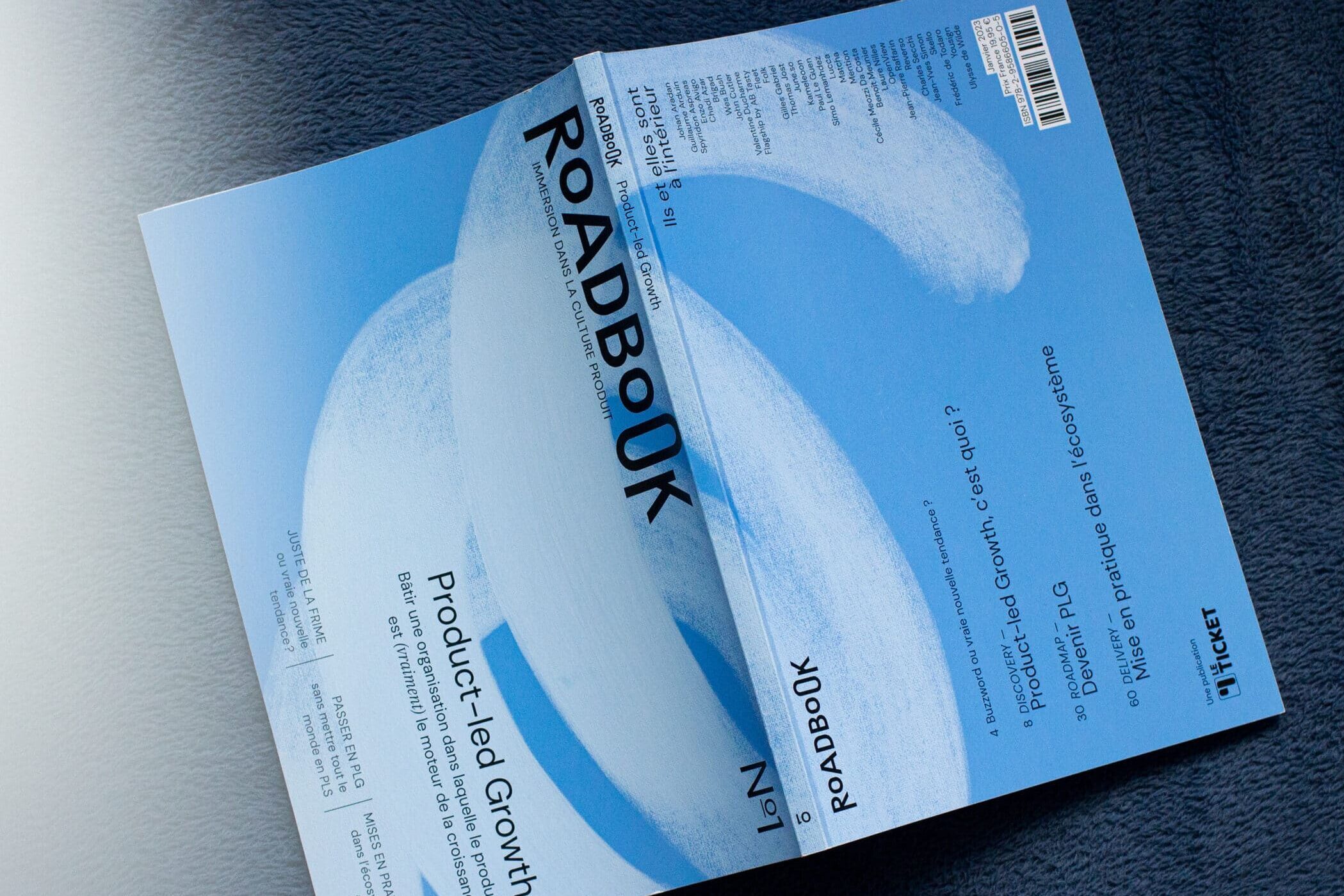
Le Ticket, a product management media outlet, wanted to launch Roadbook, a printed edition offering an immersive dive into product culture. We supported them in creating the project's art direction, with the ambition of developing an identity that could later be extended across the entire media platform. We then designed the magazine layout, formatted the content, and prepared all files for both the printer and Amazon's print-on-demand service.
Design a magazine's graphics
Our objective was to help introduce a somewhat technical yet fascinating subject through graphic design.
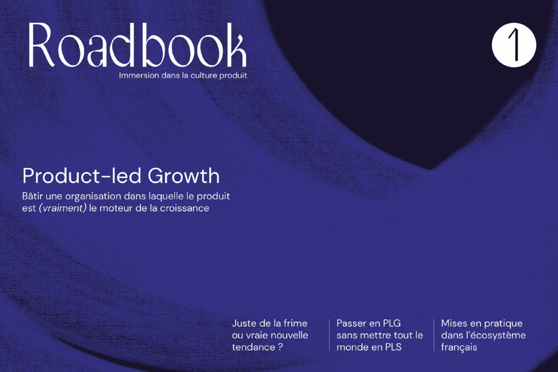
Since most subjects are difficult and impractical to illustrate literally, we chose to focus on a more abstract approach of brush strokes in circular motion that incorporate notions of flow and cycles, while adding a more human, artistic touch to a field that can sometimes seem very technical.
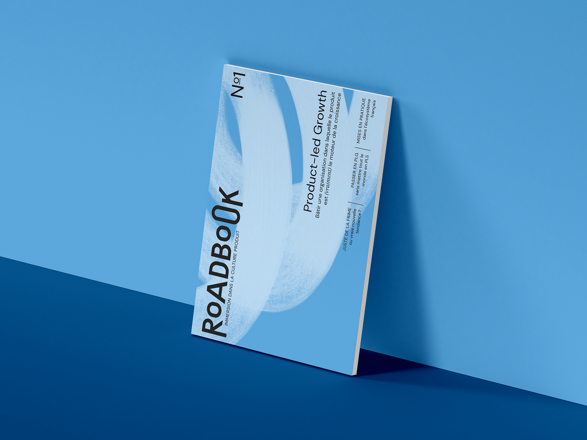
The final cover, in a brighter version.
The background color of pages varies between white, light blue, and dark blue to mark the different types of content and thus create visual rhythm in reading. Numerous spacing elements have been incorporated to open up breathing room in what is sometimes dense content.
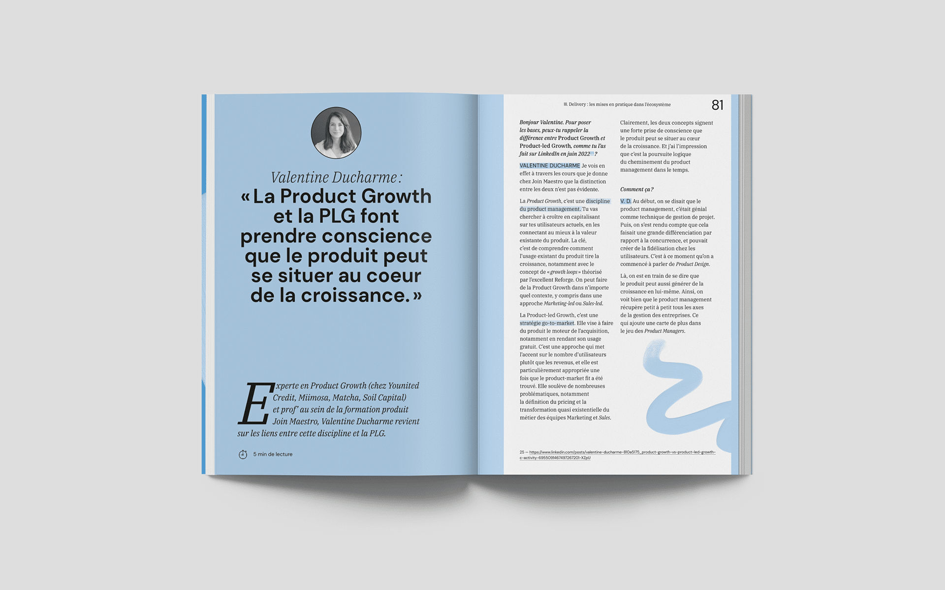
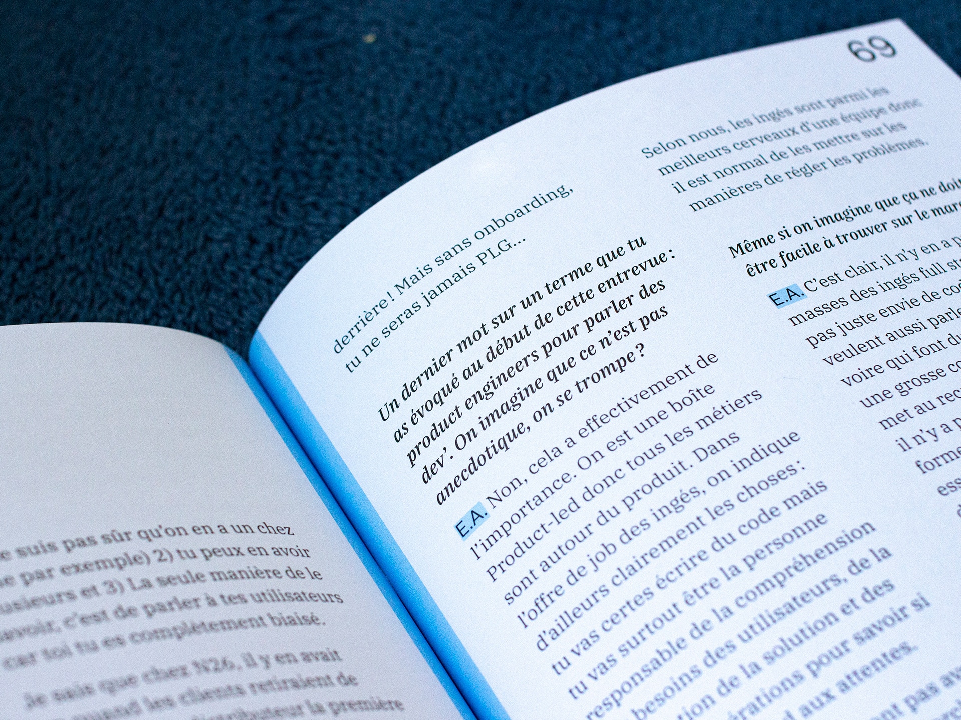
The typefaces were selected and adjusted to optimize reading comfort and clearly establish the hierarchy and status of different text elements. The goal was to create a set that is both approachable and professional.
The Roadbook logo was built using letters of different sizes to create a playful sense of movement, with the small and large 'O' capturing the essence of the pre-existing Ticket icon.
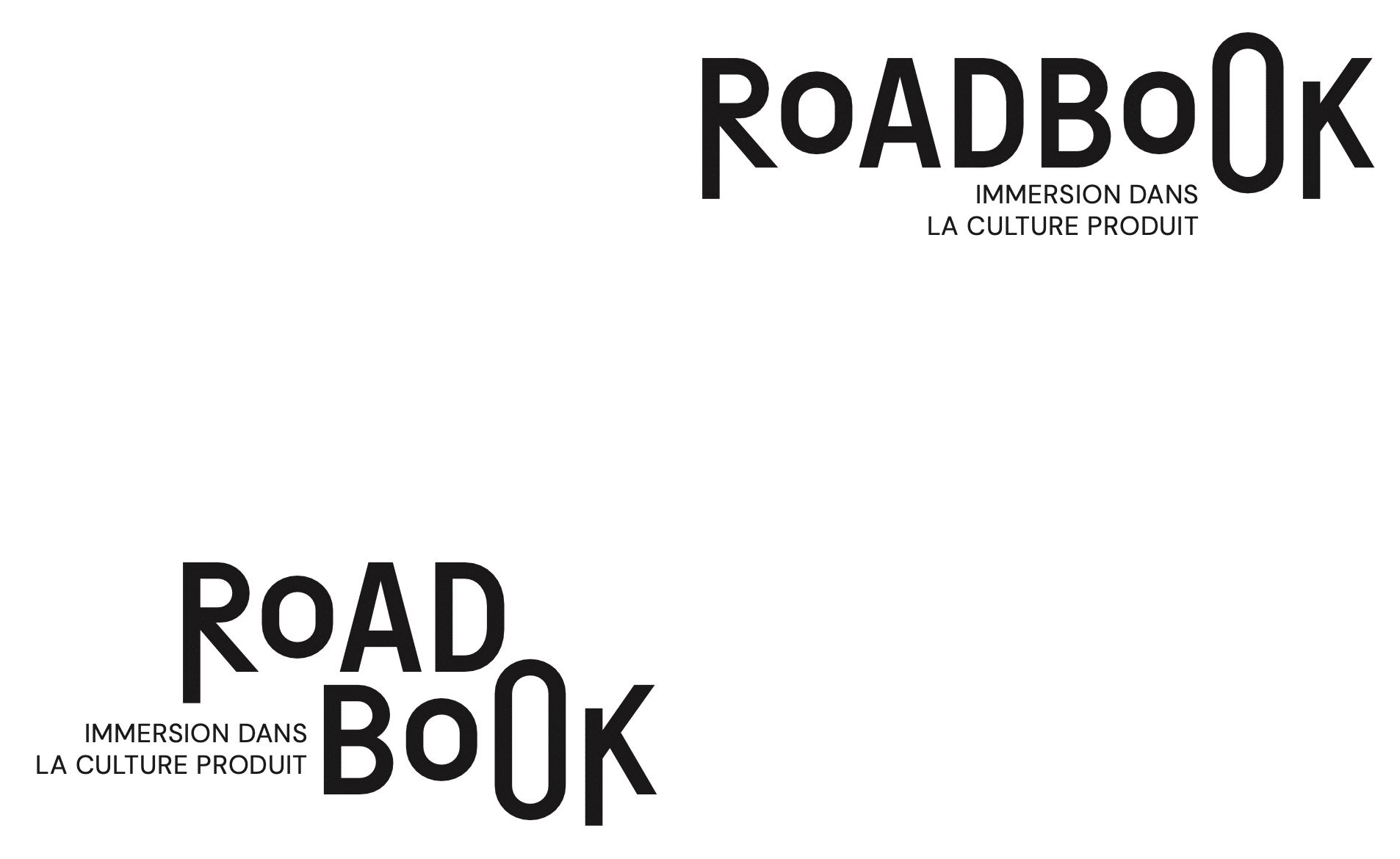
The selected logo variant.
Customize the Ticket logo
Subsequently, we streamlined the historic Ticket logo and designed a new color palette and typography as an extension of the Roadbook’s visual identity.
The Ticket
The product management media
Le Ticket is France's product management media, telling the story of what's happening in the French and European product ecosystem.


