The context
Define the strategy and artistic direction of an investigation into political feminicide.
From the end of 2021 onwards, Médianes supported the Youpress journalist collective in the strategic and artistic development of the first international investigation into political femicides: Women to Kill. An invisible crime, gendered political assassination consists of killing a woman for the cause she defends, but also because she is a woman. Through this investigation, Youpress aims to conduct collective investigative work to document these crimes internationally and thereby better combat them.
We were able to support Leïla Miñano, Sophie Boutboul, Rouguyata Sall, Hélène Molinari, Delphine Bauer and Anne-Laure Pineau in the strategic development of this project through mentoring, and then with the creation of the artistic direction.
Officially launched in March 2023, the investigation identified 300 cases of political femicide worldwide. Médianes is one of the partners in this investigation alongside notably Mediapart and La Déferlante.
Strategy
Define the editorial, financial, and marketing strategy
How to create, fund, and communicate about this survey? Over the initial months, Médianes supported the Youpress team in defining and developing the project: target audiences, value proposition, manifesto, editorial and business model, partnerships. The goal? To design the project alongside a cohesive community and seek broad and lasting impact.
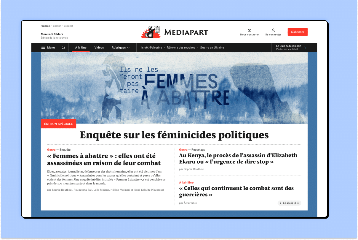
Upon its launch, the survey Femmes à abattre was notably broadcast in six installments on Mediapart's website, in the feminist magazine La Déferlante, and on the Dutch website apache, and received significant media coverage.
Art direction
Designing the artistic direction of the inquiry
Alongside the editorial, marketing and financial development of the investigation, we supported the Youpress team in defining the artistic direction of Femmes à abattre. The visual identity had to be neither violent nor saccharine.
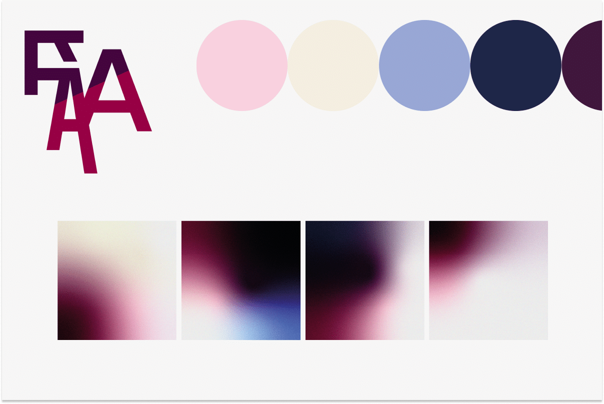
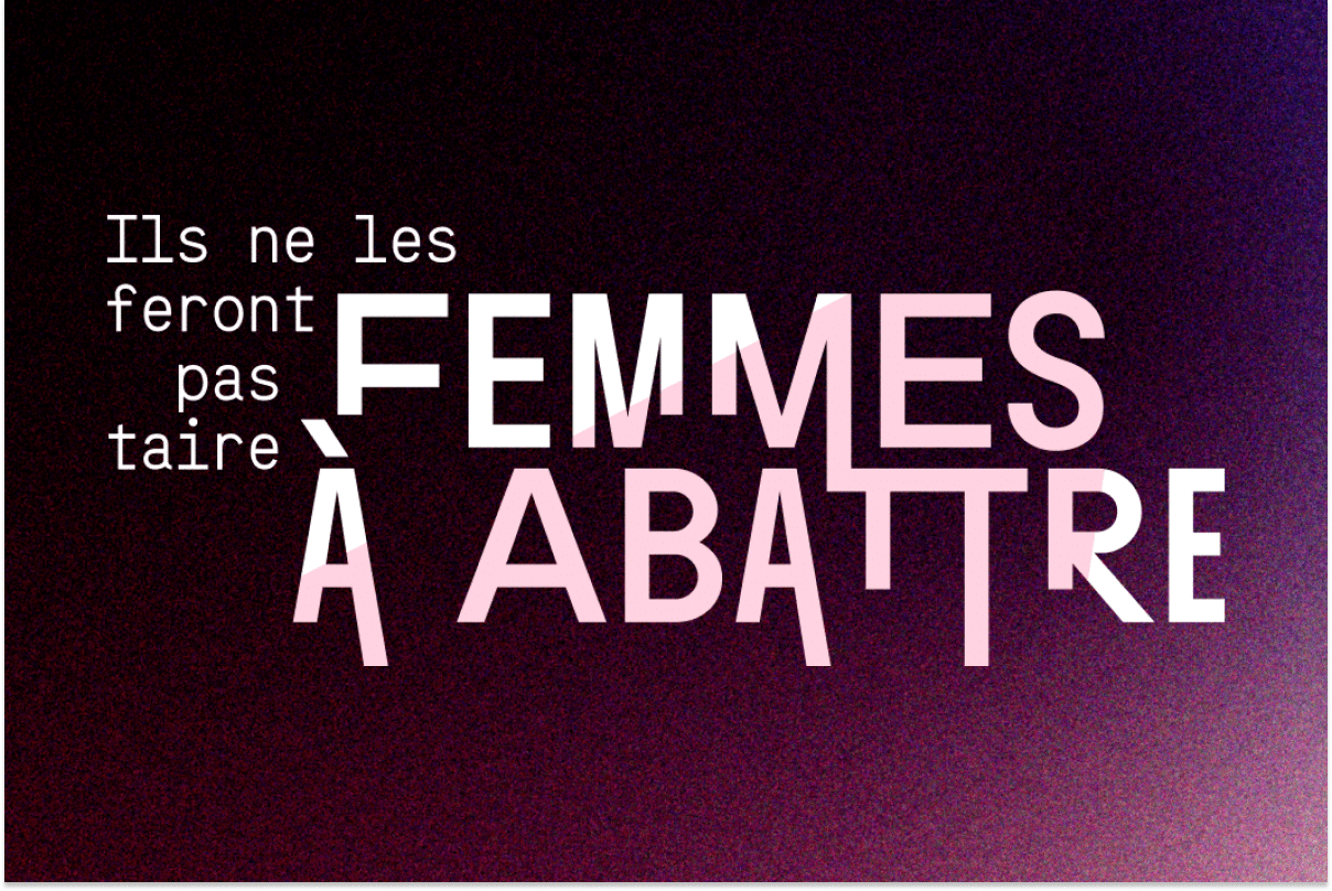
For the logo, the descending strokes of the A's and T's can suggest something flowing in this context, like tears or blood. The logo is designed in front of the shape of an illuminated projector, shining light on this investigation. The monogram condenses the initials into a signature flourish, a reduced version useful for small-scale placements.
Regarding the colors, gradients of different hues meeting organically evoke the fluidity of reflections and the difficulties in building certainties. The colors range from pink to purple, evoking the struggles for women's rights. The blue, nocturnal tones, in turn, recall blows and danger. Beige brings light to the overall composition. As for typefaces, the title font is a serif with gaps, featuring slight white interstices within the characters. In addition to giving it a subtle relief, these breaks in the letters can recall others.
Find more visual elements on the art direction for Femmes à abattre on Christelle Perrin's portfolio, art director at Médianes.