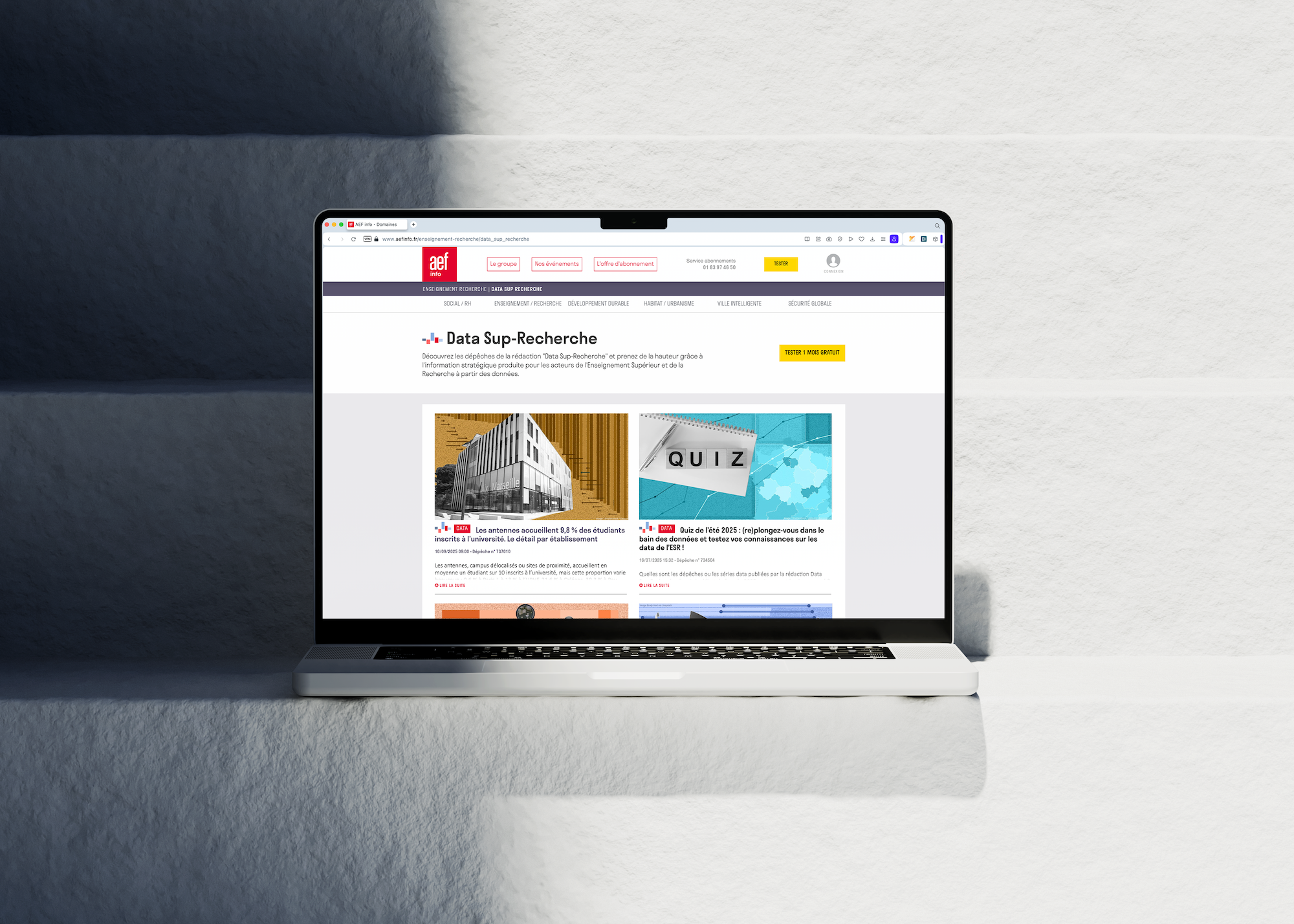
The context
As part of AEF's graphic redesign, Médianes proposed a new accessible color palette for infographics produced by journalists and designers, as well as templates for featured images to highlight DATA news items.
Complete color range
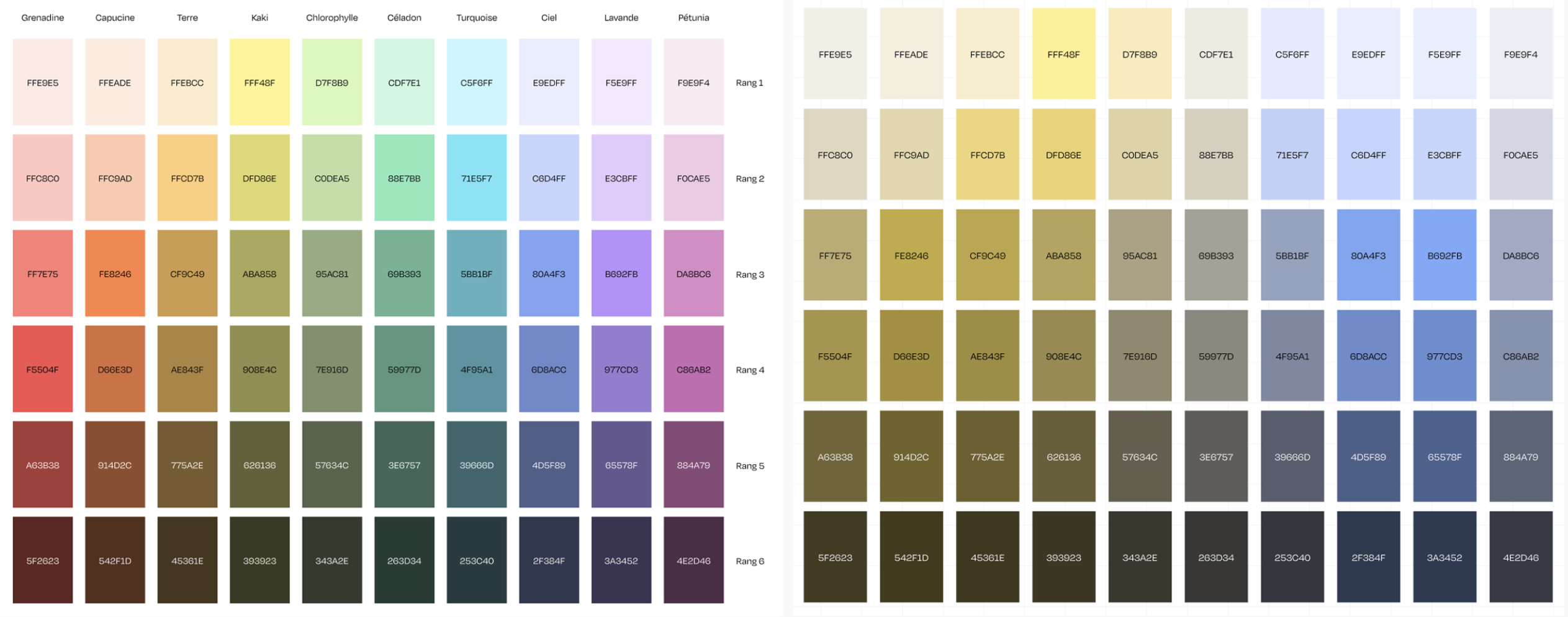
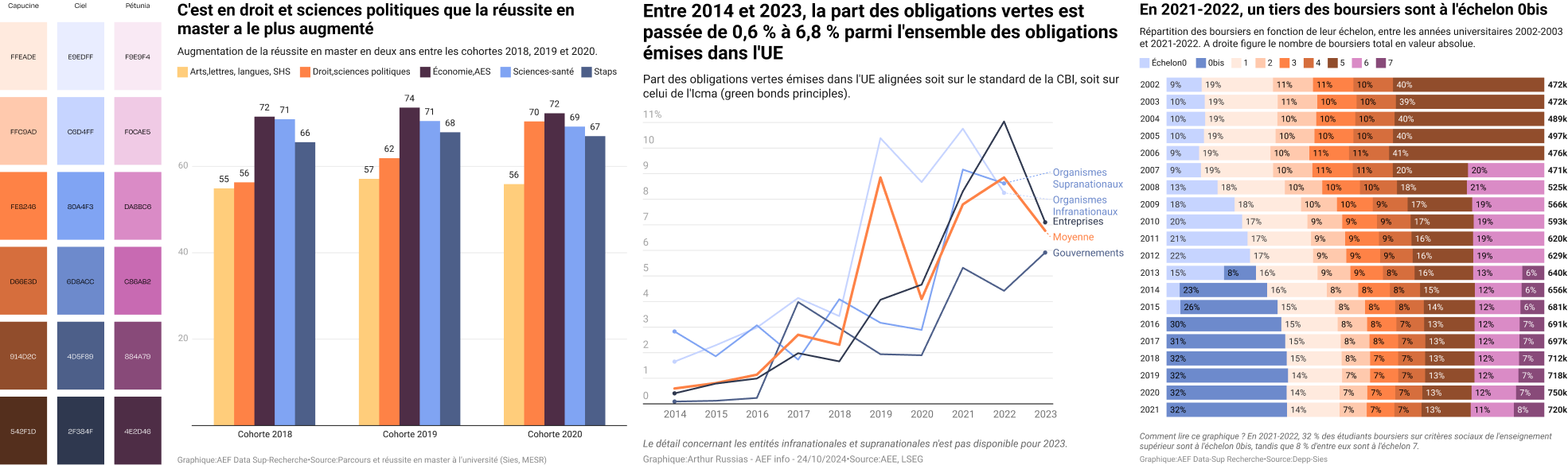
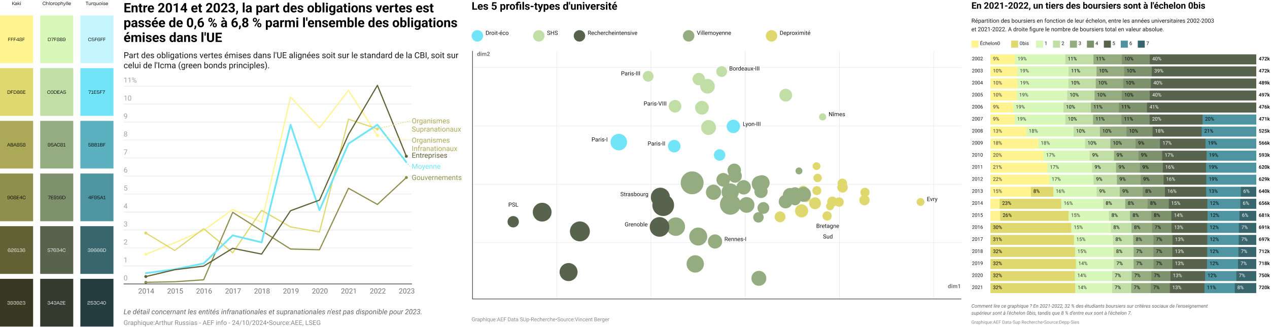
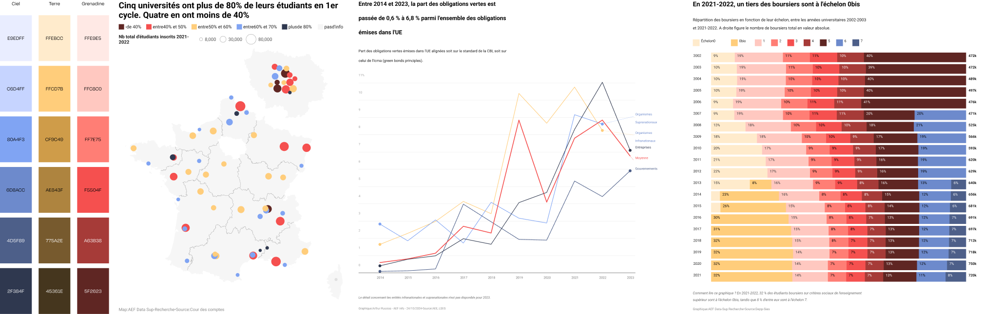
AEF needed 10 different colors, plus lighter and darker variants to have enough flexibility to create all their infographics.
On the left: These hues were developed in CIELAB so they appear equally luminous at each level. It's a chromatic model based on human perception.
On the right: Simulation of the same colors as seen by someone with deuteranopia — a form of color blindness that affects just over one in a hundred men and one in five thousand women.
Featured image principle
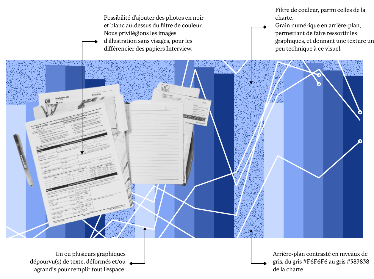
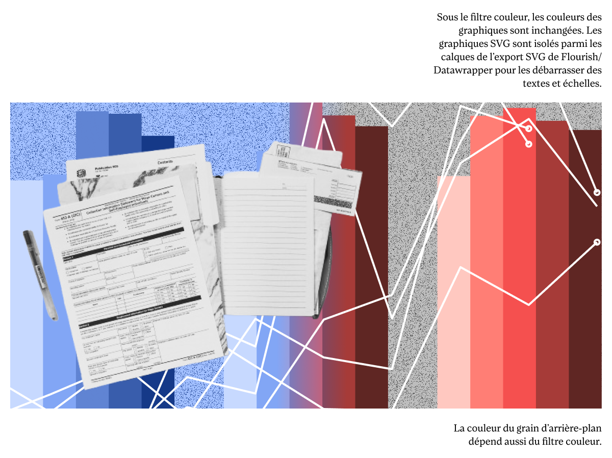
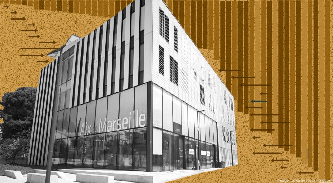
In Figma, we designed a reusable template with successive layers that can colorize background graphics, add texture, and place black-and-white photos on top. You can directly cut out these images within Figma.
Prototypes with sample graphics and stock photos.
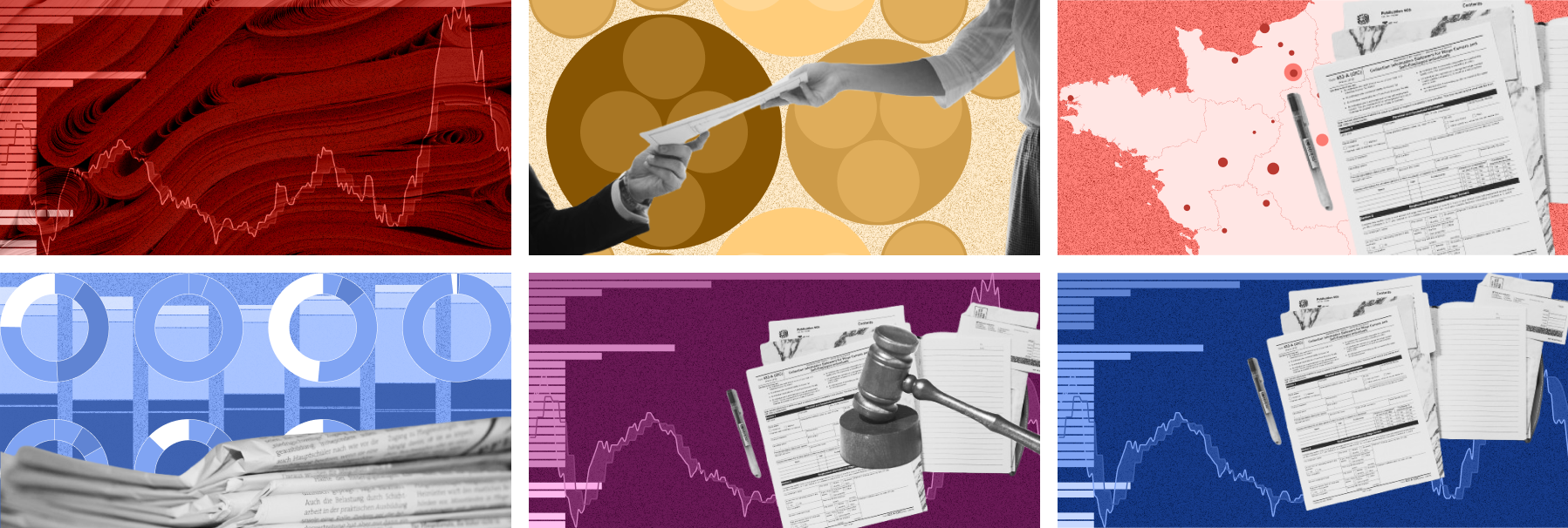
Actual production by AEF's internal designers, following the template and established principles.


Raw infographics
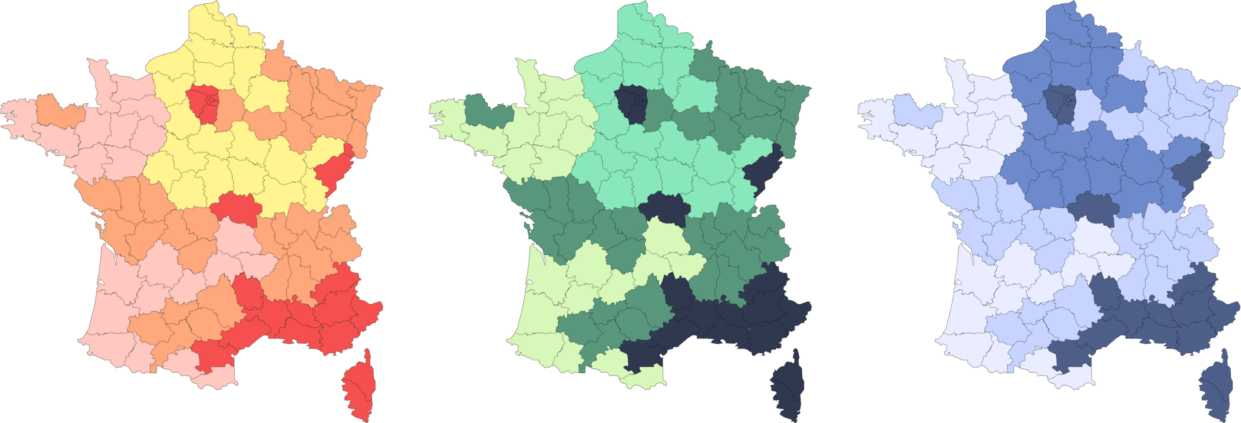
Tests using this color palette on various maps and charts.