Article translated by Marine Slavitch — Original version published on the Inbox Collective website on July 11, 2022.
For people with disabilities, accessibility issues extend far beyond the physical world. Yet while we readily recognize the need for reserved parking spaces for people with reduced mobility, we tend to overlook that similar needs exist online. Although current web accessibility requirements remain limited, they will likely evolve over time. It's high time we made our digital environments more inclusive.
Beyond the moral responsibility of enabling people with disabilities to navigate public spaces, making a city accessible aims to make its spaces more welcoming for everyone. While access ramps in streets and elevators are necessary for wheelchair users, they can also help a child learning to ride a bike or a worker transporting goods on a cart.
Online, it's the same thing. A few simple accessibility measures can give many people the opportunity to navigate digital spaces more easily. Today we'll go into more detail about the issues surrounding newsletter accessibility.
Why is it important to make your newsletters accessible?
The inbox is one of the most frequented digital spaces. According to a study conducted in 2019 by Adobe, we spend an average of five hours a day on our email accounts – three hours for work and two for personal messages. Journalists and media outlets are increasingly relying on newsletters to develop and engage their audiences. A study by the Radicati Group predicts there will be more than 4.2 billion email users by the end of 2022, representing more than half of the world's population.
Moreover, an increasing number of people will need accessibility accommodations. These may be conditions that last a lifetime or worsen over time – such as declining vision and hearing in older adults. The United Nations identifies aging as one of its primary concerns, with populations aged 65 and older being the fastest-growing demographic group, many of whom face age-related disabilities. According to the Centers for Disease Control and Prevention, the number of people with visual impairments in the United States is expected to double to more than 25 million people by 2050.
The Dyslexia Center of Utah estimates that 15 to 20% of the population suffers from a learning disorder, with dyslexia being the most common. It is our responsibility, as marketing specialists and content creators (and humans), to create accessible emails. If karma isn't reason enough, just think about the possible return on investment and the money your company could earn if your newsletters were readable by a larger audience.
In practical terms, what is an accessible email?
Accessibility can be defined as the ability to access something, use it, and benefit from it. Ramps allow people in wheelchairs to access stores, libraries, homes, and so on. And accessible emails allow newsletter readers to access the information contained in an email and use it as they see fit.
While accessibility does have underlying technical aspects – the Web Accessibility Initiative offers a comprehensive guide on accessibility standards if you'd like to dive deeper – two aspects have a considerable impact on email accessibility:
- The very content of the email
- How this content is displayed
Recipe for accessible content
Write shorter texts
Crafting complex, poetic narratives that showcase our writing prowess is flattering to the ego. But what good are these narratives if no one but ourselves or a small circle of people understands them? If the text blocks are so long that no reasonable person would ever read them?
The first step in creating accessible email content is writing concise text. In a newsletter engagement report, Litmus found that the average attention span for newsletters is just over 13 seconds. That's a short window to get your message across. Additionally, many people have cognitive disabilities that make reading lengthy text difficult or impossible. Besides, even without disabilities, people are often distracted when browsing their emails.
For journalists used to writing long newsletters, crafting short sentences and breaking them into small paragraphs is an excellent way to ensure your emails can be read by a large audience. Highlighting key elements throughout the text can also be helpful.
Use less jargon
While using fewer words is important, choosing the right words matters just as much. A typical contact list brings together a diverse group of people with different backgrounds, education levels, and experiences.
For marketing professionals, journalists, and writers who work daily navigating the intricacies of their specific niche, it's easy to fall into the trap of using jargon. By doing so, you risk alienating a large portion of your subscribers.
So choose commonly used words, define difficult terms and acronyms, and try to make your text understandable for those who don't have your experience or expertise. The basic rule? Make sure that someone discovering your content for the first time can understand it just as easily as a loyal reader.
Use inclusive illustrations
Be mindful of the images you include in a newsletter. The 13 seconds that internet users spend on an email are primarily devoted to scanning the headlines and seeing what the images tell them about the content. This underscores the importance of choosing images that are easy to understand and inclusive.
Easy-to-understand images are those that convey the meaning of your message. Even if web users don't read every word and just glance at the images, they'll be able to understand what you're trying to get across.
Inclusive images, on the other hand, should reflect – or include – your subscribers. They don't exclude different groups based on race, sex, religion, sexual orientation, or economic status. They show that you recognize all your subscribers, not just those who are like you.
Inclusive imagery also means that images should be accessible to people using assistive technologies such as screen readers. Not everyone can necessarily see the images that appear in a newsletter, which is why including alternative text (ALT) – which describes the image content – can help a broader audience benefit from your emails.
If you don't have the ability to add alt text, you can still include it as a caption below an image. Either way, adding descriptive text for users with low vision or who are blind is one of the best ways to make your newsletters accessible.
Recipe for an accessible container
Use real text, not just images
One of the most important things is to use real text. Marketing specialists are often tempted to design an entire newsletter using software like Photoshop or Canva, as both offer many options for creating attractive emails. Journalists also tend to include too many images in their newsletters to illustrate their articles or highlight key elements. However, emails with a lot of images remain poorly accessible.
Many email clients disable images by default for security reasons. Some companies do the same at the network level. When this is the case, newsletters containing only images cannot be accessed.
Here's an example of what subscribers see when images are disabled.
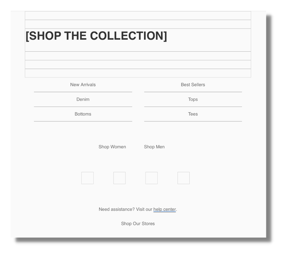
While it is possible to address the issue of disabled images by using descriptive alternative text in the email’s HTML code, the user experience is still often subpar. The challenge is even greater for users who are visually impaired or blind and who use screen readers. Without actual text, the software has nothing to read to the user. This is enough to prompt these users to unsubscribe quickly.
Make sure your text is legible
There are practical ways to make a text easier to read, regardless of your subscribers’ cognitive or visual abilities.
The first is to use text that is large enough to be seen even by users with low vision. At a minimum, the text should be at least 14 px in size. Realistically, it’s best to start at around 18 px. Smaller text becomes difficult to read, especially on mobile devices or screens that are farther away from the subscriber’s eyes.
Similarly, make sure your text has a high contrast ratio. The Web Content Accessibility Guidelines (WCAG), one of the leading reference documents on accessibility, provide clear guidelines on contrast ratios.
Here is a summary:
- Make content easier to see by separating the foreground from the background
Choose black text on a white background, or vice versa. Avoid colors that are too similar to one another. People with vision problems will have an easier time distinguishing the elements of your message.
Also, be sure to align your text properly. For languages written from left to right, such as French, most of the text should be left-aligned. For languages written from right to left, such as Arabic, align your text to the right instead. Although centered text is visually appealing due to its symmetry, it can make the text harder to read. Left- or right-aligned text gives the reader a consistent starting point for moving to the next line. In contrast, center-aligned text requires the reader to make an extra effort to find the next line.
A good rule of thumb is to left- or right-align any text longer than 2 or 3 lines. There is only one exception: shorter titles can certainly be centered.
- Make the links clickable
It is important that your links—whether they are text or buttons—are usable. First, make sure to clearly indicate that the links are actually links. Follow well-known conventions, such as using a different color from the surrounding elements, underlining text links, or adding a tooltip URL.
Next, be sure to leave enough space around these links so that users—especially those with motor impairments—can easily click on them. Generous line spacing for paragraphs containing text links, or ample white space around buttons, will help your subscribers get the most out of your newsletters.
- Create emails that are easy to read
It’s important to create newsletters that are easy to read and understand, even if your subscribers don’t read every word. Again, 13 seconds isn’t enough time to get your message across. Prioritizing content and using a layout that makes it easy to read will help your subscribers process the information more quickly.
Hierarchy simply involves organizing your content based on its importance. Since headings are important, they’re usually larger. Since the body text is often secondary, it’s smaller. Calls to action (CTAs) are extremely important; therefore, they’re usually larger, more colorful, and the most visible element of an email. Following this hierarchy allows subscribers to quickly find what they’re looking for in your newsletter.
Finally, opt for simpler layouts. Layouts with multiple columns, numerous elements of different sizes, or busy backgrounds create a cognitive load that subscribers may find difficult to handle.
Simpler layouts—with one or two columns—help reinforce the hierarchy of content and improve readability, making newsletters more accessible. Whenever possible, emails should automatically adapt to the device on which they are viewed (mobile phone, desktop computer, tablet).
That’s our goal: to reach as many people as possible with our newsletters and ensure that everyone can access, use, and benefit from them. These guidelines should help you improve the accessibility of your emails. From now on, we hope that when you hear the word “accessibility,” you’ll think not only of ramps or parking spaces, but also of how you can provide better experiences for your subscribers.
Editor's Note
This text is not a word-for-word translation of the original article published on the Inbox Collective website. We have added contextual information, adapted certain expressions, and omitted certain passages containing specific references intended for English-speaking or American readers. We have also chosen to apply the rules of inclusive writing to this translation, in accordance with the editorial guidelines in effect for all Médianes content.