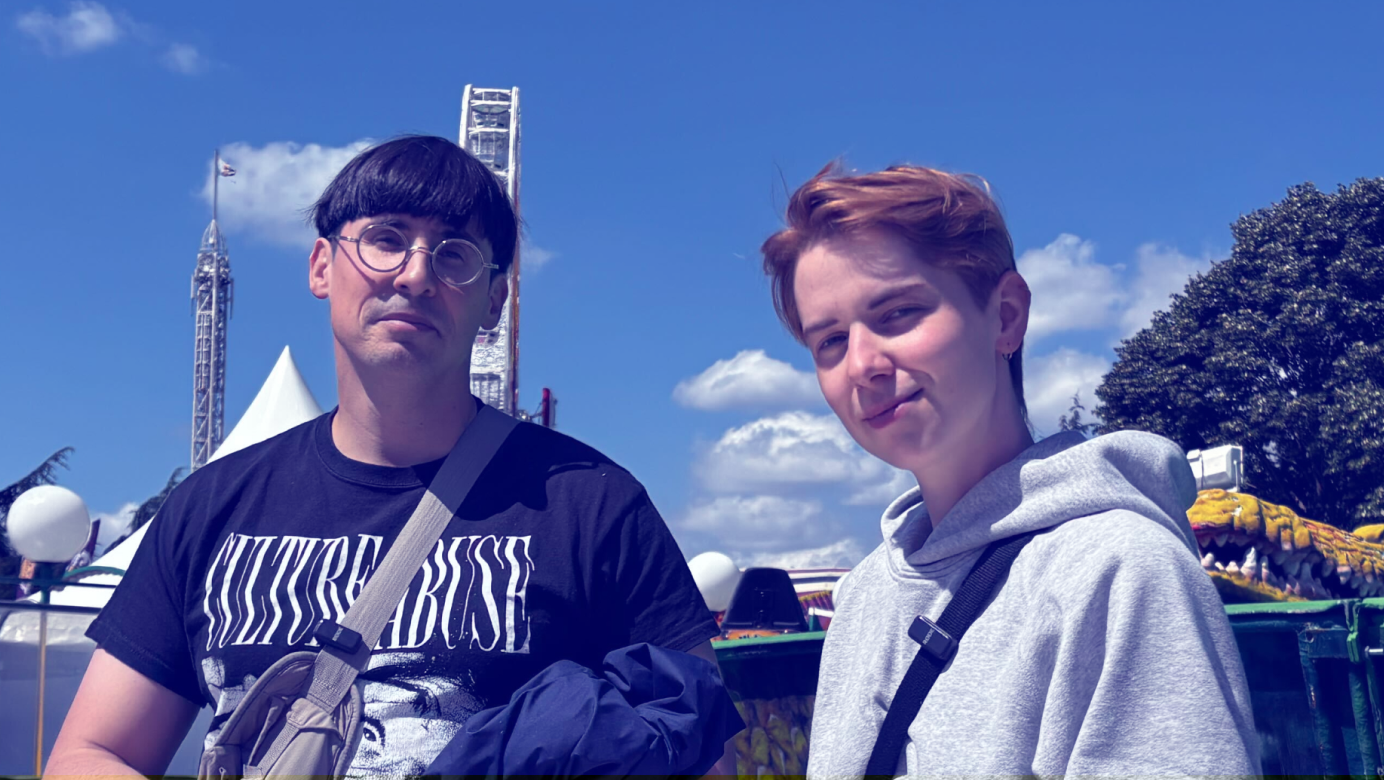
Christelle Perrin is a co-founder of Médianes and the magazine Pays, two projects for which she has designed artistic direction tailored to the product and audience interests. At Médianes, Christelle also carries out graphic design work for the studio's clients: the design of the La Déferlante website, the graphic identity of La Disparition, the web redesign of POLITICO in Europe…
Thomas Steffen is a specialist in digital editorial design. He has notably redesigned the websites of Disclose, StreetPress, Slate, Binge Audio and ARTE Radio, and today heads the digital design team at Monde. His obsession: making design not window dressing but an editorial tool designed for user experience.
Here are their tips for prioritizing your design needs and making the best possible choices that align with your media's identity.
When launching a media outlet, at what point should you start thinking about design?
Christelle Perrin: Quite quickly. Not necessarily from day one, because first you need to know who you're addressing, what resources you have, and what your priorities are: it's better to avoid creating a visual identity and then wondering what you're going to talk about. But very early on, you need to communicate to tease the project: and for that, we need at least an image, a typeface, a background color—something to signal that something new is coming, which can grab attention. Design, even very simple design, lays the first building blocks of the media's spirit. After that, the graphics can evolve with the project and mature with the audience. What speaks to readers at launch may no longer be relevant five or ten years down the line.
Thomas Steffen: From the start, you need to stand out. If your project doesn't stand out visually, it's hard to recover from. But you have to be realistic: you don't spend half your budget on visual identity at launch.
What should be editorial teams' priority when it comes to design?
Thomas Steffen: Serving the readership. You have to move past the somewhat artistic mindset: we're not going to do something just because I decided it with my gesture and my vision, but because the product will be read and it serves a function. At the Philharmonie, Jean Nouvel had decided to paint the offices black. For him, it was beautiful that way, and that was his only argument. The employees went on strike to say that no, it wasn't possible because it was depressing them. And he refused: he wasn't designing that building for people to feel good in it.
"People don't have time: if they don't immediately understand what the media is saying or how a website works, they leave."
What does a media outlet lose by neglecting design?
Christelle Perrin : If the visual identity isn't clear, you can completely miss your target audience. Everything needs to be understandable at a glance: navigation, identity, values. A media outlet with very strong commitments, one that's very activist, should avoid having a visual identity that's too delicate or poetic. Conversely, you need to be careful not to assault readers with overly harsh color contrasts, for example. People don't have time: if they don't immediately understand what the media is about or how a website works, they leave.
Thomas Steffen: We live in a visual world. On social platforms, algorithms favor content with images. An article without appropriate visuals—a map, an illustration, a photograph—won't perform well. Most importantly, careful design builds trust: it signals that you're dealing with a serious news outlet. For independent media, the challenge is to demonstrate their authority to gain recognition. Are you doing investigative journalism? You need to prove visually that everything you write is accurate and sourced. If you use an eye-catching image generated by artificial intelligence, people will have doubts.
Christelle Perrin : Beyond the image, typography speaks volumes. For example, a typeface that resembles those found in newspapers or books evokes seriousness and lends credibility to the medium.
So does that mean you have to be as neutral and smooth as possible to be read?
Christelle Perrin: No, but it's all a matter of consistency. You can mix sobriety and boldness: a classic typeface with a pink background, for example. You can imagine hand-drawn pictograms that will bring a handwritten feel. Being serious doesn't necessarily mean looking as much as possible like Monde. StreetPress looks very serious and yet has a strong identity, with bright yellow and very large headlines.

Thomas Steffen: The limit is accessibility. If a fancy 3D effect, animation, or eye-catching visual doesn't display on an old phone, it's not worth it. We risk losing too many people. The goal is for everyone to be able to read, not just those with the latest iPhone.
Why do all media outlets seem to look alike?
Thomas Steffen: It's always the same names coming back, including us. Every designer has their own style. As long as new people aren't arriving with fresh perspectives, we risk going in circles. And since in France we tend to take everything that comes from across the Atlantic at face value, if everyone draws inspiration from the same source, we inevitably end up with similar or unsurprising identities.
"Everyone knows how to design. But people have been stripped of this skill in the name of 'good taste,' as defined by powerful and highly credentialed people."
Christelle Perrin: Media outlets look alike because they're also rooted in continuity and a visual history that makes it clear we're looking at a media outlet and not a pharmacy.
Is the design elitist?
Christelle Perrin: Everyone can do design. We know that the heading will be larger than the detail text, we know how to choose a clear image: it's a form of common sense. If you're organizing a sheep fair, you put up an image of a sheep. But we've stripped people of this skill in the name of "good taste," defined by powerful and highly educated people. Today, we find less visual freedom of expression in public spaces, a standardization of codes, a suffocated popular culture. People sometimes reclaim this freedom in protests, through signs and collages. In the city, everything is locked down and regulated: you can't post freely in the streets or on public transport. The range of what's deemed acceptable is narrower, and with it, the space for minorities. The only way to have more visual diversity is to have more diversity among the people doing design. We need more diverse people to be able to access these creative positions with or without formal education, and to be able to express themselves too.
Thomas Steffen: Yes, there is such a thing as class design. The visual codes of luxury, for example, make it very clear to those without money: "this isn't for you". Conversely, some designers have fun recycling "ugly" things to make them trendy, but that only speaks to those who share the right cultural codes. If you don't have the references, you don't understand. That game is closed, meant for an in-group. When we find something popular "too charming" at a village party, it's often because we're looking at it from a notch above.
"Just because you're putting out a left-wing publication doesn't mean you have to slap together an identity on the cheap."
Don't independent magazines with a strong editorial stance that adopt a very polished and cutting-edge design risk giving the impression that they aren't made for everyone?
Thomas Steffen: No. Just because you're running a left-wing publication doesn't mean you have to rush into creating an identity. The pitfall would be thinking that because we're an independent media outlet, we absolutely have to prove we're making do with whatever resources we have.

A visually well-designed publication isn't necessarily made for people who have the knowledge and cultural background to read it. What matters is working to create the most polished object possible so that it's comfortable to read for everyone.
"Nobody reads a format. Your audiences want to read stories that interest them."
What advice would you give to media founders who want to launch a design project?
Christelle Perrin: Ask yourself what your needs are, what your roadmap looks like over the next six months or two years. Maybe you don't need design right now! For a Substack banner, an hour might be enough. For a redesign, you need to be careful not to let your ego and desires get the better of you. Your audience should always be the priority.
Thomas Steffen : Don't spend a fortune on a logo. Put your effort into content instead. Nobody reads a format. Your audiences want to read stories that interest them. The format itself only speaks to us. If the subject is boring, it's boring. Design won't create magic.
Do you absolutely need a visual redesign to signal renewal in a media outlet?
Christelle Perrin: First, let's ask ourselves what justifies the redesign: a change of direction, a new business model? What are the objectives? In any case, you can't change everything, otherwise no one will recognize your magazine. Or else, readers won't know where to find their favorite content on your site anymore, and that will frustrate them.
Thomas Steffen: I get the impression that a graphic redesign is always the basics of renewal: you want to convey the idea that you're launching a new formula. In doing so, media outlets focus on the graphic redesign, but not on the editorial overhaul. If the content stays the same, there can't be any results. Just because a media outlet does a visual redesign doesn't mean more readers are suddenly going to show up.
Was design in the media better before?
Thomas Steffen: No. I run a department that has only existed since 2019. Before that, we weren't doing digital design at the Monde. I remember that in 2015, I went to Frankfurt to attend the Society of News Design seminar: a major gathering with all the big names in global design. There were people from the New York Times, from the Washington Post. They already had designers in their newsrooms. What we're doing today, they were already doing fifteen years ago. I was blown away: I wondered how we would ever manage to do at the Monde what they were doing back then. So I'm very happy to be able to make visual articles today. Before, we were trying to understand the point of these issues. Now, we're no longer asking ourselves why we need to do it, but how to do it better.

Christelle Perrin: There can certainly be nostalgia for paper. You might think that the days when we did everything by hand—the typesetting, the layouts, without a computer—must have been wonderful. But we can absolutely go back to that. In my work, I love taking the time to do a watercolor, for example. I find it very soothing to work directly on paper. Just because we invented computers doesn't mean we're forbidden to do without them, whereas the reverse isn't true.
Thomas Steffen: Ask us that question again in two years, when funding runs out or artificial intelligence has had its way. At that point, maybe we'll think things were better before. Automation now makes it possible to create entire mockups with certain tools. I can clearly see what's going to happen in the minds of people who, fundamentally, had allocated budgets to design. It's likely that teams will shrink. We're already seeing layoff plans arriving in some newsrooms.
To go further
- What are the specific features of graphic design for independent media? What vision do we uphold? Here is our manifesto.
- Running short on inspiration? In a panic to find ideas? Here are a few resource suggestions to expand your visual culture, whether in publishing, communication campaigns, typography, or color.
- A quick guide to graphic design briefs to help you identify the information to share with a designer tasked with creating your visual identity.
- What questions should you ask to choose your fonts? In the form of a practical guide, three main axes can help you navigate through the abundance of font offerings.
- When sharing an article link on social media, it's usually accompanied by a horizontal image. Here are a few tips for choosing your preview images wisely.