

The context
Create the book layout
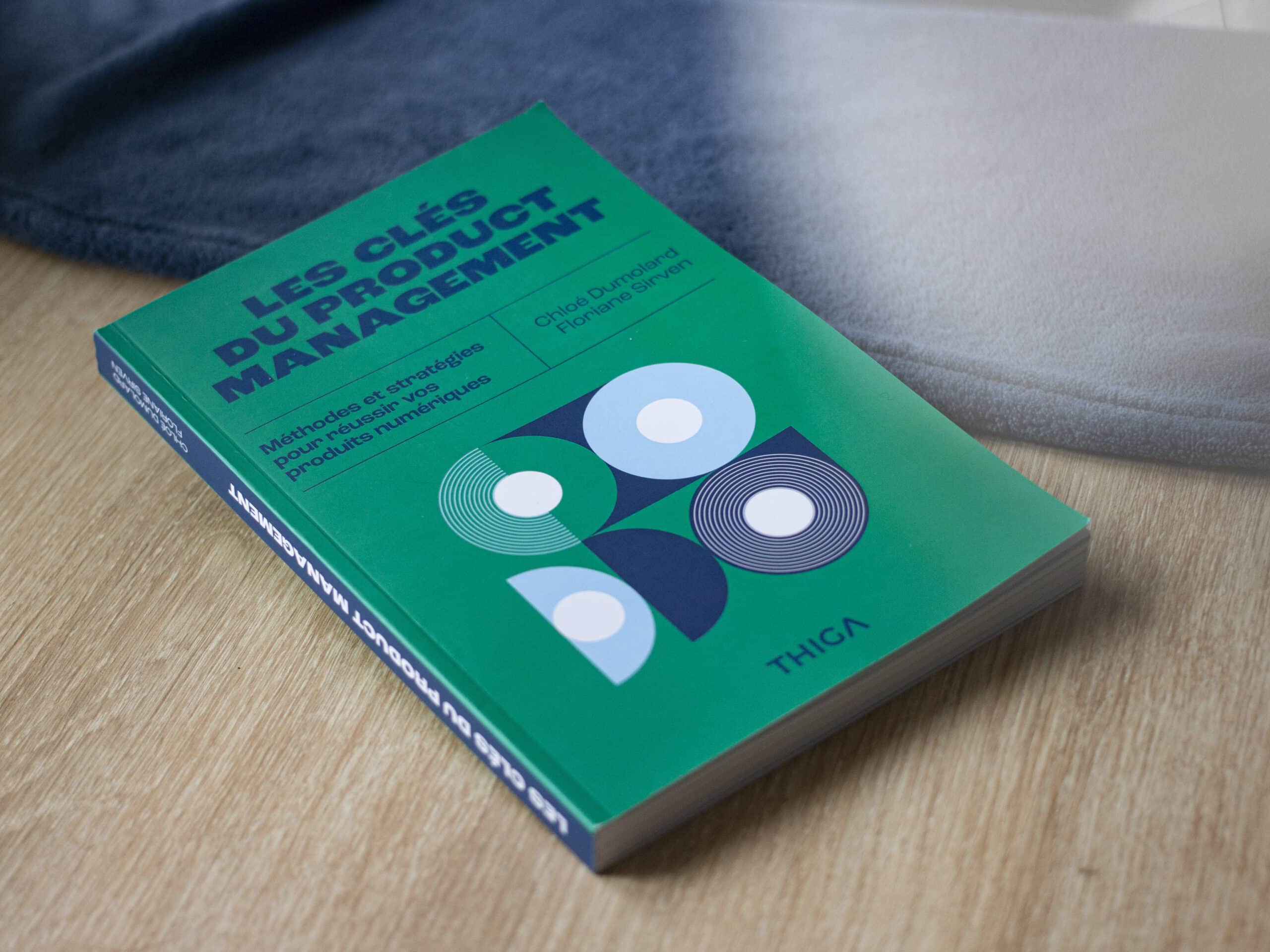
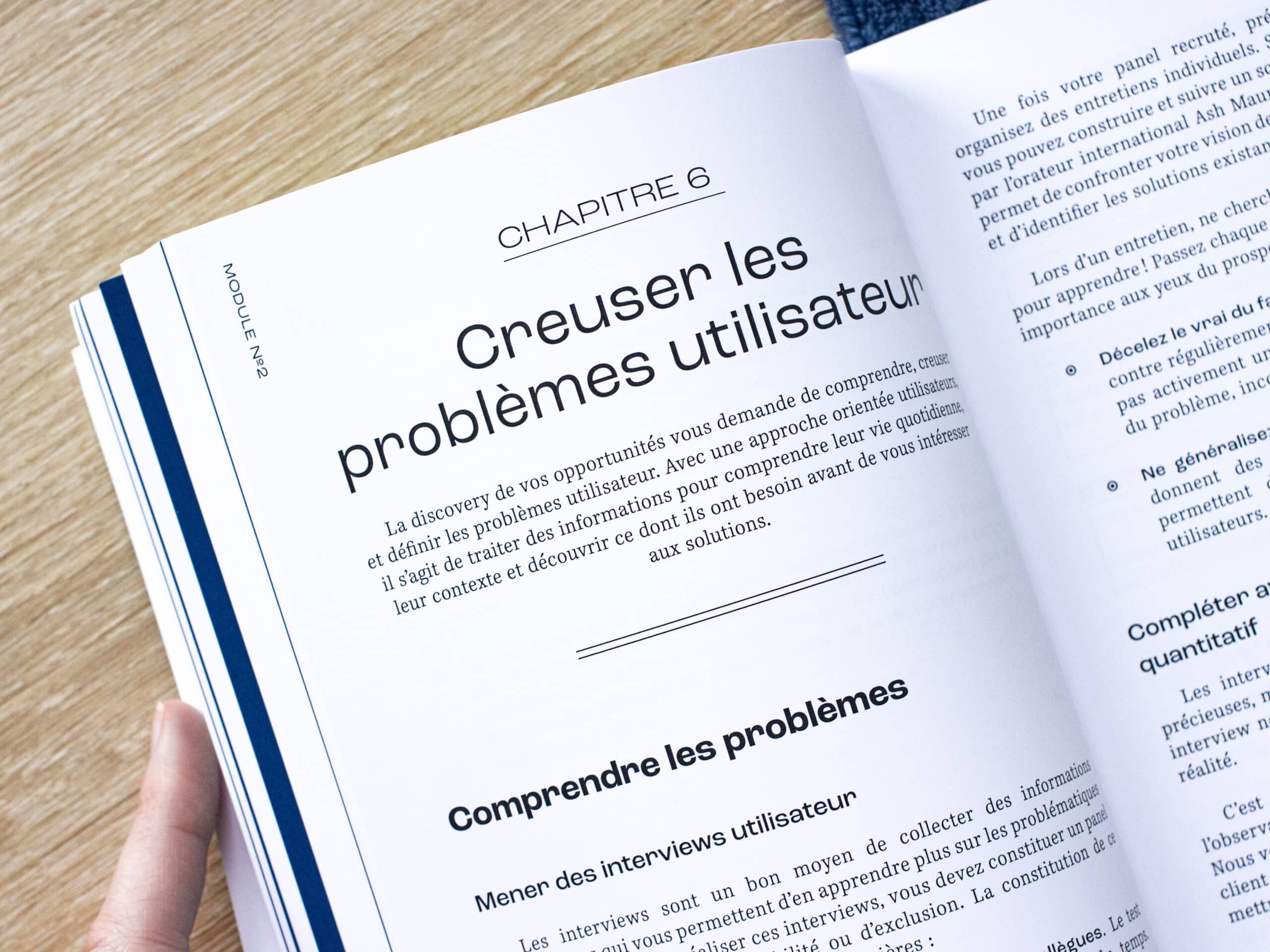
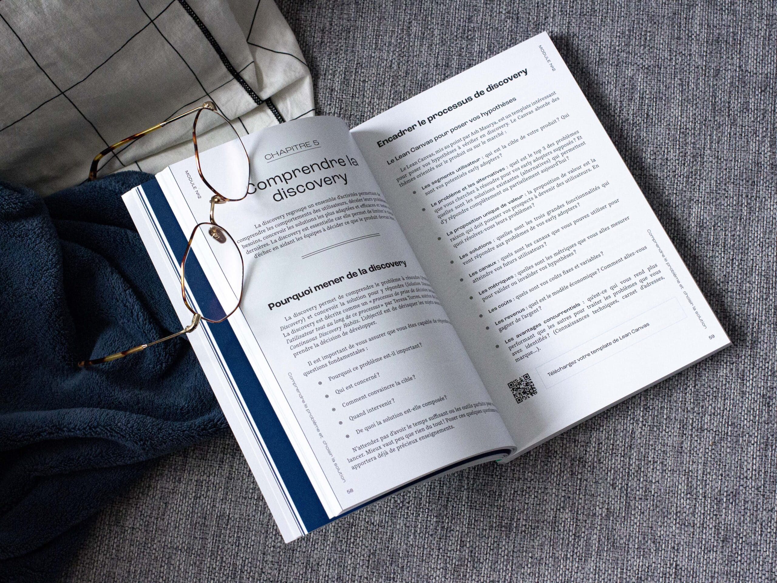
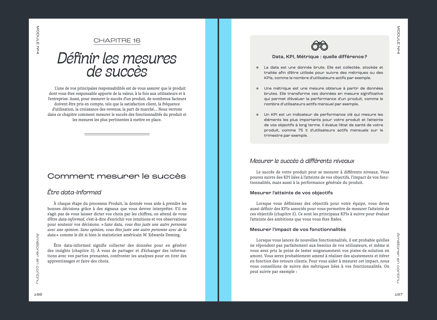
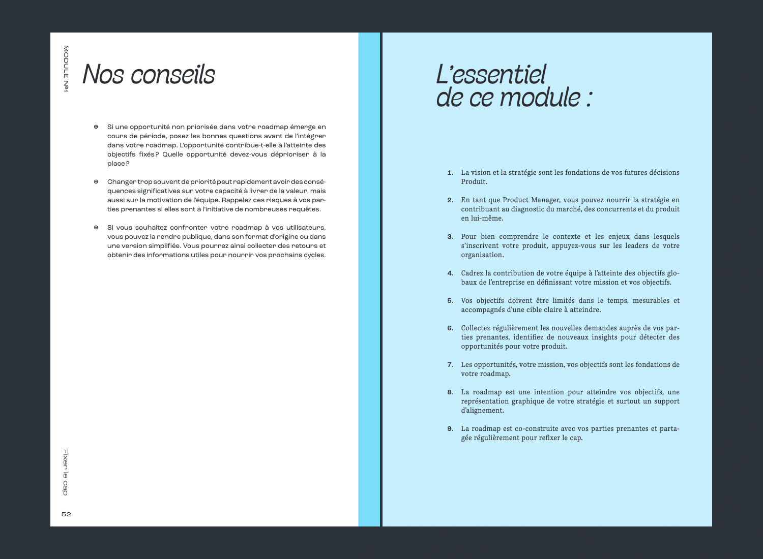
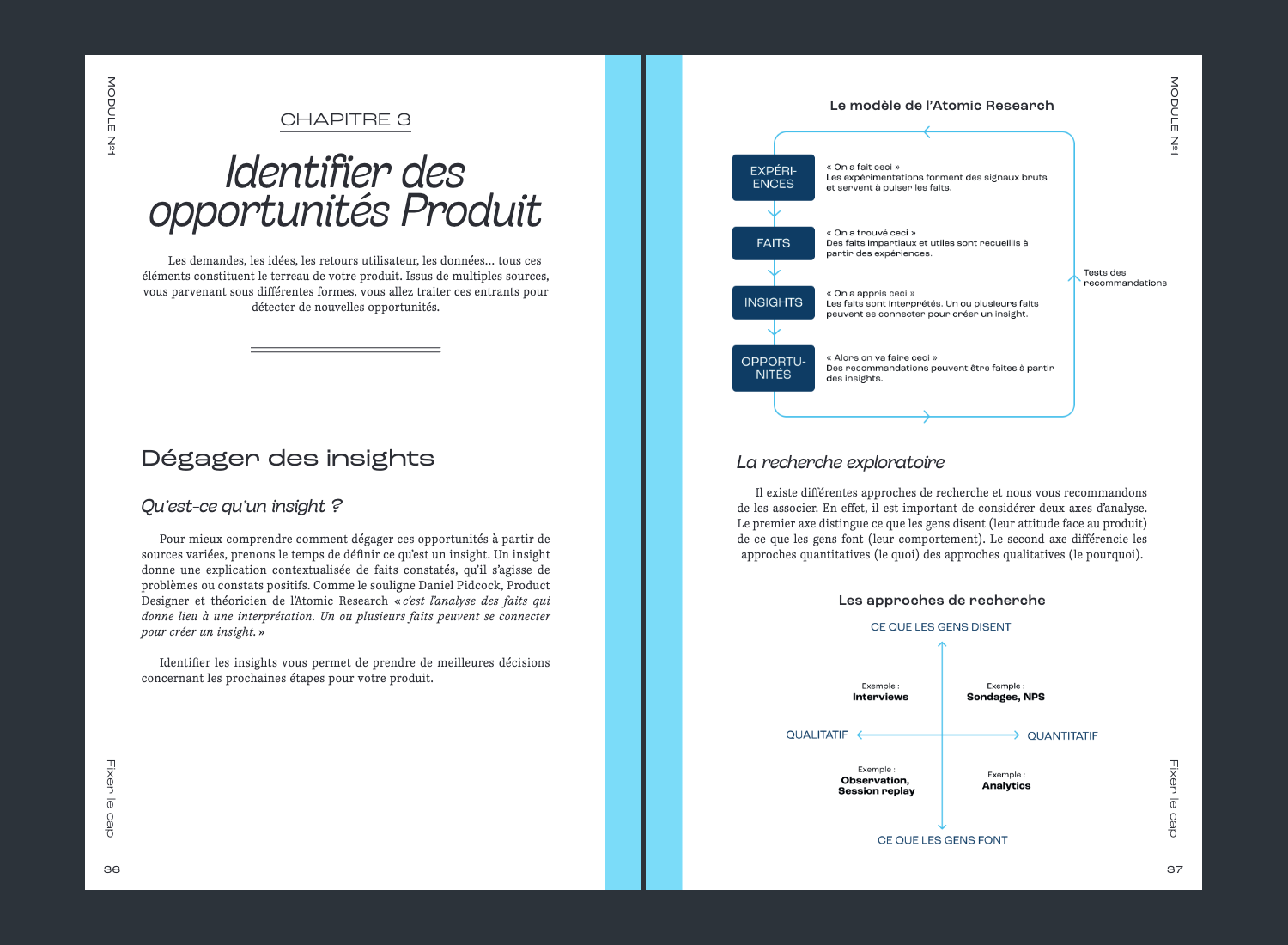
In June, with a view to the release of their 5th book, the Thiga, consulting firm and media dedicated to Product professionals, was seeking a design that was less academic and more editorial in nature. Médianes was called upon, and we handled the art direction, layout, and brought the diagrams and tables of this work « The Keys to Product Management — Methods and Strategies to Succeed with Your Digital Products » into compliance with the brand guidelines.
This entire mission was coordinated by Christelle Perrin, assisted by Maëlle Ledu on text editing. The work was finalized with the help of Camille Pfaender.
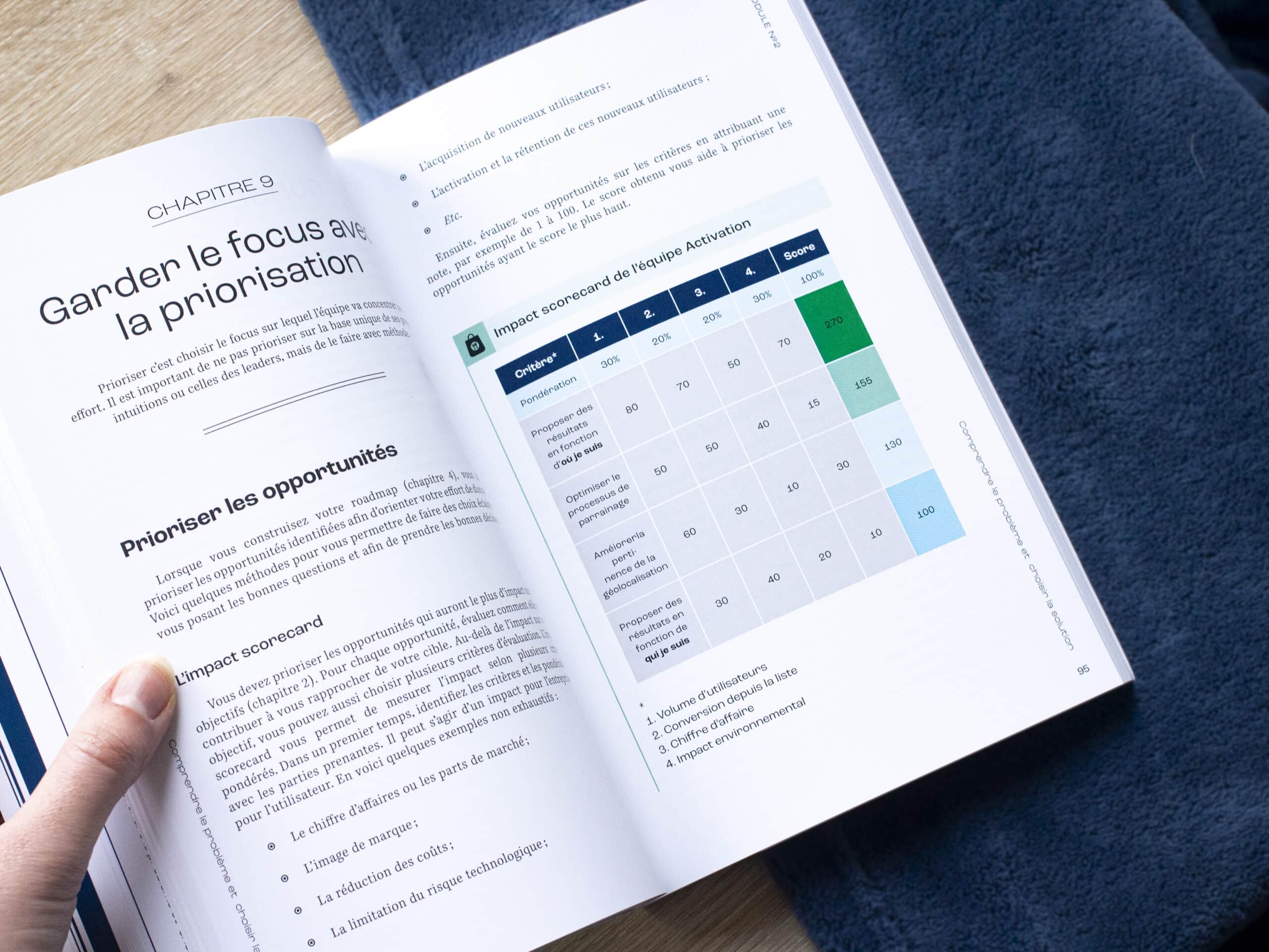
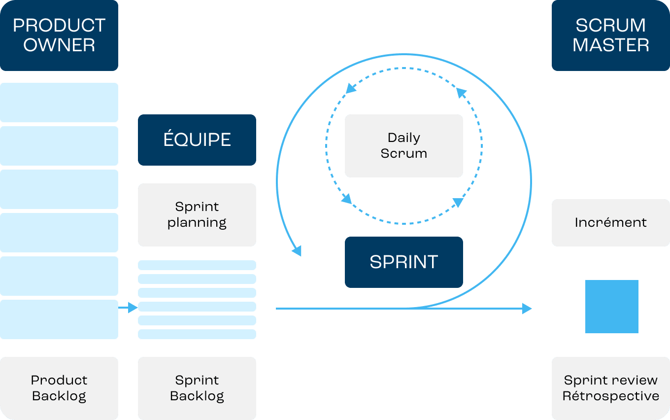
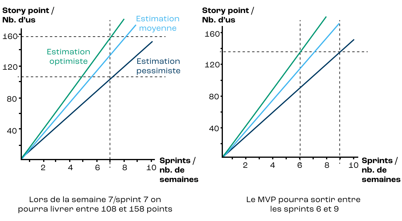
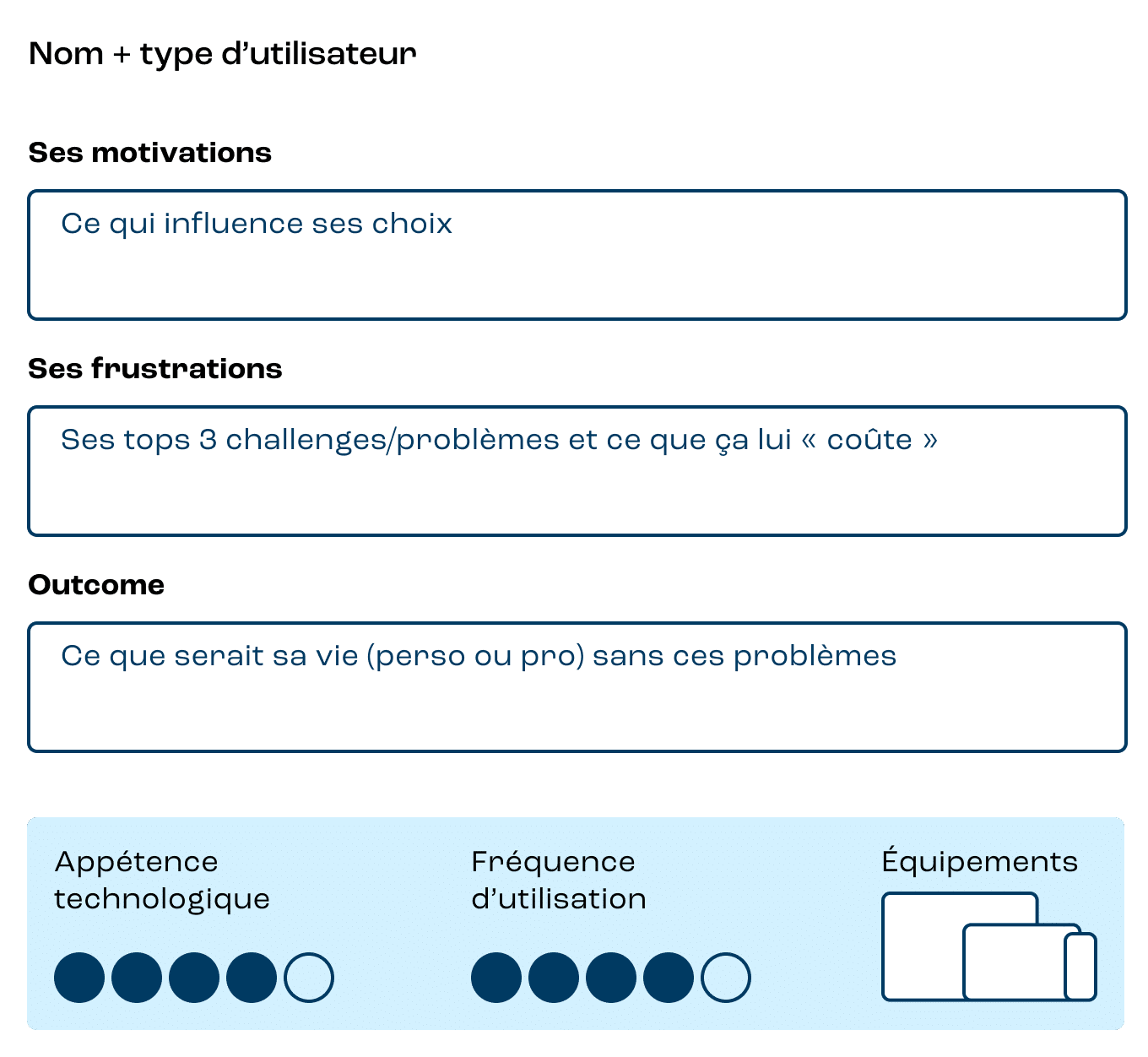
Align diagrams and tables with the style guide
Based on various screenshots, Miro boards, and spreadsheets, we harmonized all the schemas using the tool we use and recommend, Figma.
Choose fonts
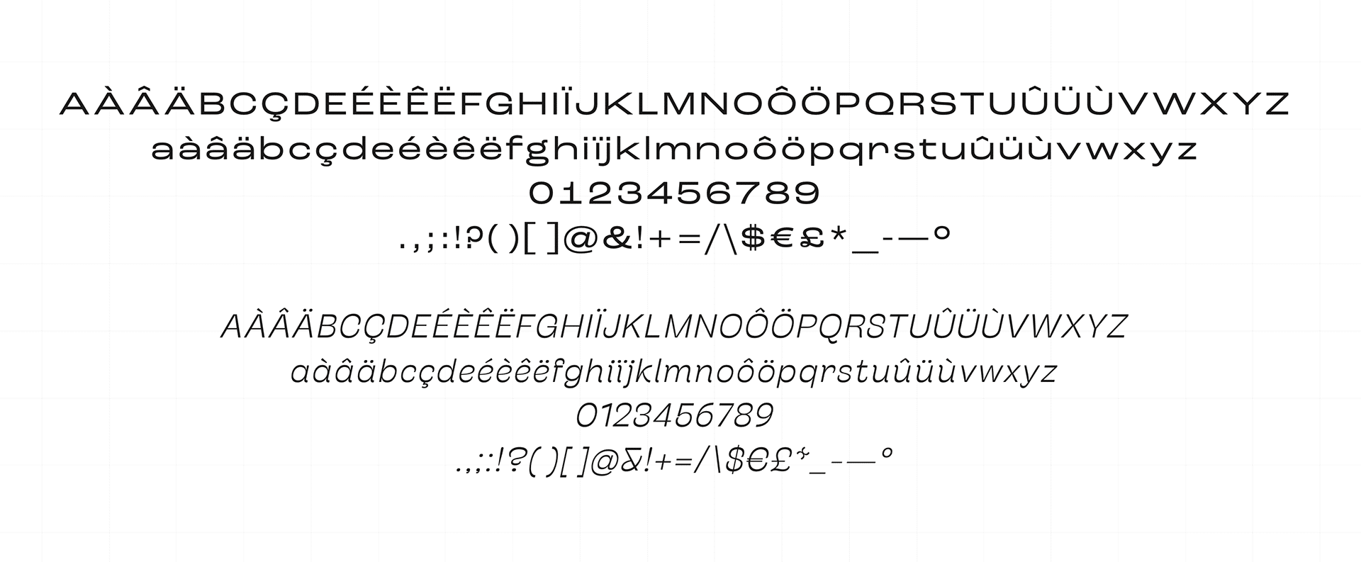
For headings, we chose the Roc Grotesk Wide and Stinger Fit Italic typefaces. The idea here was to create a technical, grounded aesthetic that would be balanced by a typeface intended to be lighter and more dynamic. To complement the body text, we also used Proforma; a fine and elegant typeface that is easily readable on paper.
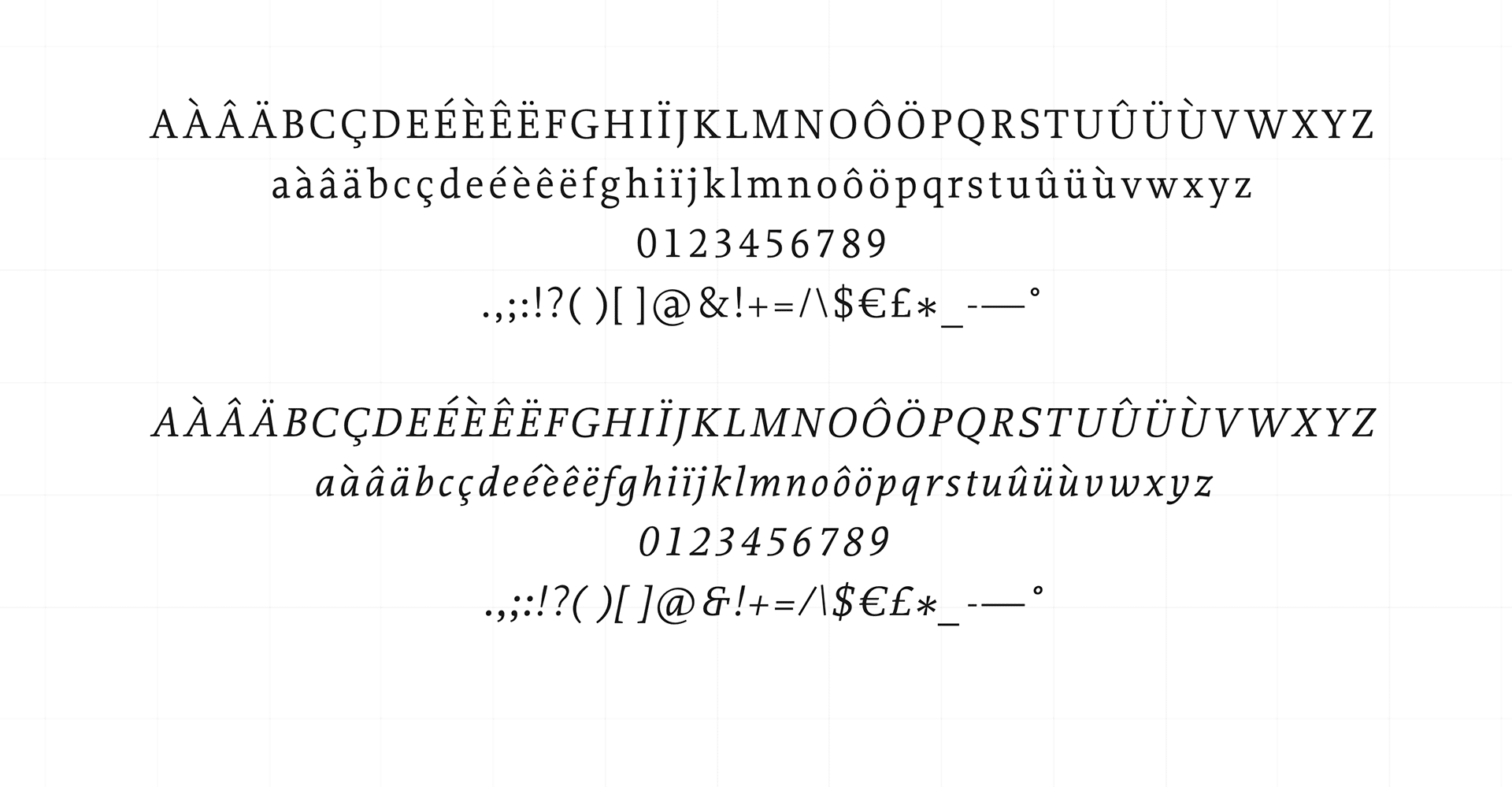
Mockup — Layout choice examples
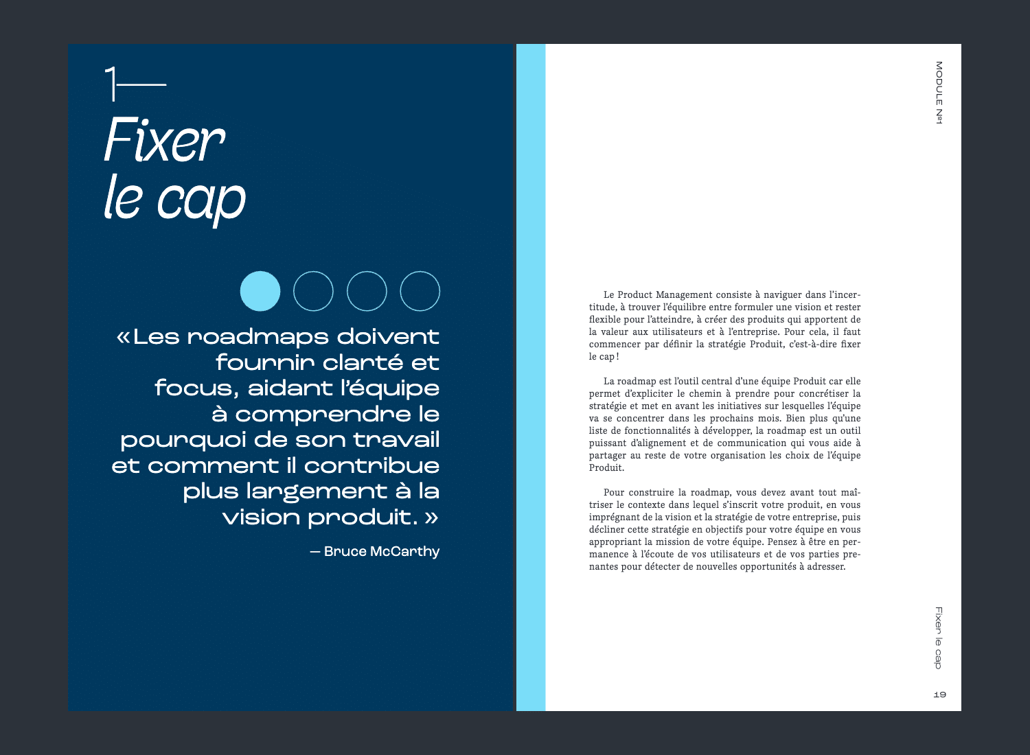
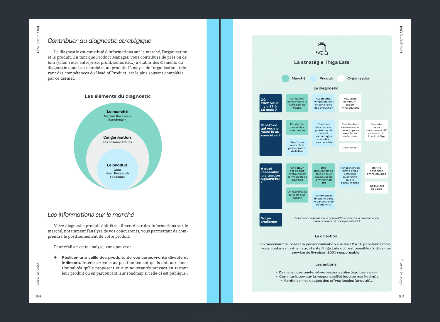
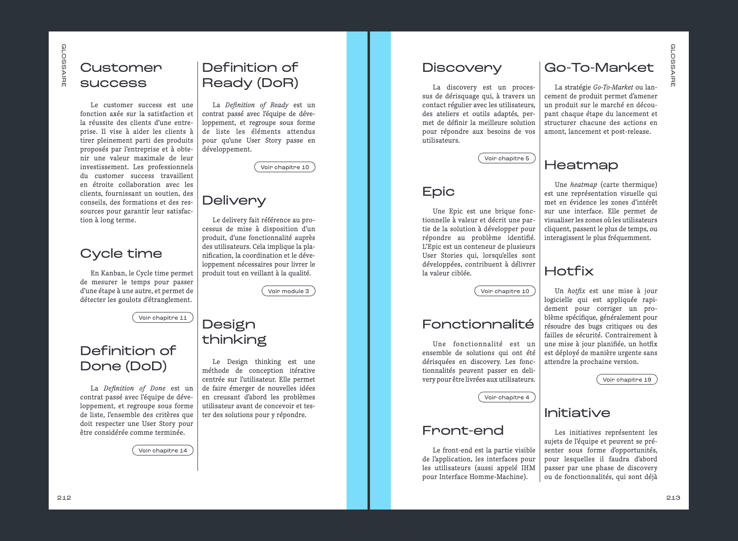
Search coverage
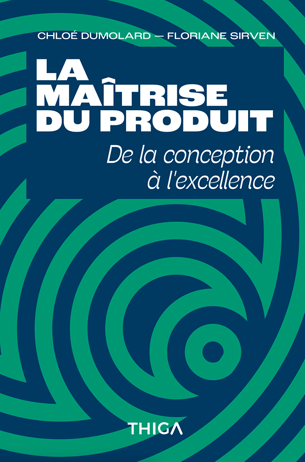
The idea revolved around the four pillars of the book, the flow of the product approach, with green in majesty — it's the key color of the media.
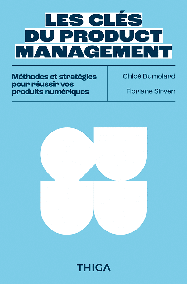
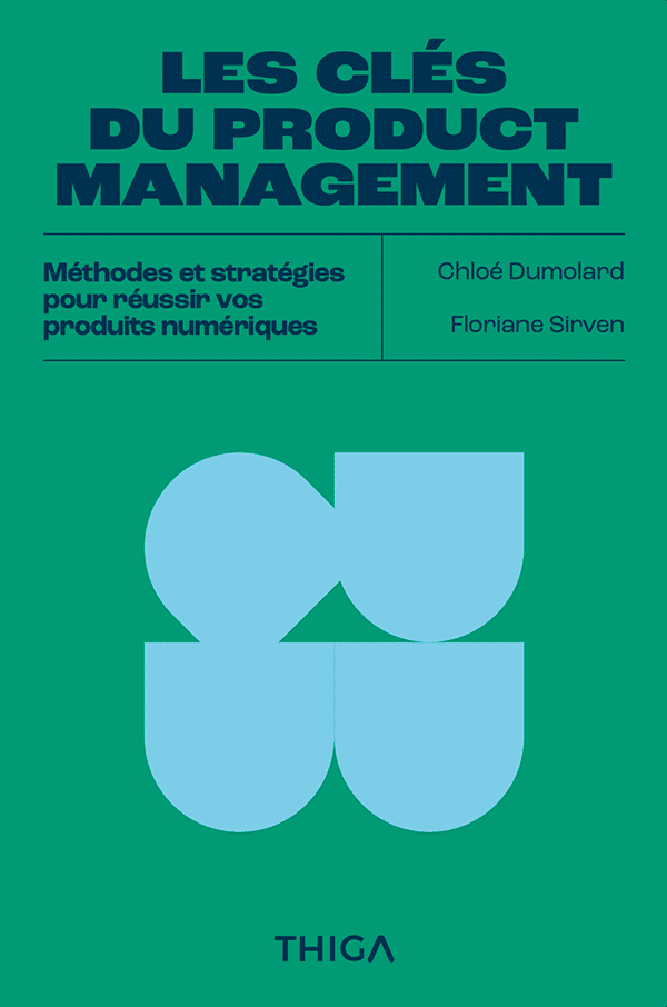

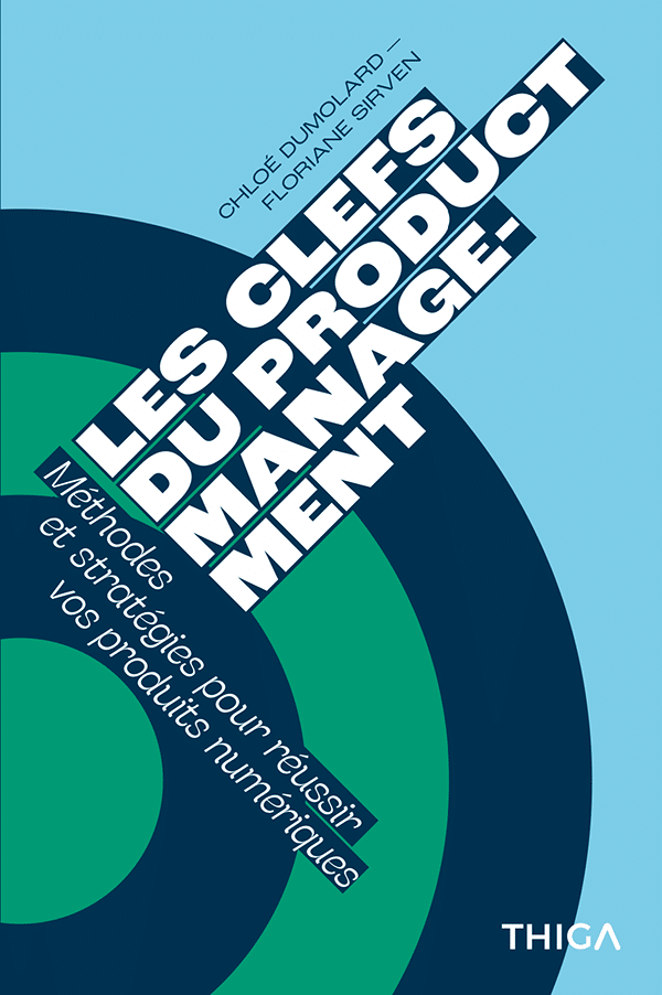



Thiga
Thiga is a consulting firm entirely dedicated to Product disciplines, as well as a media outlet. Thiga supports all disciplines related to Product Management.


