

The context
Create the artistic direction for the new media Les 3 Ours.
Nous avons accompagné les 3 Ours à la définition du projet dans le cadre du Programme Médianes. Au fil de discussions, nous avons réfléchi ensemble à quelle direction ils souhaiteraient prendre pour leur média, ce qu’ils voudraient transmettre. Nous les avons ensuite accompagnés dans la création de cette identité visuelle qu’ils souhaitaient sérieuse et gaie.
At a critical juncture in its development, the media outlet sought to launch a campaign aimed at consolidating its business model and asserting its positioning as an independent legal expertise resource, particularly among a new audience of business professionals (B2B).
We supported the team throughout the entire campaign cycle: defining strategic foundations (editorial and marketing), developing the campaign page (design and tech), and providing operational support throughout the collection period.
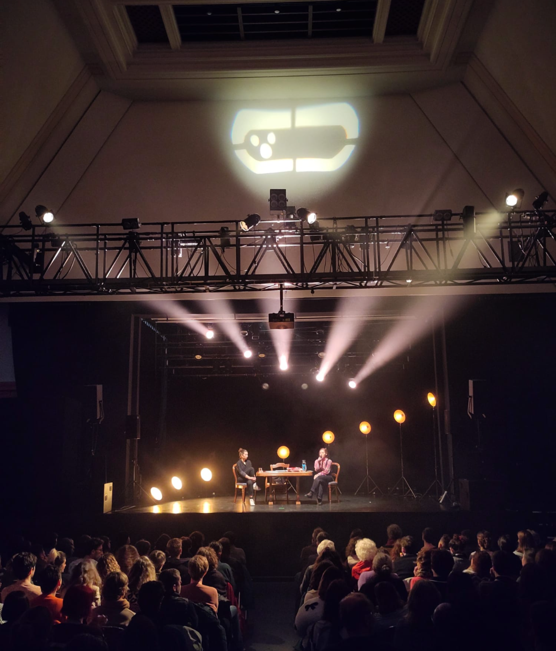
Logo projected at the first public event. Photo: Chloé Maniscalco
Set directions
Build the logo
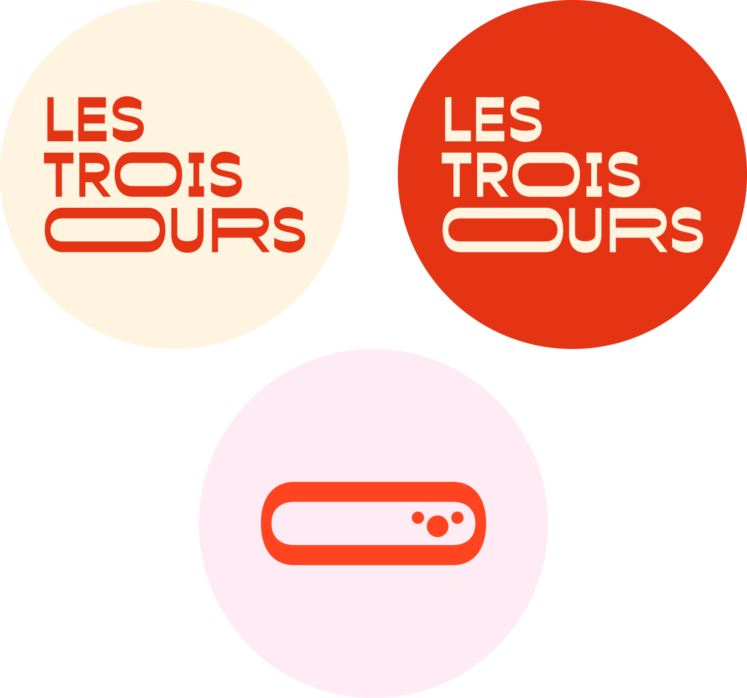
The logo is composed in tiers to recall representations of media. The O stretches like an open mouth speaking, and also evokes the circle that unites us, the circular theater.
The O can contain other circles suggesting a bear's snout or a surprised, curious face.
Choose fonts
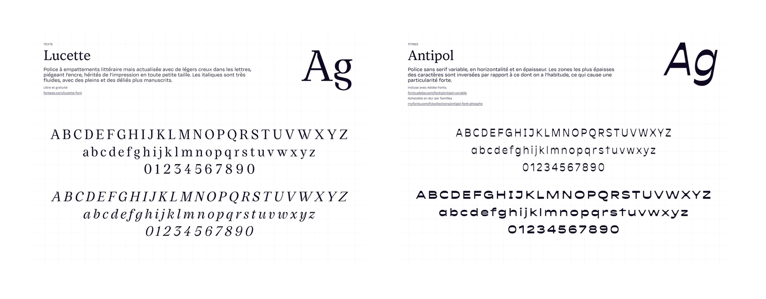
We were looking for a distinctive typeface that would stand out in headlines while remaining highly readable and imbued with a journalistic quality. For body text, we sought a versatile, readable typeface with roots in somewhat rough printing traditions yet possessing an elegant character. To round out the system, we also needed a more conventional sans-serif typeface with a fairly pure design.
Choose colors
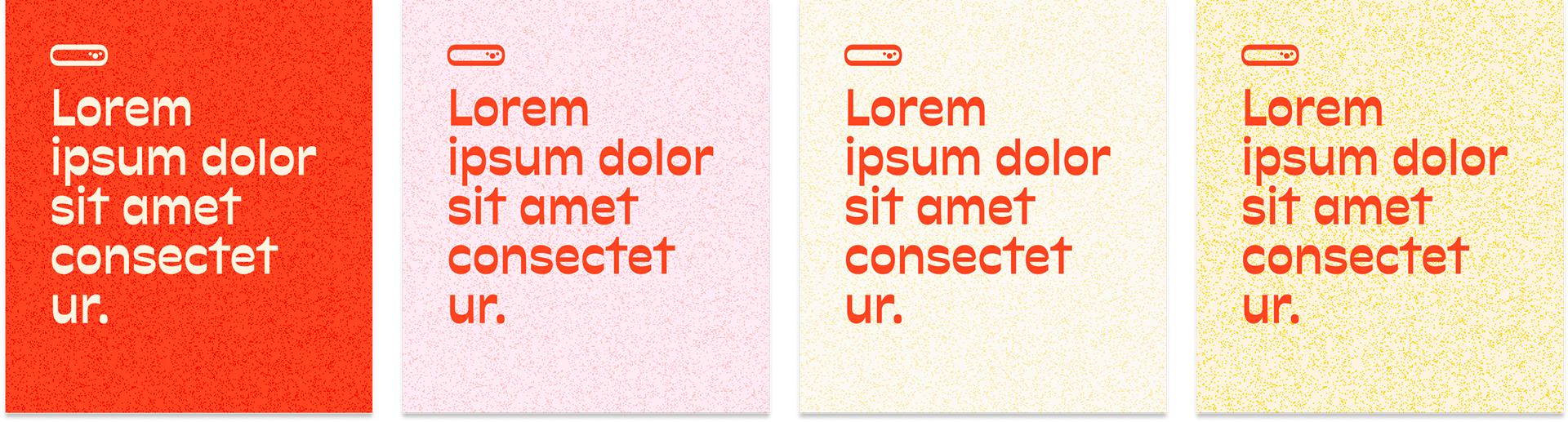
We sought warm colors, some reminiscent of paper, decidedly cheerful, as well as contrasting shades to ensure text remains readable.
About
Les 3 Ours is an independent media outlet founded by Louise Katz, Nathanaël Simon and Julie Lallouët-Geffroy that brings news to the stage in Brittany. They also publish a newsletter and run media literacy workshops.


