


This article is adapted from a masterclass held by Christelle Perrin, co-founder and design director of Médianes, and Maxime Loisel, independent consultant in digital strategy and design, at the Festival des Médias Indépendants in Paris on April 25, 2026.
Design, what exactly are we talking about?
Artistic direction concerns the visual identity as a whole: typefaces, colors, logo, photos and illustrations used in articles or around them. It's a complete system.
Graphic design, which forms the foundation of interface design, encompasses information hierarchy, visual composition, content layout, and clarity of user flows.
At Médianes, we believe that media are global products, where design serves the readership by demonstrating what the media offers—both in terms of editorial positioning and commercial offering. To learn more, you can read our manifesto on the role of graphic design in media.
Why it's strategic for a media outlet
The notion of marketing can raise eyebrows in newsrooms, especially independent ones. But in a capitalist world, a media outlet needs to find its audience and secure funding. It must manage to stand out, be visible to the right people, and convince its audience to pay, donate, or support the project. Design is one of the most powerful tools to get noticed and succeed.
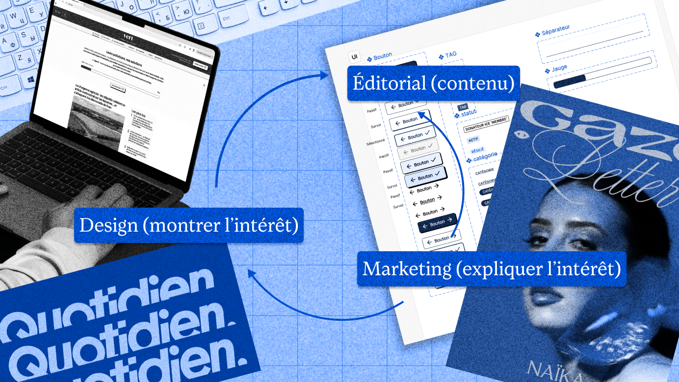
The media's editorial direction produces the content, design makes you want to engage with it, and marketing explains why it's worth subscribing. These three dimensions feed into each other. Separating design from the rest means depriving yourself of an essential lever.

Make the media identity legible
Visual design transmits a signal about what the media is, what it covers, and how. Editorial line, values, tone, positioning: all of this can be felt visually, before you've even read a single word. These visual choices are an integral part of the editorial project.
Here, for example, Quotidien is pop, rounded, dynamic, very colorful, entertaining.

Conversely, Zetland, a Danish media outlet, cultivates something intimate and human in its graphic choices.

Two feminist media: on the left, The 19th: visual codes of intersectional feminism (purple, pink, black) but also codes of mainstream news media (serif typeface, white backgrounds, label/headline/summary/author/featured image/body text structure), which indicates that general politics will be analyzed through the lens of gender and race. At Gaze: more artistic and creative, more focused on photography and careful typography. It's indeed a magazine that celebrates feminine perspectives through intimate narratives, immersion journalism, and extensive photography.

Conversely, a poorly designed interface can create confusion. What is this business shown below, whose labels I've erased? Is it a marble shop, a HiFi store, a phone repair service, a chocolaterie?

It's a bakery (which is actually great) but it doesn't follow the codes we're used to: the whites, beiges, ochres and warm lighting that would evoke flour and fresh bread, or the red that would at least signal a food business.
What matters in design isn't what we like or what's trending right now, but the visual choices that allow people to identify who you are and understand what you offer.
If your visual identity is too similar to another better-known one, there is a risk of confusion.

Evolve your visual identity with your media
The way a media outlet presents itself visually is not set in stone and can evolve with its editorial direction. A visual identity change can also mark a move upmarket, illustrate a change in scale, or signify the opening of a new branch or vertical within that media organization.
To support the professionalization of the ecological media Vert, and its growing credibility, we have refined the visual identity: the shades of green, and the typefaces, the introduction of yellow for donations — with the goal of being more readable and more serious, without becoming elitist.

Clarify the editorial and commercial offering
Design can help make what a media outlet offers more readable.
The website navigation of the media outlet The Funambulist, which examines the connections between politics, space, and individuals, clearly highlights the magazine, podcast, and online articles.

The media outlet The 19th visually integrates its themes (Politics, LGBTQ+, Health, Justice, Caregiving) at the end of articles, which enables recirculation and also a deeper understanding of its editorial direction.

The investigative media outlet Disclose is freely accessible and clearly indicates this at the bottom of articles while making clear calls for donations.

These aren't details: they're choices that make understanding and conversion easier.
Trigger actions
Good web interface design, by explicitly indicating the site structure and offerings, can help trigger newsletter signups, subscriptions, and donations. This comes down to seemingly simple things: readable and well-organized buttons, forms that anticipate common errors, and reassuring payment flows.

In this example, 60 Millions de consommateurs highlights the subscription as the primary action (red box), then newsletter signup as the secondary action (blue box), less prominent but in a prominent position.

On Vert, an independent and free media outlet focused on ecology, donation requests are explicitly featured in multiple places, with the yellow color reserved for this purpose to make what you're reading easier to understand quickly.

On the Politico signup page, each newsletter is displayed with an icon and can be selected to subscribe to multiple newsletters at once.
Make content more enjoyable to read
This is perhaps the most underestimated dimension. We live in an environment of constant overstimulation, especially through screens. Our readers have access to extremely seamless services like Netflix or Apple, and online media are not always known for being pleasant to browse. The structure of an article, the hierarchy of headings, the care taken with typography, the amount of white space around articles, or information overload: all of this shapes reading comfort and contributes to the perception of rigor.

Example with the redesign of the Louie Media newsletter: clarifying the structure by physically separating sections and ensuring a proper heading hierarchy helps readers navigate and stay engaged.
Rather than adding bold to important elements, structuring content with clear heading and subheading levels helps readers navigate and find the information they're looking for.

Readability is also a key concern. Reading comfort—which depends on careful font selection, sizing, weight, and sufficient white space around text to aid concentration—is essential if you want to put your audience in the best frame of mind to read important, dense content.


It's Nice That, a media outlet covering art and design, offers a very clear article structure with minimal distractions, to better showcase the works presented and the texts produced.
There's another important consideration: accessibility. Let's be mindful of insufficient contrast between text and background, and text overlaid on photos that makes reading difficult. Accessibility is a topic in its own right, and we've written a short guide to help you make your newsletters and websites more accessible.
A well-structured page with clear heading levels will be readable by a screen reader, but also clearer for everyone: everyone benefits when we try to be more accessible.

The dark side of design
Design can also be used problematically: large platforms like GAFAM have extensively optimized their interfaces to maximize our attention at every moment: infinite scroll, notifications, short-form content designed for addiction.
Mimicking the design of a reputable news outlet to publish dubious articles while impersonating it was already a common practice; artificial intelligence makes it even easier by being able to retrieve and reproduce the code to deceive users.

In a world saturated with ultra-smooth design, we find ourselves asking: shouldn't we, on the contrary, reintroduce some friction? Independent media could contribute to this by choosing to go against personalization and algorithms, against invasive AI, against information overload. By strengthening print and long-form journalism. By reviving face-to-face encounters. It's also an editorial stance, and design can reflect it.
The questions you're probably asking yourself at this point
That's expensive, isn't it?
That said, we often hear concerns about design costs, especially when budgets are already tight.
In reality, design is an investment that can (and in my view, should) be tailored to the needs and resources of the media outlet. It's not necessarily essential to launch a full brand guidelines manual right away. Depending on the nature of the media, you can start by building a basic visual identity (a simple logo, a headline font, an interface font, a body text font, at most, and a range of primary and secondary colors) that can be adapted to a landing page, a clean newsletter template, templates and usage examples for social networks to facilitate internal adoption, then evolve them gradually. Some media outlets choose to hire a designer very early on, or even found the media with one, when design is at the heart of their value proposition and when that's feasible.
Where to start?
Now, the real prerequisite is being clear about your editorial line, values, and target audience. Design can't compensate for fuzzy positioning, and you'd risk wasting a lot of time and energy going back and forth.
Once that's clear, and your priorities are too, you can write out your needs as clearly as possible and look for a designer to help you. We've prepared a short guide to prepare your creative brief. You can also see what you can do on your own.
Which tools should I use?
For teams without a dedicated designer, the tools vary depending on the medium: Canva or, better since it's more versatile, cleaner, and more comprehensive: Figma, for creating templates to adapt across social media, Adobe Illustrator to produce the logo in vector format, Adobe InDesign for printable paper formats, editing tools like Brevo or Mailchimp for newsletters, Ghost for online articles + newsletter. By the way, we've also written an article to help you choose your newsletter platform.
The use of artificial intelligence in the field of creation deserves careful consideration: AI tends to generate consensual proposals based on the statistical average of what already exists, so it's unlikely that the proposals will be suited to your specific audiences, your use cases, or your value proposition. Moreover, this risks locking you into a black box without knowing how the products were made or how to use them afterward. Not to mention the ethical questions for creative professions, and worse still: the confusion that can arise between what was generated by AI and what was conceived and written by humans. This can lead to distrust from your readership, and the use of generative AI for illustrations or design can thus contribute to diminishing your value proposition.
To go further
- Are you looking for more specific information about the relationship between design and its audience? Read our dedicated article.
- To learn more about our design vision, read our manifesto.
- Need a little help choosing these fonts for your project? This way.
- Kerning, baseline, ligature… a handy glossary for surviving in typographic territory.
- Not sure what to tell your designer to get the project started? A few starting points.
- Putting lots of passages in bold in a text isn't necessarily a good idea? We explore this further here.
- And as a bonus gift, a guide to make your newsletters more accessible.


