Name: It's Nice That
Nationality : British
Year of creation : 2007
Founders : Not specified
Business model : Part of The HudsonBec Group which is part of Residence
Platform : Web
Media type: News and visual culture
Publication language(s): English
I discovered It's Nice That during an internship at an advertising agency, around the turn of 2013 — at the same time as the wonderful site/blog FFFFOUND!, which compiled excellent graphic design projects, sadly no longer around. At the time, I was fresh out of secondary school, with a particularly vague idea of what career I wanted to pursue. Graphic design didn't really interest me, but encountering It's Nice That was a shock: wait, there are that many different kinds of graphic design? How is it that people create, by hand, these ads and posters you see on the street? Who comes up with all these great ideas? And what could a site like that possibly be for?
Reflecting on what shapes a practice
What makes It's Nice That particularly valuable, in my view, is what often goes missing from graphic culture magazines and websites: beyond finished projects, away from innovation and big names, it takes time to think about what we do, who we are, what graphic design could be or might become today: ecologist, queer, feminist, humble?
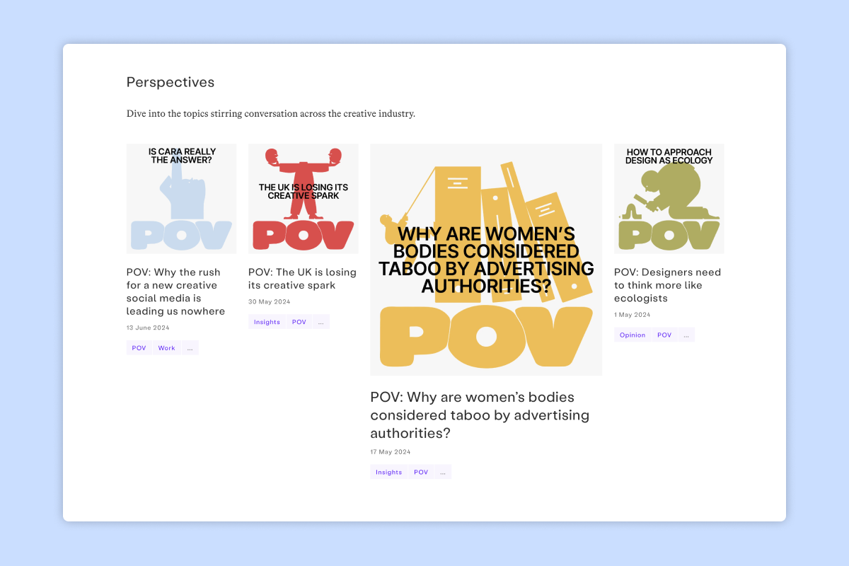
These ideas have been nagging at you for ages, and sometimes it seems there's nothing to think about them because they seem so obvious: of course I'd rather create design that's useful, pleasant for the people who receive it, legible, than something innovative, fun to make, or flattering to my ego. That is, until you read the words of someone articulating perfectly what bothers you, what intrigues you, and shines new light on it. No, none of this is innate, much less natural.
The media outlet also organizes events, the Nicer Tuesdays: weekly meetups in London where creatives can learn and share their ideas.
You'll also find a section entirely dedicated to interviews, conversations with creatives — graphic designers, photographers, artists…
Reading this content prompts us to think about the reasons behind changes and developments, why a project is carried out in one way rather than another, and ultimately to look beyond personal preference to understand a product.
Get inspired by others' work
When curiosity peaks or inspiration runs dry, it's always salvation to look closely or from afar at the forms proliferating on It's Nice That's pages, to see for example how Figma designed the visual identity for a conference, or to hunt down what's new, the way you'd keep up with movie releases. Hey, did you see Spotify's new typeface ? Why did they spend so much money changing something most people won't consciously notice ? And it's fascinating how the Guardian switched from digital to paper and scissors to make their visuals, at a time when photorealistic visuals generated by artificial intelligence blur the line between real and fake, don't you think ?
Politically, one can dwell on the role of graphic designers by offering, for example, royalty-free posters that are freely modifiable.
It's also possible to see what emerges if you try to push a concept to its limit: creating a visual identity using only circles in three colors?
It's Nice That has blessed this world with its existence since 2007. It was launched with the goal of "inspiring the global creative community, [sharing] stories, perspectives and [bringing] people together to help them make the most of their creativity."
Digging a bit deeper, we learn that the project was born in response to a university's request to publish something that would help people feel more comfortable in their shoes. That gives us something to work with.
Rest in a calming environment
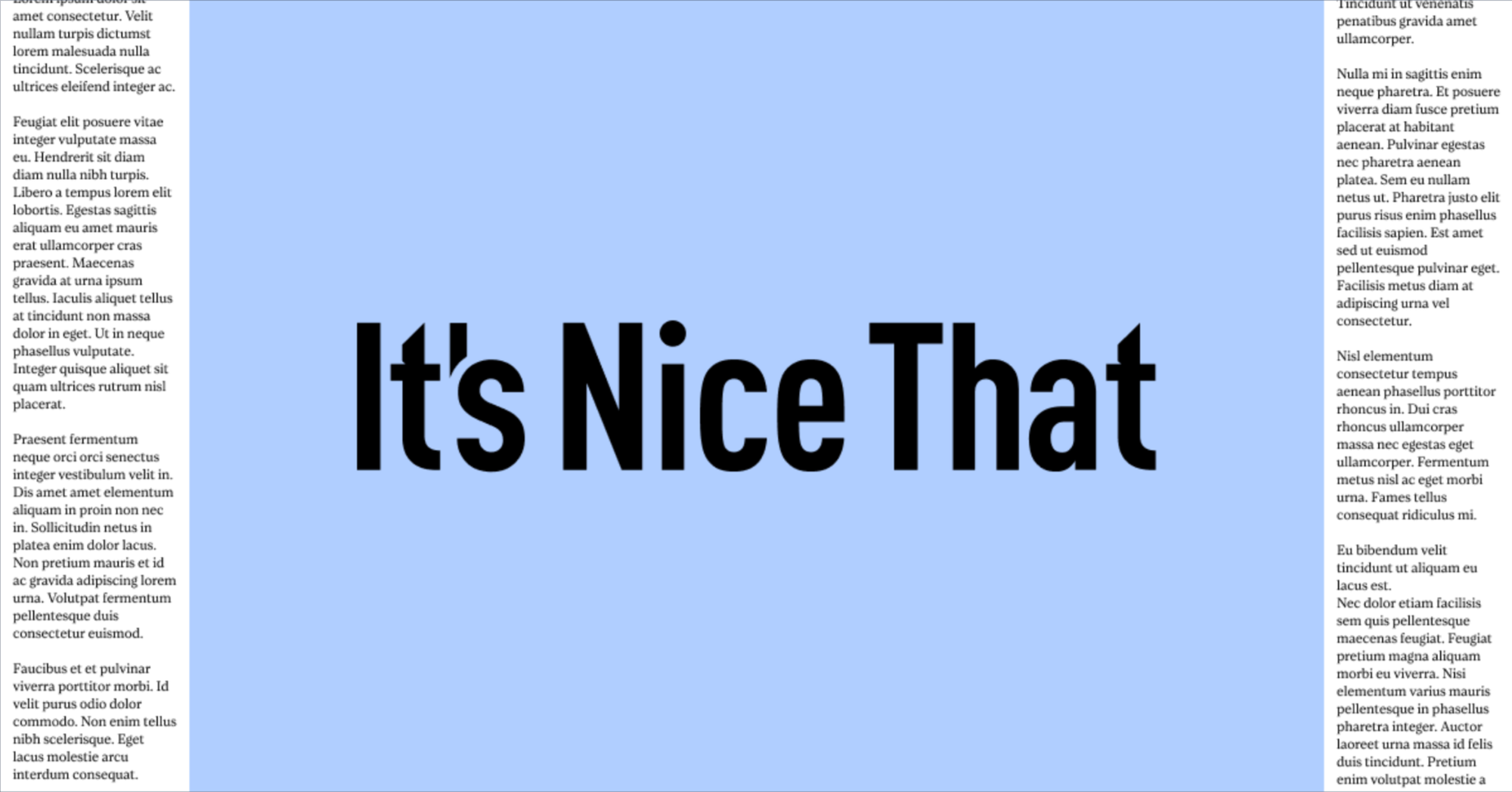
Visually, the It's Nice That website is a gem, and a showcase of best practices. The structure is clear, sections are well-defined, and the hierarchy between heading and text levels is transparent.
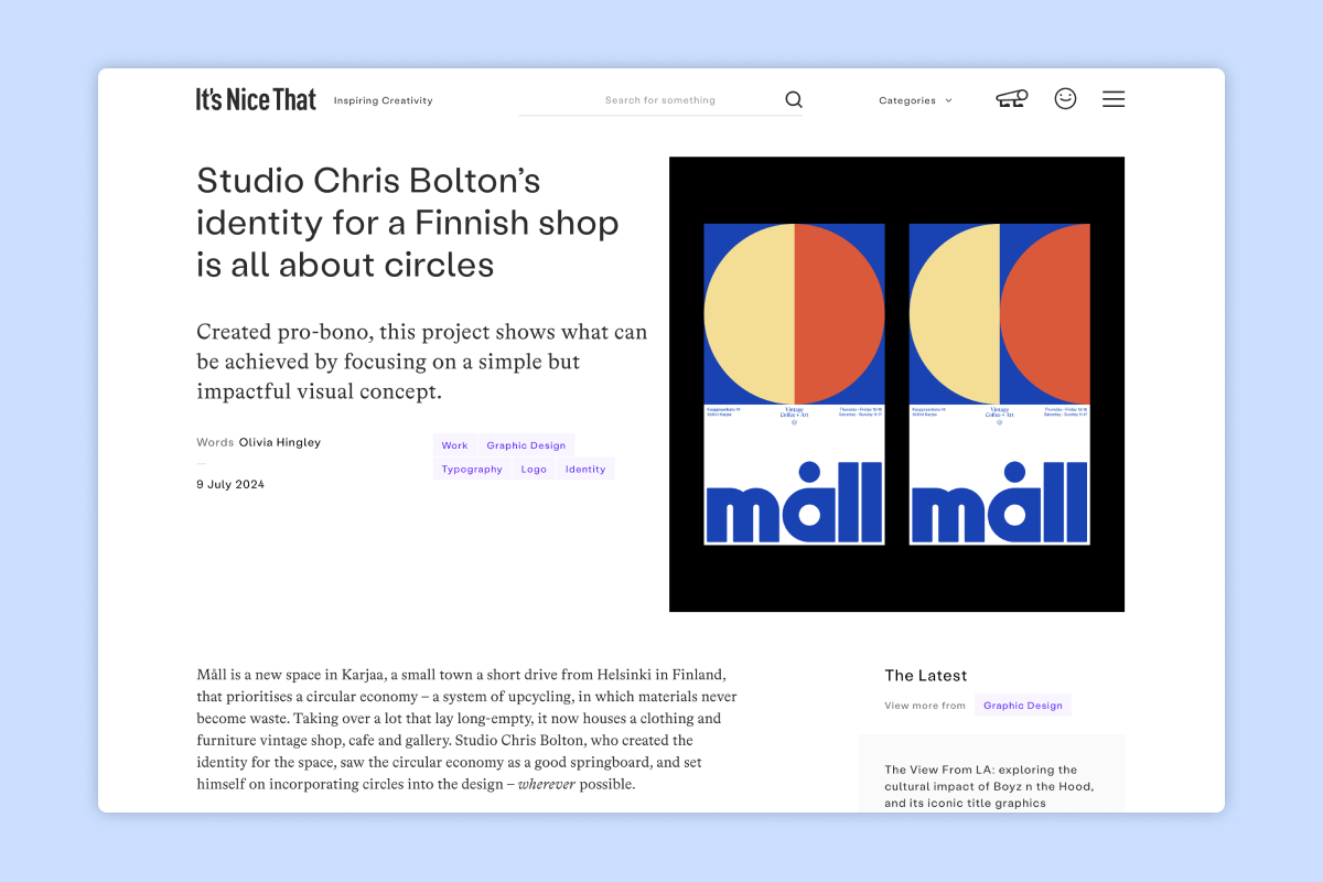
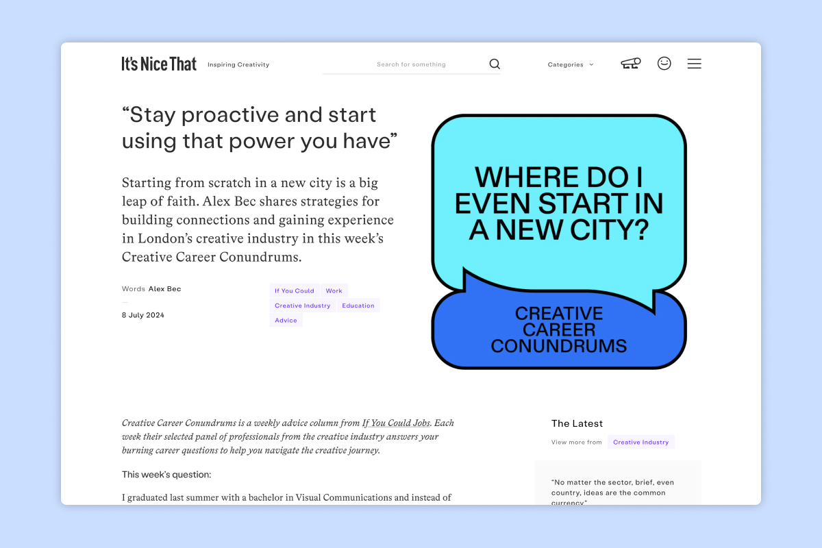
Since the site is a showcase that highlights many visual projects, the media's visual identity is understated — color only appearing on category tags and on hovering over clickable links, with everything else in black and white — yet also very refined, with highly readable and comfortable typefaces. Every detail is delicately calibrated, it's a feast for the eyes.
To go further
- The media that intrigued Maëlle, Marine and Pauline in recent months: It's Freezing in LA!, Les Autres Possibles, Surf Session and Sabir.
- Need some inspiration? Maëlle shares her tips for discovering new things to watch.
- Do you need a graphic designer but aren't sure how to approach them or explain what you need? Check out our guide to creative briefs.
- Do these discussions about fonts make you want to better understand the terminology? Our glossary is made for you.
- Looking for places to find beautiful free fonts, then get help choosing them? Look no further.