



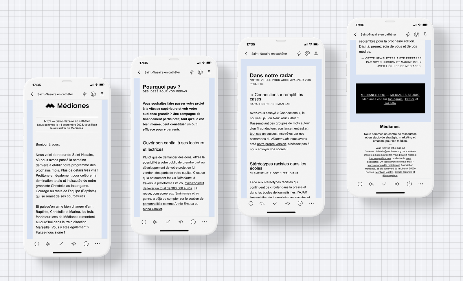
Whether you're using Mailchimp, Brevo (formerly Sendinblue), Beehiiv, Kessel, Substack, or others, the design and technical limitations of newsletters go hand in hand with what they fundamentally are: emails.
Email is an old tool that has changed very little since the 1980s in its essence: text lines, images, and limited formatting options, which are then reinterpreted by the email client (dedicated software or webmail) that receives it (Gmail, Thunderbird, Outlook, Yahoo, Apple Mail…).
Keep in mind
Be mindful of your newsletter's weight
Gmail truncates all emails larger than 102 KB and hides the remaining content behind a slightly visible "Display entire message" link: this cuts off your email reading and also interrupts any open rate tracking. Each character in the code weighs approximately 1 to 2 bytes.
You need to make sure the plain text isn't too long and that your email's source code is clean. Contrary to what you might think, when you insert an image in your editor, it doesn't increase your email's file size, because those images are loaded from the mail service's server. If you frequently run into file size issues, you can use services like Emailcrush to minify (reduce code size) your emails. In that case, you'll need to send your email as "raw HTML code".
Ensure deliverability
Non-existent or inactive email addresses can impact email deliverability. Indeed, after multiple repeated sends to the same incorrect email address, providers may flag the sender of these emails as spam. A first step to ensure this is to enable double opt-in, meaning sending a confirmation email before subscription to the list: this will help you avoid emails with typos. A second step is to maintain your contact list, like tending a garden. You can regularly send emails to your database to remove people who never open your emails anymore, as they negatively impact your deliverability. Finally, you must ensure that your emails are properly authenticated as coming from you and are not blocked by spam filters. To check your emails and get the steps to follow, you can use a tool like Mail-Tester.
Choose your colors for good accessibility
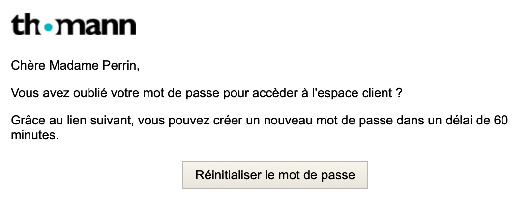
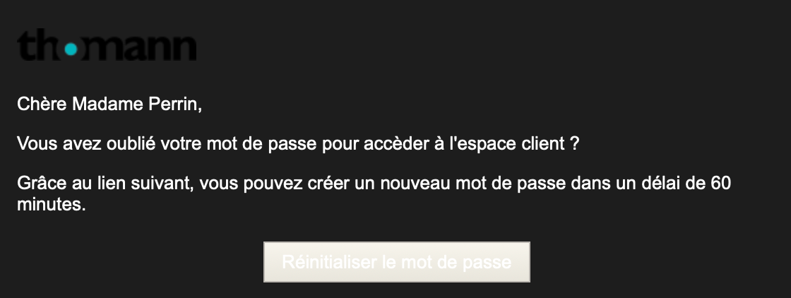
Contrast must be sufficient between the background color and text color to ensure they can be comfortably read by as many people as possible, including those who are colorblind and those with lower visual acuity.
- A testing tool that allows you to check contrast adequacy by previewing how it would look for people who see colors differently.
- Everything you need to know about the General Accessibility Improvement Framework (RGAA), which goes far beyond just contrast.
Additionally, dark mode on devices can invert whites and blacks: to prevent this, you can save a color code that is neither pure white (#FFFFFF) nor pure black (#000000)
Choose your fonts
Only a small number of fonts are installed on all browsers, all systems, and will display with certainty the same way for every user; these are called "web safe" or "system fonts":
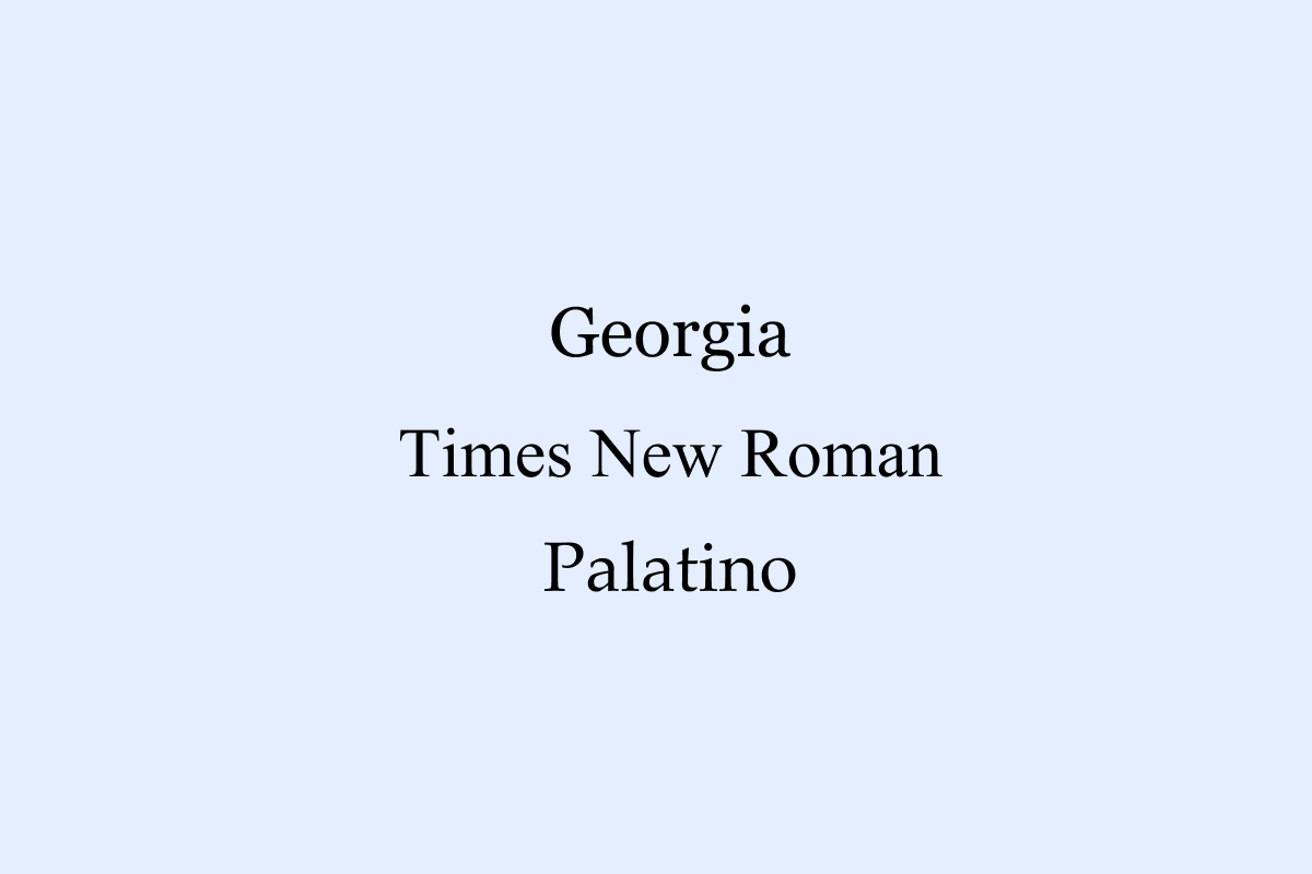
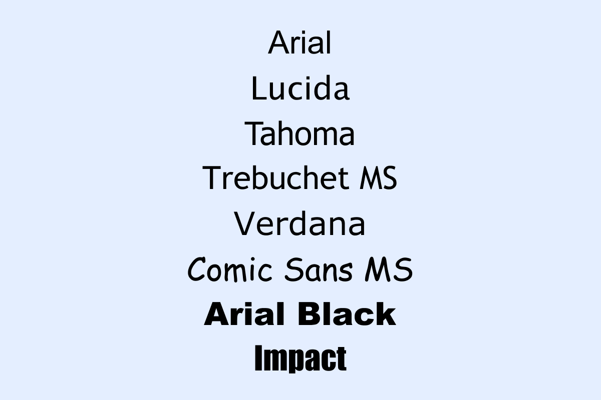
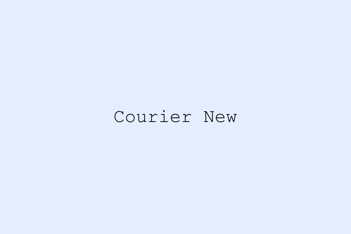
It's possible to use what are called webfonts — fonts hosted online, not permanently installed on systems. While they offer more options and variety than the system fonts listed above, they're not supported by all email services. If necessary, the font will be replaced by a fallback font from the system fonts. Your email may not look exactly the same to different recipients. This is why we don't often recommend using them.
- Serif, sans-serif… Want to learn more about fonts? Check out our help guide.
- Need a little help choosing a font type? Read our article on the topic.
To check how your emails look across multiple email clients, you can use tools like Litmus or Email On Acid. Additionally, these types of tools are sometimes available in email services under the Preview section, for example with Mailchimp and Brevo.
Technical style limitations
Sometimes, template editors built into sending services like Mailchimp or Brevo limit your creativity. It often won't be possible, for example, to add a border around a block containing multiple elements.
If you want to take it further, you can develop your email template code yourself, but you'll have to forego a drag-and-drop visual editor. Alternatives to the built-in email builders also exist, such as the excellent Stripo.
You may sometimes be tempted to work around these topics by using images to replace headings, but this is a very bad idea for two reasons. First, images are not all displayed by default in email clients, and you must ensure your newsletter is readable without them. Second, text search and mobile display could be impacted.
If you insert text elements as images, you must also ensure they will be readable on both mobile and desktop. For example, put the tagline as free text rather than in the logo, so it can adapt to the screen size and remain readable.
Does a newsletter have to be ugly?
What can you do within the constraints of editors integrated into sending services? Overall, you can modify fonts (within the limits mentioned above), colors (same caveat), add images, including as backgrounds or within blocks, add action buttons and links, but many more sophisticated effects will require HTML code, ranging from lightweight to heavy, which makes the newsletter template difficult to use.
It is our view that these constraints should not lead to abandoning graphic design, but rather that one can find a layout suited both to the spirit of the project and to technical limitations. On the editorial side, the key is to simplify the structure as much as possible to keep an email visually light. The watchwords are clarity and restraint.
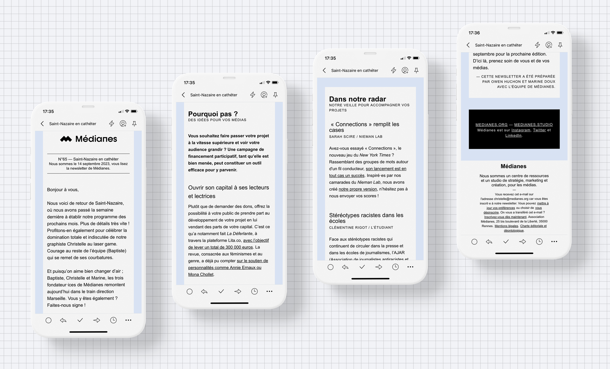
That's why for Médianes' monitoring newsletter, we favor a simple structure with few different heading levels and white blocks that separate sections, all positioned at the same level.
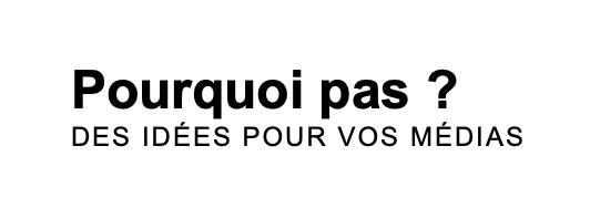
We took the liberty of using a line of code to increase letter spacing in the subtitle to create rhythm and add a subtle distinctive touch — this on small sections of text that rarely change, so content updates won't become a headache.
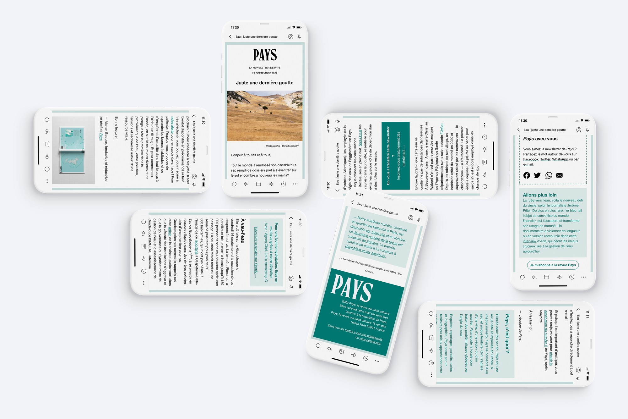
These same principles are used for the Pays newsletter, a media outlet cofounded by Médianes, with hyperlinks and blocks that are more colorful and differentiated. Since the newsletter uses the colors from the latest print issue to signal a new publication, it was important to make them stand out.
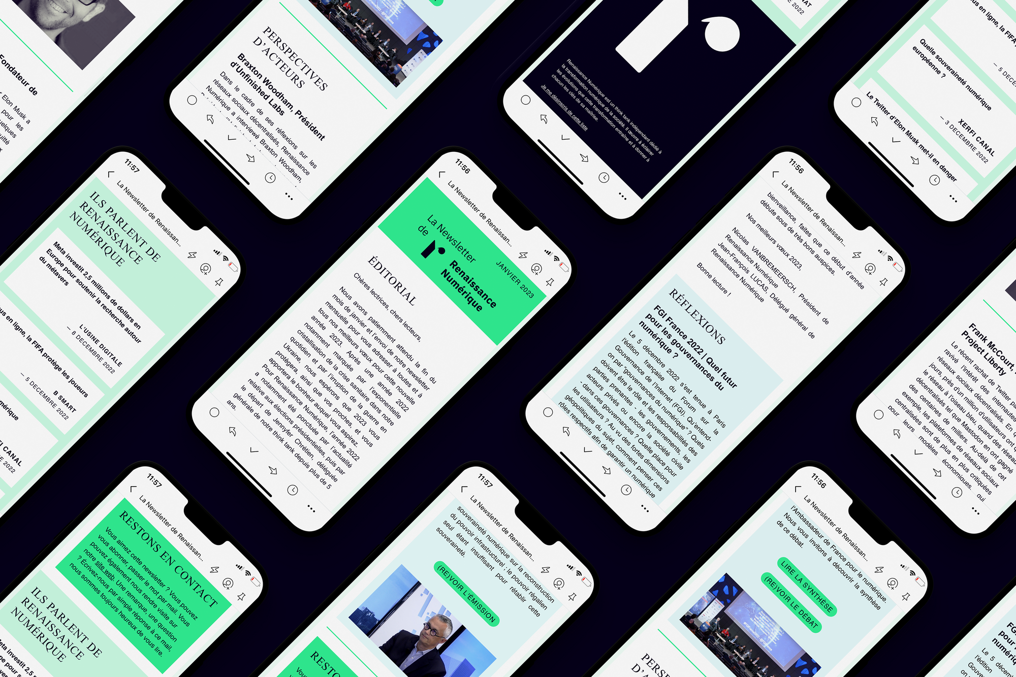
For the Renaissance Numérique think tank, our studio created a clean main column with no background, so that the colored blocks with distinct roles stand out even more.
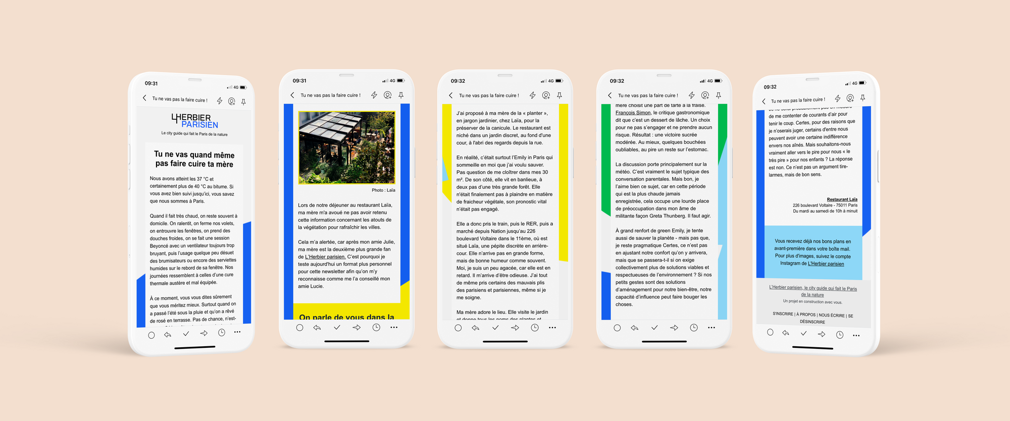
Since we had created a rich visual identity for l'Herbier parisien featuring geometric forms and saturated colors, we used them as a background image for the newsletter.
Designing a newsletter is an exercise in balancing aesthetics and functionality while navigating the technical and design constraints imposed by different email services and clients. The inherent limitations of email shouldn't be seen as obstacles but rather as creative challenges. They push us to rethink our design approach, simplify our content, and be resourceful in how we use visual and textual elements.
The key lies in adaptability and understanding the tools at our disposal. Whether it's file size, deliverability, accessibility or typographic choices, every detail matters and can have a significant impact on your communication's effectiveness.
A well-designed newsletter is more than just an email. It's a powerful tool that, when executed well, can not only inform but also engage, inspire and build a genuine community around your media. And that's where the true beauty of this seemingly simple and limited, yet incredibly versatile tool lies.


