This notice is a supplement to the article But what does the police do.
Glossary
Font: a complete set of characters in all their weights (strokes that are thicker or thinner) and styles (roman (=upright, normal, regular, default) or italic (slanted)
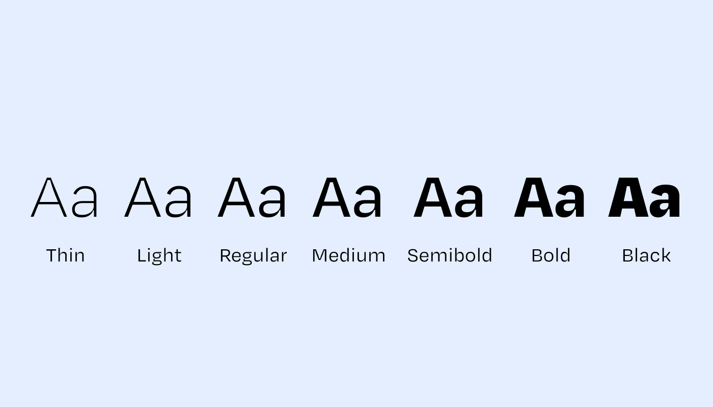
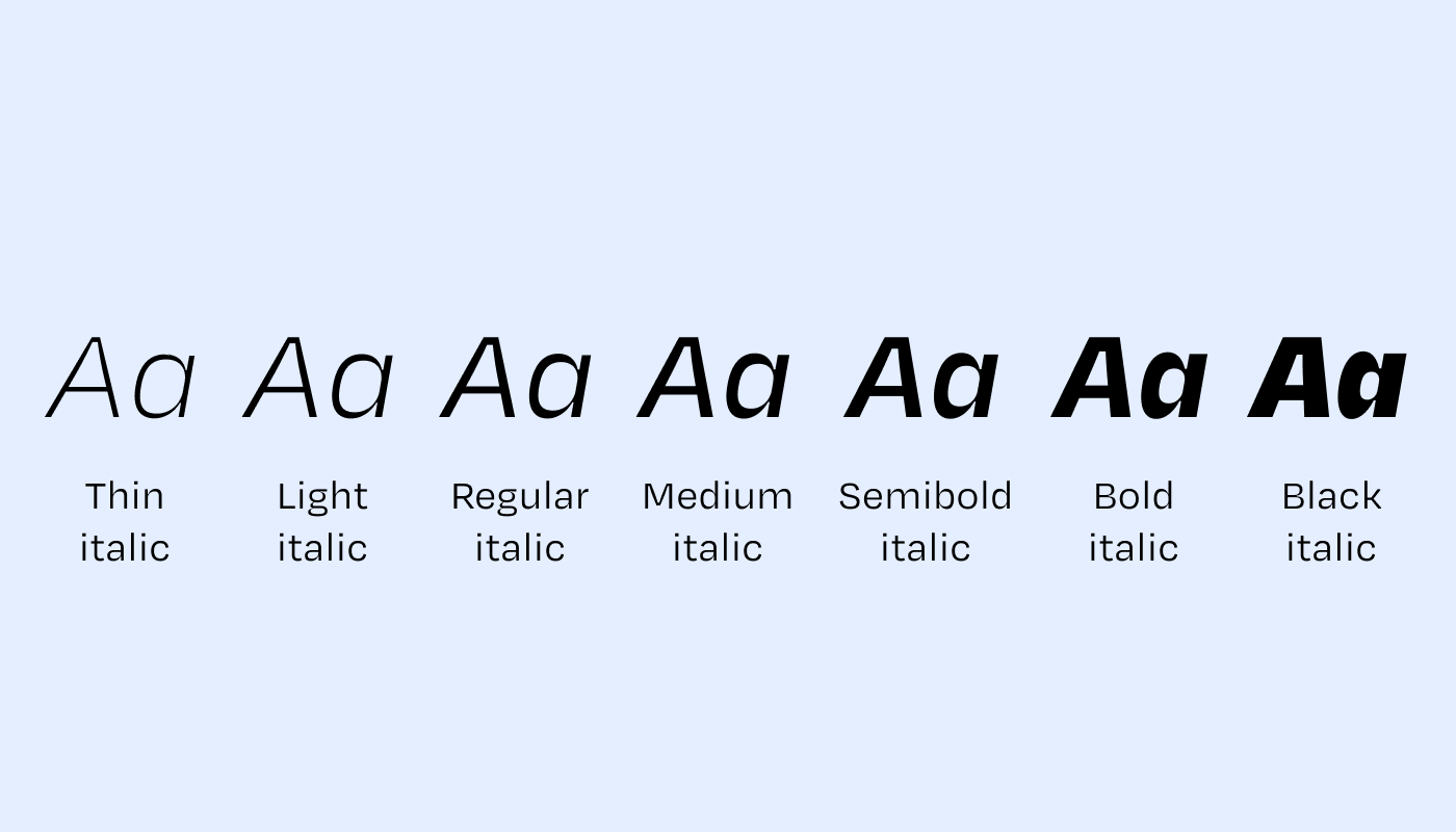
NB: bold should be used to differentiate heading levels and the lead paragraph—the structure of the text, rather than embellishing it in the body copy. Italics, for their part, are used for titles of works, names of media, and passages in foreign languages.
Source: a specific setting of a typeface. Encompasses size, weight, and style. It's a term inherited from characters cast in lead: indeed, when you have a physical character meant to be inked and then struck against paper, it's difficult at that stage to change its size, thickness, or style.
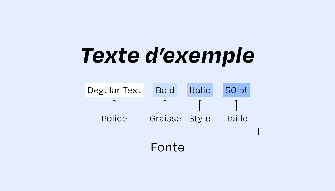
Typography (abbreviated typo): portmanteau often used to refer to a typeface or even a font. Originally, typography is the name of the discipline of character design, with typographers being the people who design typefaces.
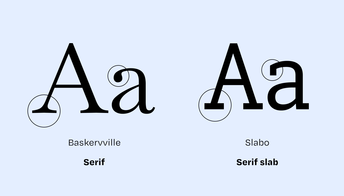
Serif: typeface with serifs. Perceived as literary, traditional, elegant, refined. Often easier to read in print. A variant of the slab (or Egyptian) typeface with straight serifs that are more mechanical. These are fonts commonly used for body text.
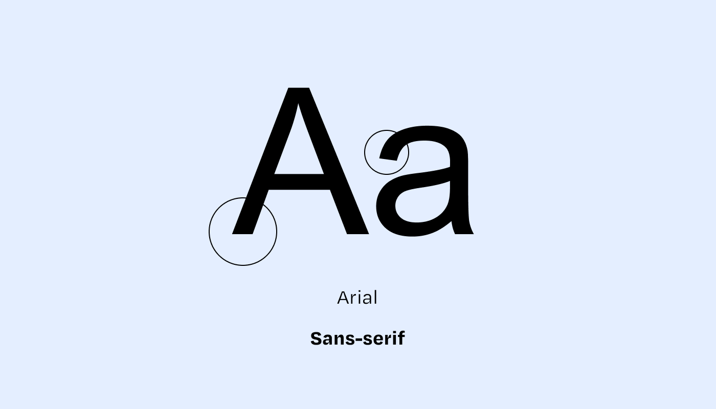
Sans-serif: typeface without serifs, also known by various names depending on language heritage: linear, gothic, grotesque, or simply
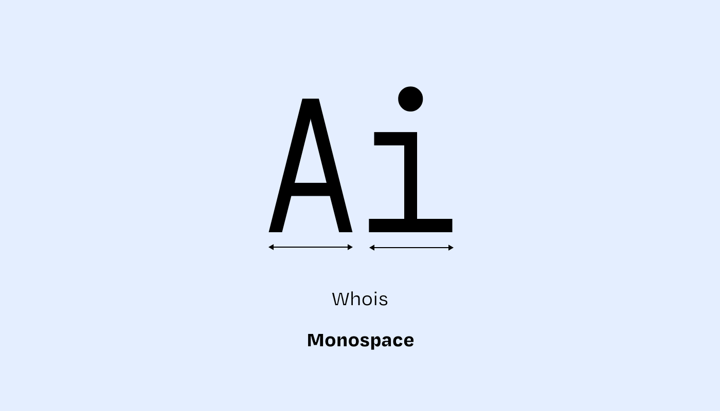
Monospace: each character or space has the same width. This is called fixed-width or fixed pitch. These are fonts inherited from the typewriter and are widely used for writing computer code. Depending on the font, they can be perceived as vintage (typewriter) or very tech (reminiscent of lines of code)
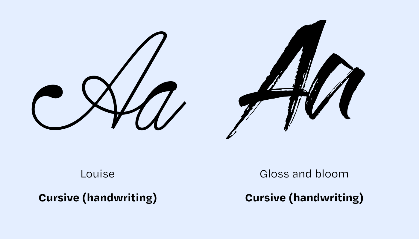
Handwriting or script: mimics handwritten text (with a pen, marker, etc.). Not always very legible. When well executed, perceived as authentic and relaxed, but generally quite awkward because handmade imitations rarely deceive and ultimately feel quite artificial. Might as well write by hand for real (using a tablet and stylus, for example).
Display: a category sometimes found that groups typefaces that might fall into one of the three above categories, but is designed and optimized for large sizes, headlines, and not for long body text.
Note: not all typefaces within the same font family are equal. Look at the curves, angles, contrasts, and serifs — which can evoke softness, dynamism, aggression, or solidity, depending on the case…
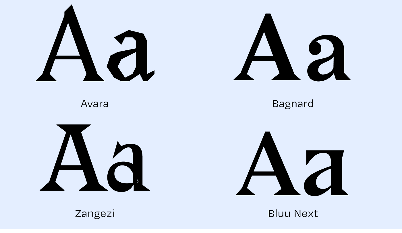
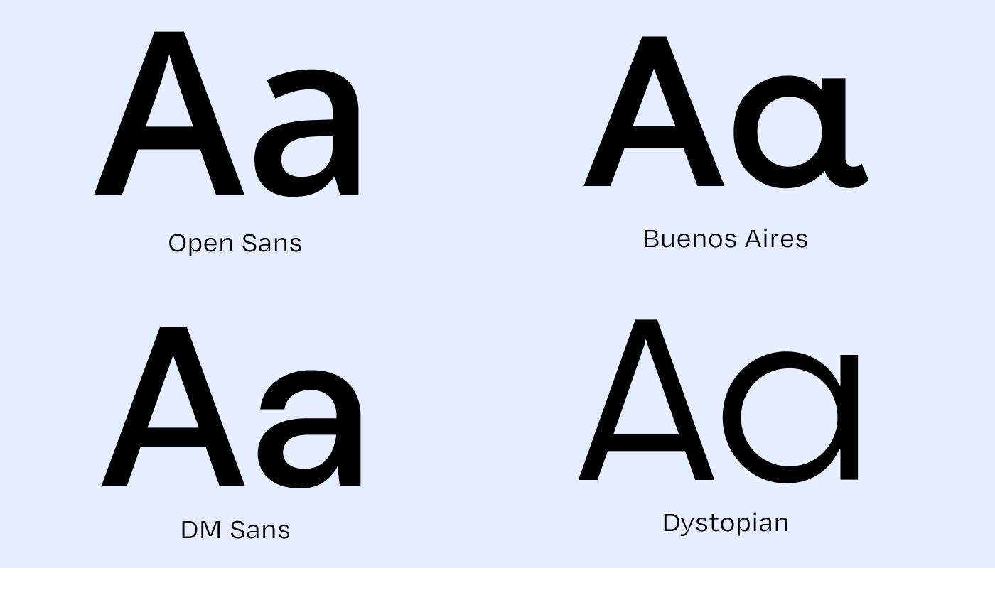
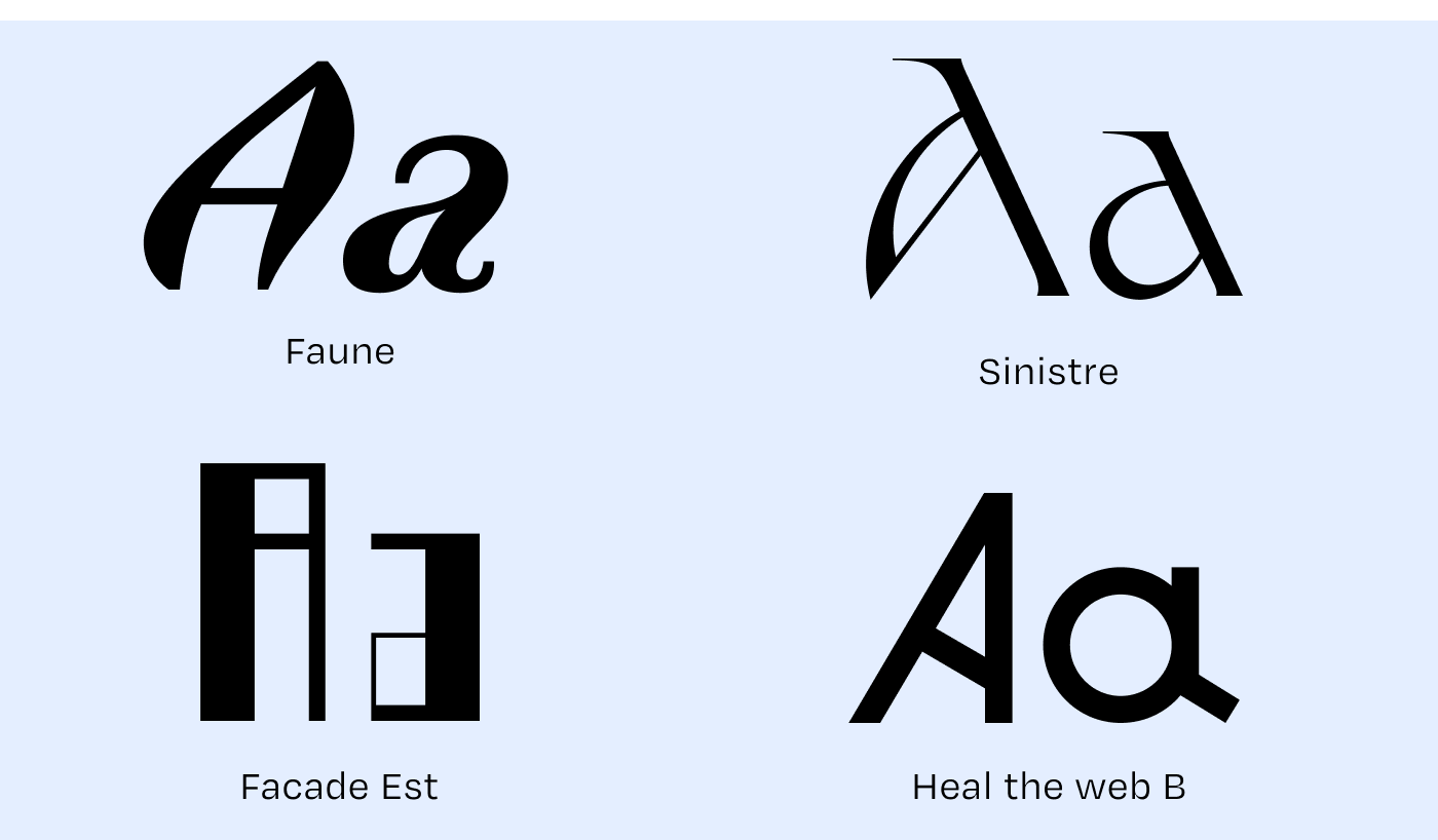
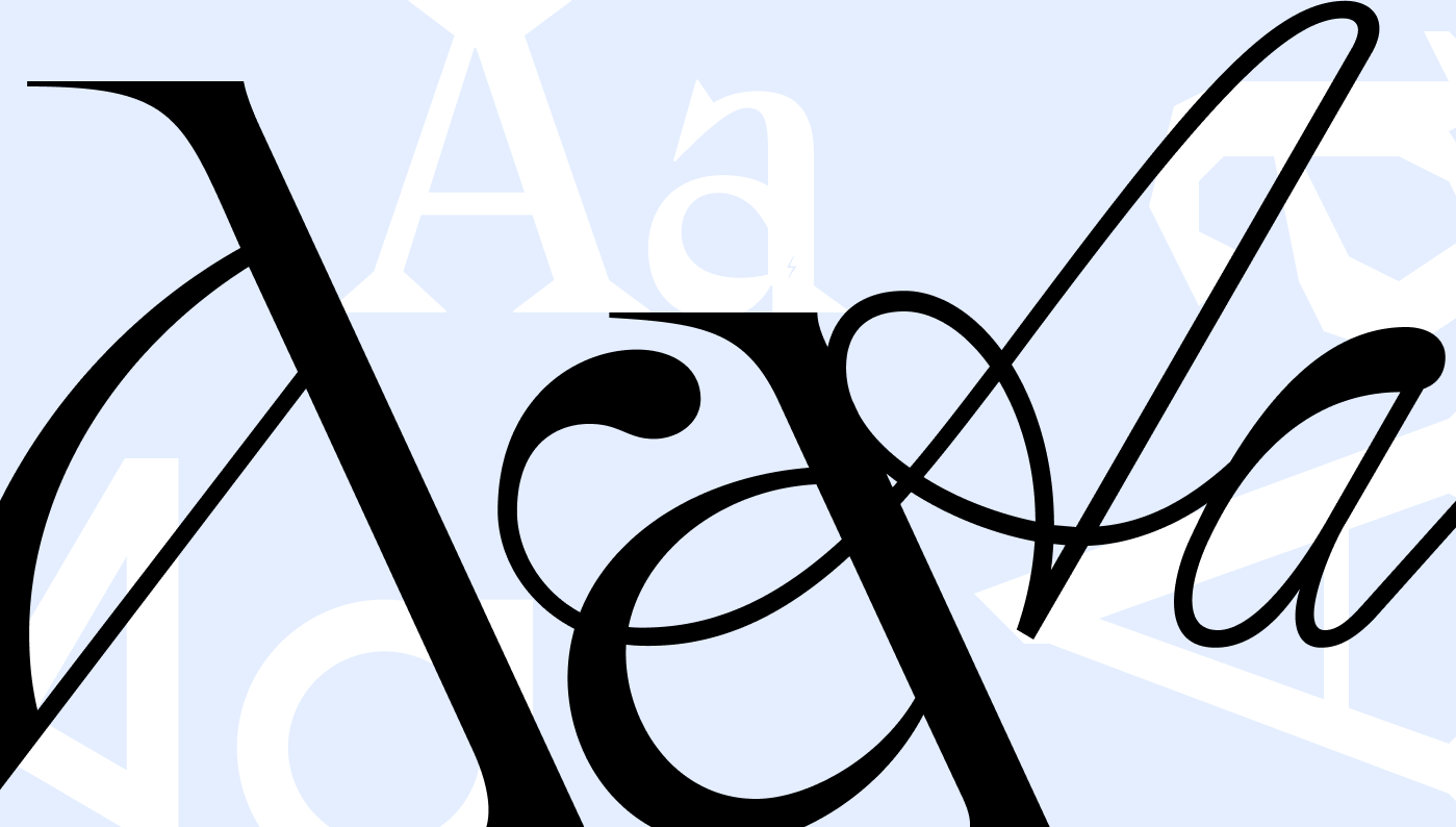
Character (or glyph): letters, accented letters, numerals, punctuation, ligatures, symbols… Each glyph is drawn by typographers.
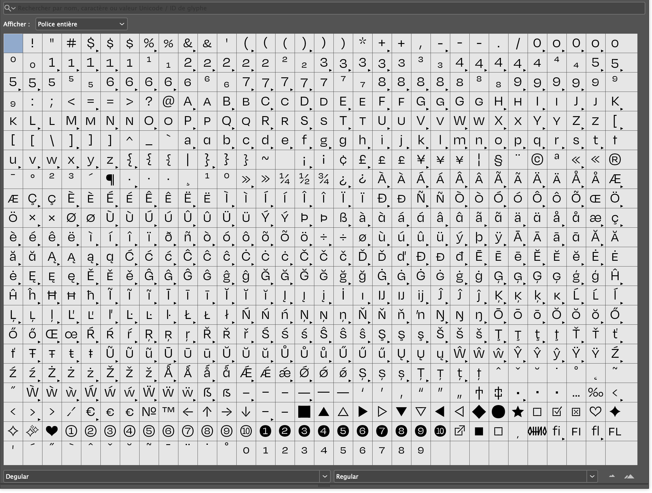
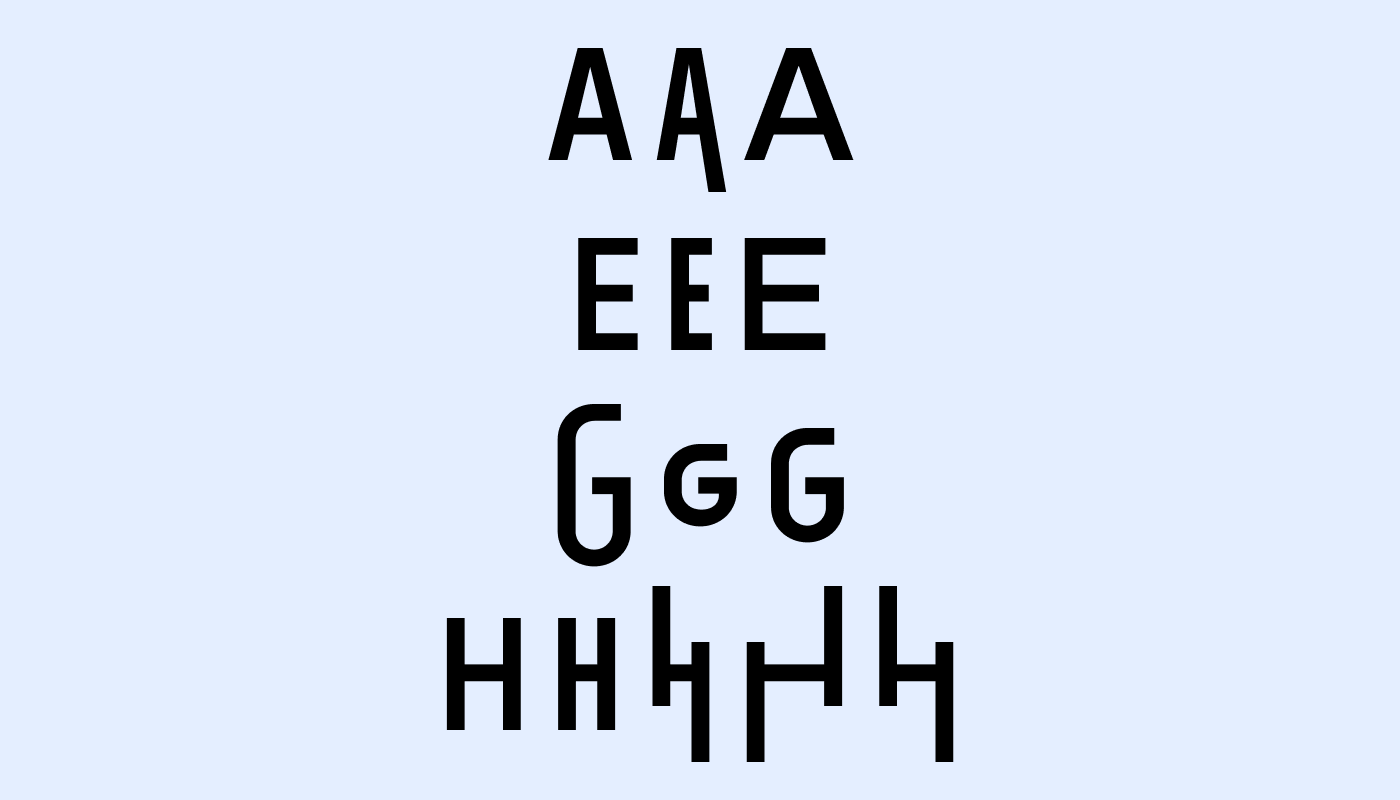
OpenType: supplementary features allow you to embed character variants within a font, which you can then select from.
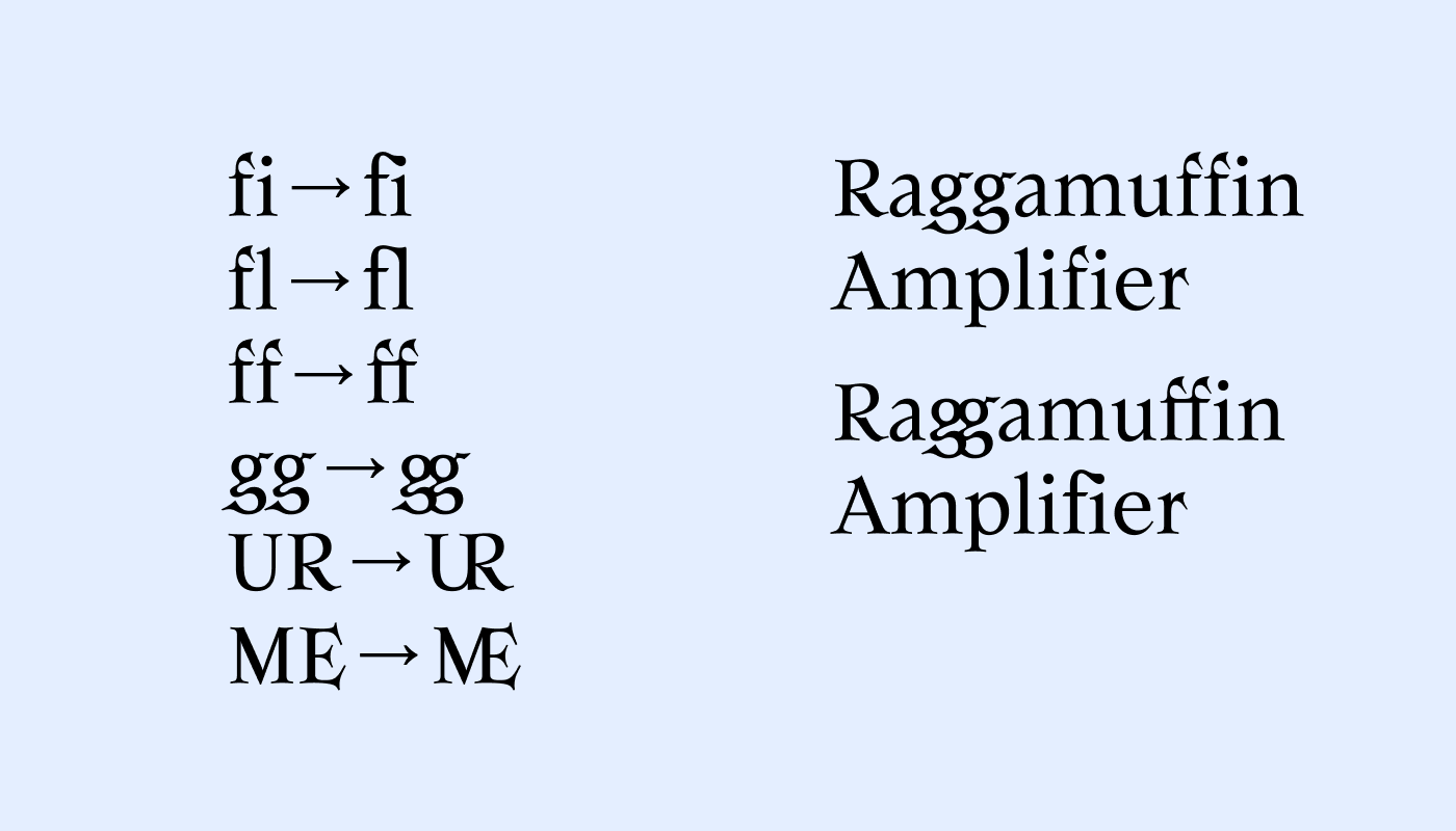
Ligature: the fusion of two or three characters to form a single one. This practice is inherited from handwriting, it makes reading more fluid and requires skill from the typographer to combine letterforms. It can also be used to merge characters as a way of considering inclusive writing.
Foundry: a structure that groups and sells typefaces.
Font size: the size at which a typeface is used. Expressed in points (pt) for print, in em or % on the web to adapt to screen size.
Uppercase: capital letter, beyond the capital at the beginning of a sentence. (example: CLICK HERE)
Lowercase: character in lowercase, also possible at the beginning of a sentence. (example: click here)
Line spacing: space between lines.
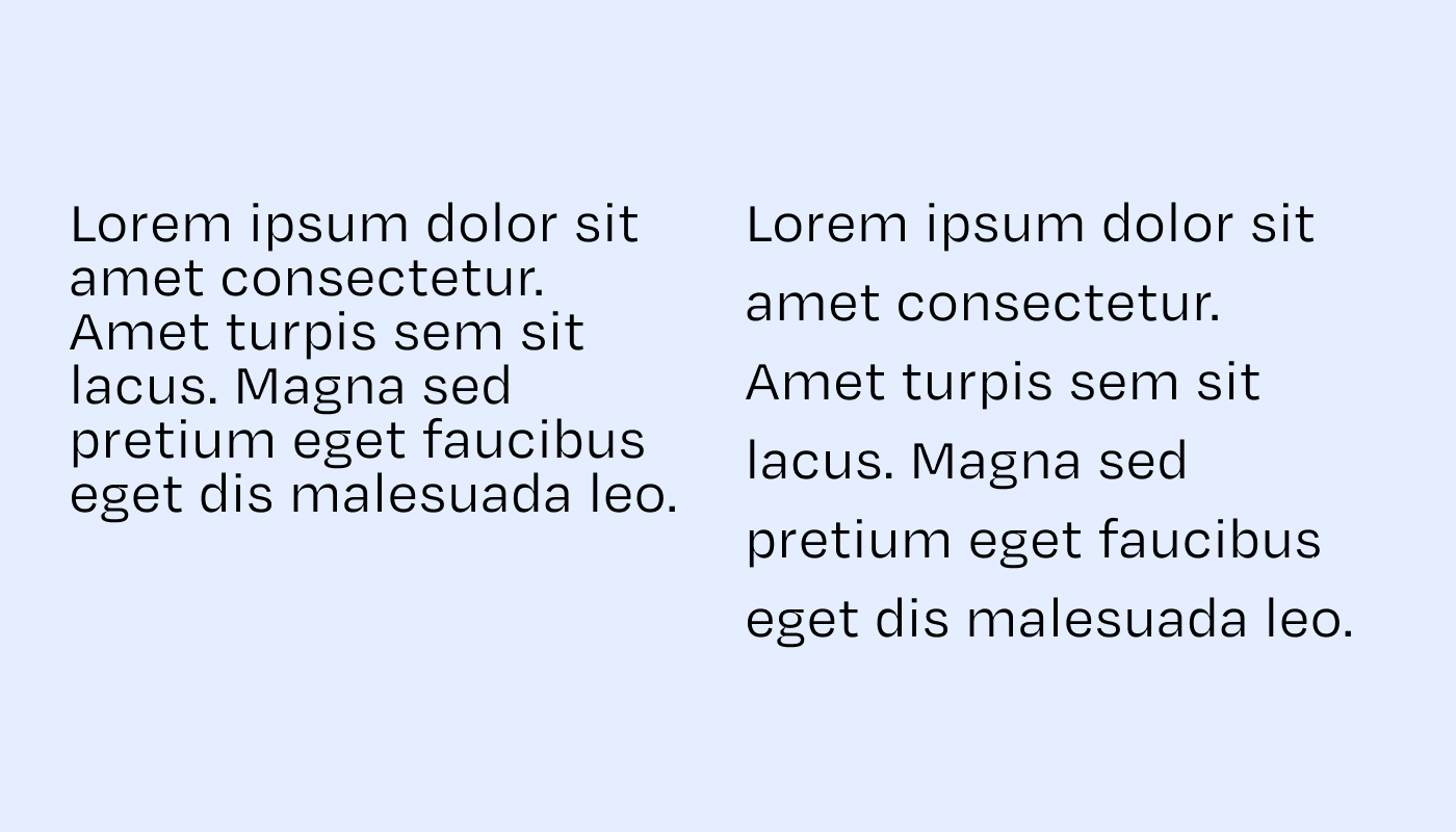
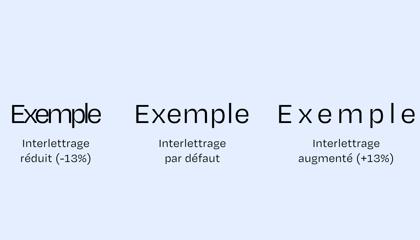
Letter spacing: the space between characters.
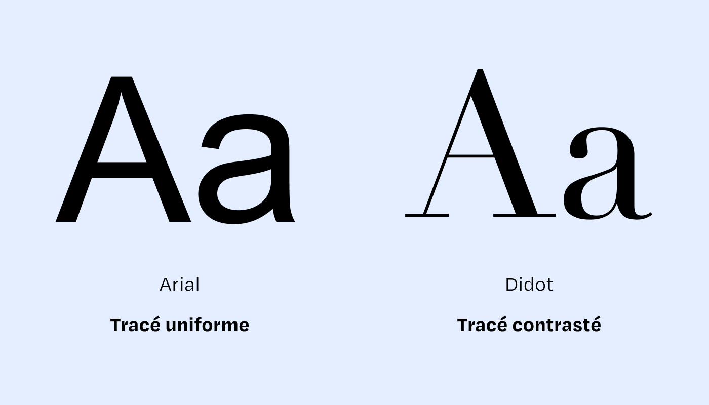
Contrast: a difference in the thickness of a character from one point to another (uniform or varying: thick and thin, feathered, etc.)
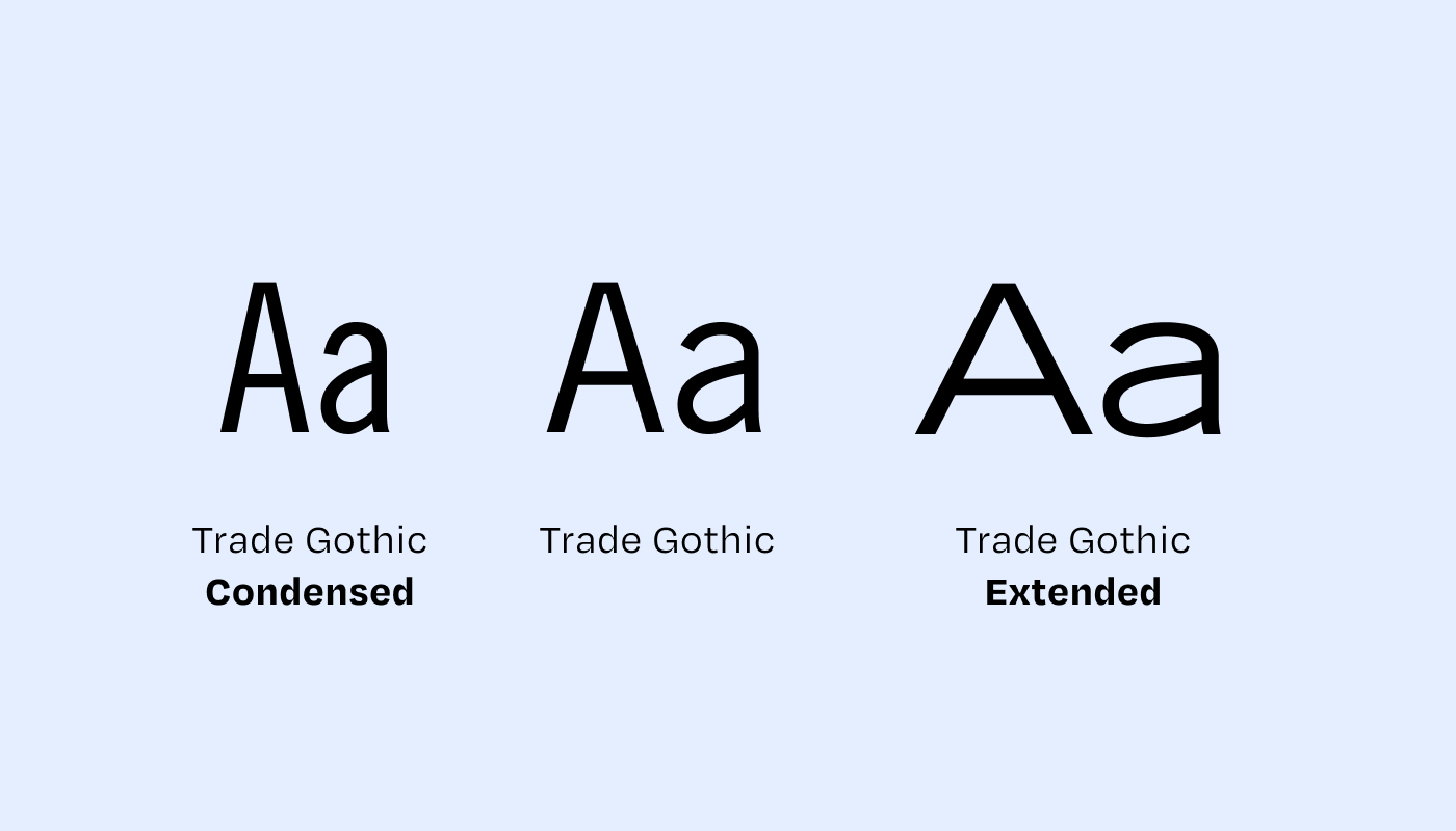
Character width and leading: A font is said to have a wide character width when it extends significantly in length. We often see condensed, regular, or expanded font variants.
Kerning: the spacing between characters within a word. Kerning is set by the typographer and encoded in the font file. It can be artificially adjusted by modifying the letter spacing.
Learn More
With these concepts in mind, how do you choose your fonts?
Examples related to readability, accessibility, hierarchy, and
structure Practical
examples from my portfolio Médianes Column: Why So Much Bold?
Médianes Column: Paying Attention to Illustrations That Accompany Your Images