Printing has an ecological impact due to the use of resources such as paper and ink, the use of solvents and machines for printing and finishing. It is also known that many books and documents are discarded without even being read. Here are some ways to reduce your impact when printing a document, magazine, book, etc.
Print or not print?
The first question to ask yourself is simple: is printing really necessary? If so, how many copies? With what pagination? Once printing has been decided, there are solutions available to minimize its impact.
Choose your paper
There are many recycled papers, alternatives (made from alternative fibers such as starch, beetroot, seaweed), labeled or certified, available on the market. To learn more, you can ask your printer for the paper profile, a tool that provides information on the composition, emissions of the products used, and the origin of the paper in question.
Watch out for falls
In printing, "waste paper" refers to the paper used for calibrating and adjusting the printer and which is therefore… wasted. In addition to waste paper, all trimmings related to printing margins are also discarded. Choosing a standard format, such as A4, can limit the size of printing margins. The printer can help you minimize waste.
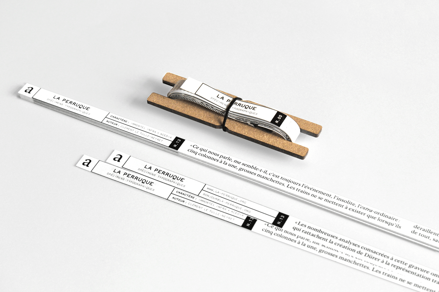
It is furthermore possible to reuse certain materials intended to be discarded. The magazine La Perruque, for instance, publishes typographic specimens printed on the margins of documents normally destined for the trash.
Color or black and white?
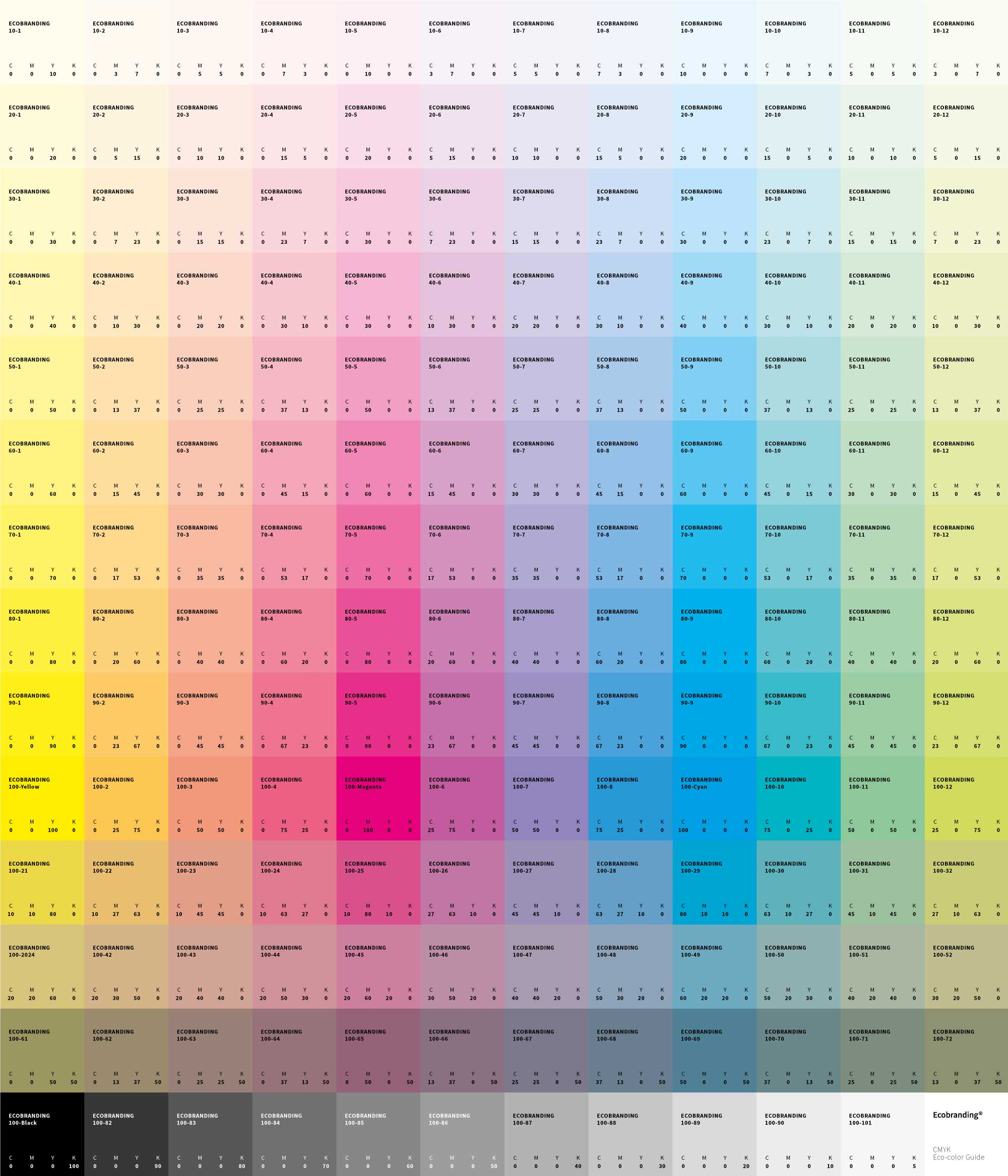
In printing, not all colors use the same amount of ink. Printing red tones, for example, uses twice as much ink as black. Choosing black and white printing therefore reduces overall ink consumption.
The CMYK guide master is an open-source tool that helps reduce the amount of ink used for four-color printing. It provides a color guide with lower ink density.
Let it breathe
It is advisable to leave ample space for white space and reduce solid color areas. Photographs can be reworked, for example by screening them, to lighten ink coverage. They can also be replaced with illustrations using a clear line style, which consume less ink.
Choose your font
Typographic choices also have an impact: certain fonts require less ink than others when printing. These are fonts that are generally thinner and narrower, such as Garamond or Times New Roman. These two fonts were designed well before the advent of digital printing. The first appeared in the 16th century, with characters engraved by hand. The second was created for printed newspapers, to improve readability while using as little space as possible.
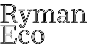
Other typefaces have been specifically designed to reduce ink consumption, such as Ryman Eco, whose characters are crossed with lines. The alternation between solid and empty spaces maintains readability while limiting large areas of ink.
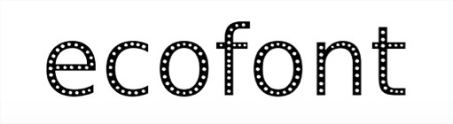
Make holes
Ecofont Software is a print driver that offers a selection of
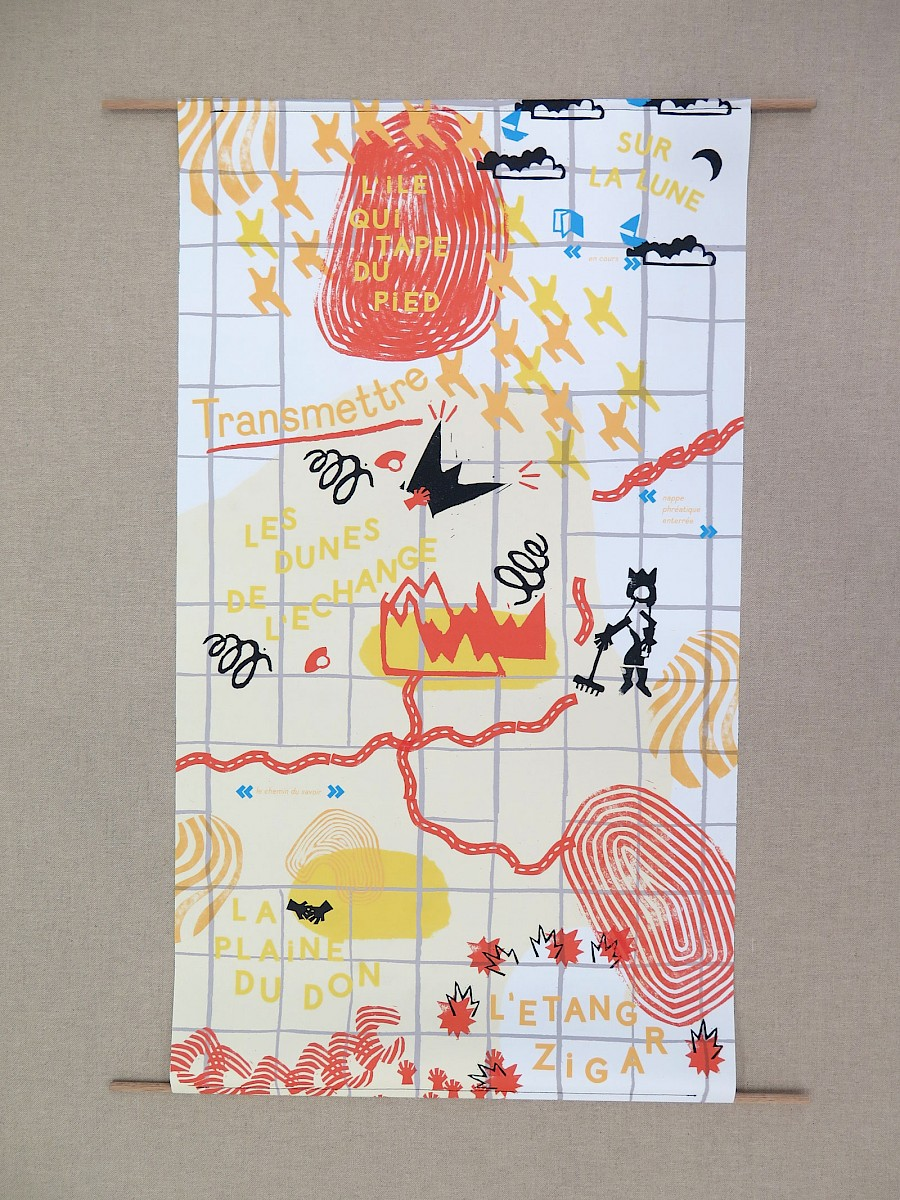
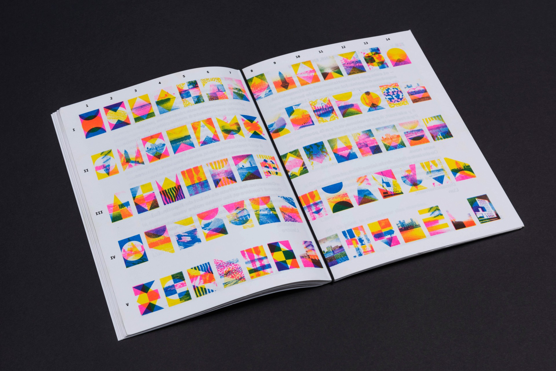
There are energy-efficient printing techniques like risography, which uses a cold printing process. Another advantage is that the inks used are made from soy and contain no solvents. The inks are very vibrant and I find the result beautiful and textured.
A small note: the maximum format is A3 and it is recommended to print a minimum of 20 copies.
Transparency
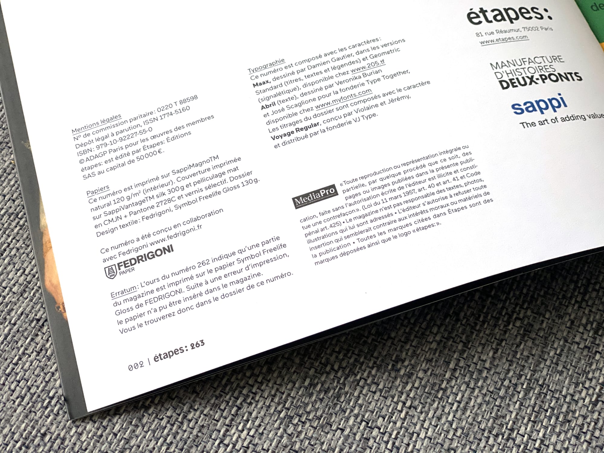
To allow anyone to identify the typefaces and papers used, it is possible to list them in the Colophon, a page generally located at the end or beginning of a printed work, which records the names of publishers, printers, contributors, and so on. The magazine étapes:, which recently ceased publication without explanation, even went so far as to specify the varnish used for its cover, the Pantone (a solid ink prepared before printing), the lamination, and so on.
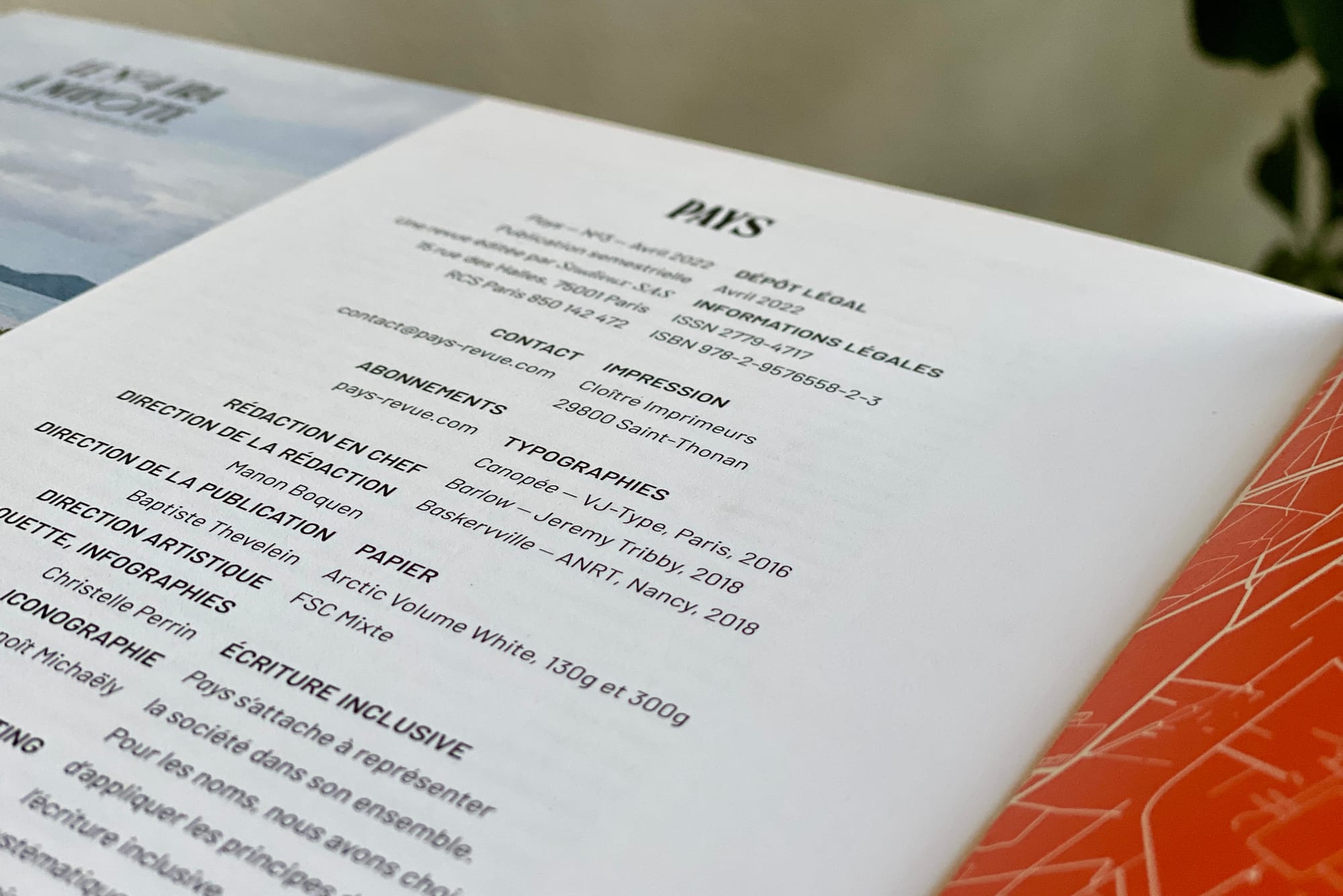
Pays, the magazine surrounding us, also specifies the typefaces used and the papers chosen.
Conclusion
In short, there are many alternatives for reducing your carbon footprint. If these concerns matter to you, don't hesitate to gather information and discuss options with your suppliers, so you can develop viable solutions that fit your projects.
To go further
- How the editorial team at Ouest-France gives paper a second life.
- A talk by Étienne Ozeray, graphic designer, "Digital and Ecological".
- A feature on the steps to follow and the characteristics to prioritize when choosing the right paper.
- A series of case studies with magazines and newspapers to help you choose your own paper.